
Case Study 15:
Ohio Educational Technology Conference
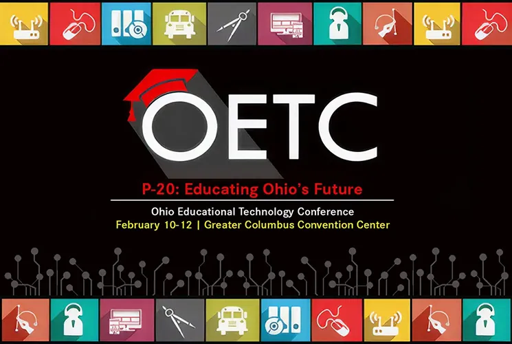
Under Pressure
One Month. One Designer. One Statewide Conference.
When KRAM & Associates was awarded the contract for the seventeenth annual Ohio Educational Technology Conference (OETC), I was brought in as the Art Director and lead designer responsible for creating OETC's visual communication system.
The plan was straightforward. I would receive the conference content three months before opening day, giving me enough time to design the branding, conference guidebook, environmental signage, mobile app graphics, and supporting materials for one of Ohio's largest educational technology events. Instead, the content didn't arrive until the final month.
One month remained. The dates were set. The conference was moving forward. Thousands had already registered. The schedule disappeared. The work didn't.
The seventeenth annual OETC, held at the Greater Columbus Convention Center, drew over 4,000 attendees and more than 5,500 total participants from across Ohio and the country. Ohio's premier professional development event for educators spanning PK–20, with 200+ exhibitors, keynote and featured speakers from around the world, workshops, a full trade show floor, and a mobile app that put the entire conference in attendees' pockets.
The Client
The Ohio Board of Regents commissioned OETC as Ohio's flagship educational technology conference, bringing together K–20 educators, administrators, technology leaders, and private industry partners. Seventeen years in. A known event. A known reputation. The kind of client where you do not show up with average work.
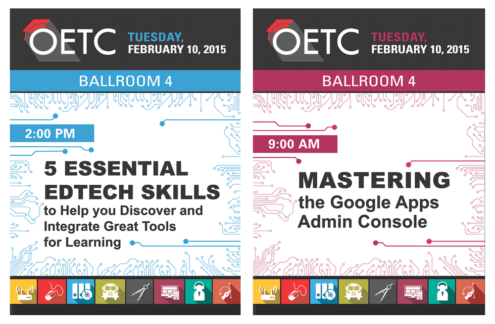
The contract, valued at $30,000, was secured through KRAM & Associates Marketing Solutions. As the firm's Art Director and Senior Designer, I was brought in to handle the visual communication the conference required: the 120-page guidebook, mobile app graphics, over 40 pieces of onsite dimensional signage, Save the Date advertising, and a forward-looking exhibitor prospectus for the following year's conference.
My Role
Art Director, Senior Designer, Editorial Designer, Environmental Signage Designer & Mobile App Designer
Although the contract was awarded through KRAM & Associates, I served as the Art Director and lead designer responsible for virtually every attendee-facing piece of visual communication created for OETC.
The work included event branding, a 120-page conference guidebook, mobile app graphics for iPad, iPhone, and Android, more than 40 environmental signs, Save the Date advertising, and a 12-page exhibitor prospectus for the following year's conference. I also created the signage templates used by the print vendor to produce additional room signs beyond those I designed directly.
I designed everything shown in this case study.
The Challenge
The contract included a three-month production window. In practice, that window became less than one month. OETC did not deliver the content needed to begin production until the start of the final month before the conference. By that point, the convention center was booked, the exhibitor booths were going up, the invitations had gone out, and thousands of educators had registered. There was no room to push back. The conference was happening. The work had to be done.
Beyond the timeline, the scope itself was its own set of challenges:
The Visual Concept
The OETC logo was provided. The color palette was largely carried over from the previous year's icon system: gray, yellow, blue, red, and a deep reddish brown. What was not given was the idea. The visual system that would make a 120-page guidebook, a mobile app, and 40+ pieces of convention center signage feel like they all came from the same place.
I wasn't interested in decorating the conference with technology. I wanted the visual language to feel as though it was built from the same invisible infrastructure that powers technology itself.
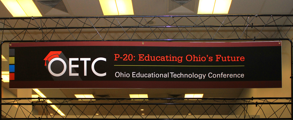
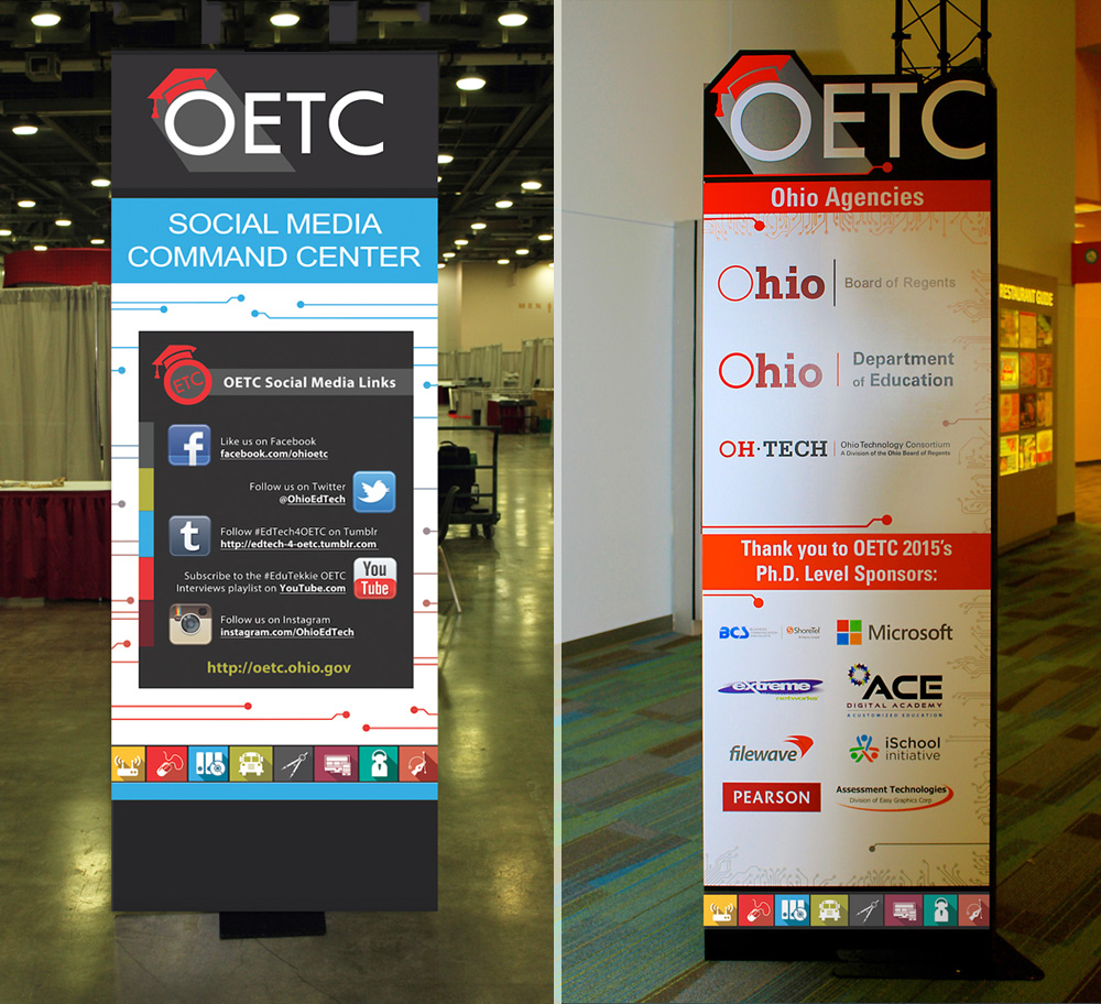
That led me to technological circuitry. The visual language of microchips and circuit boards. The invisible architecture that makes digital technology possible. For a conference built around educational technology, the connection was direct without being obvious. It gave everything a unified texture that felt right for the subject, and gave every deliverable a shared visual language, from the large entrance banners down to the smallest room sign.
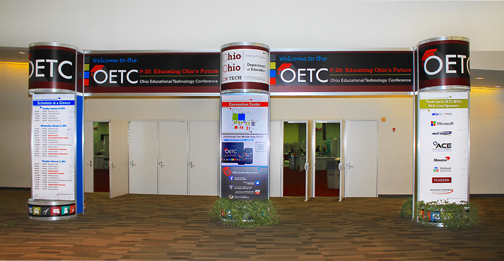
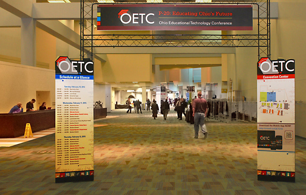
Conference Branding and Entrance Signage
Graphic Design Elements and Branding System


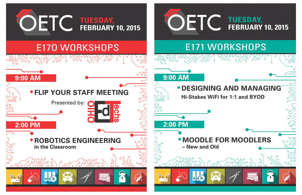
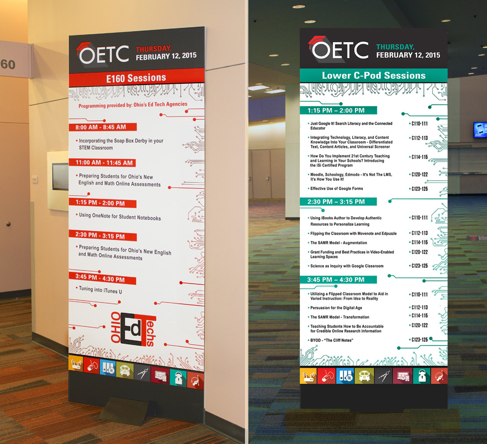
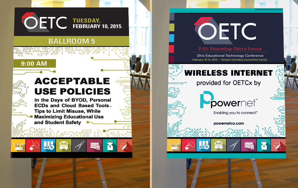
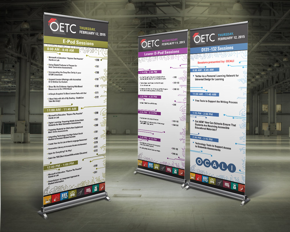
Onsite Dimensional Room Signage: Workshop Easel Signs (3′ × 4′)
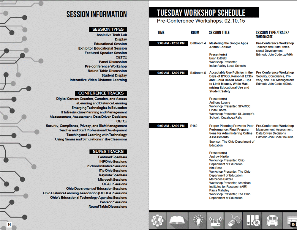
Conference Program Guidebook (120 Pages)

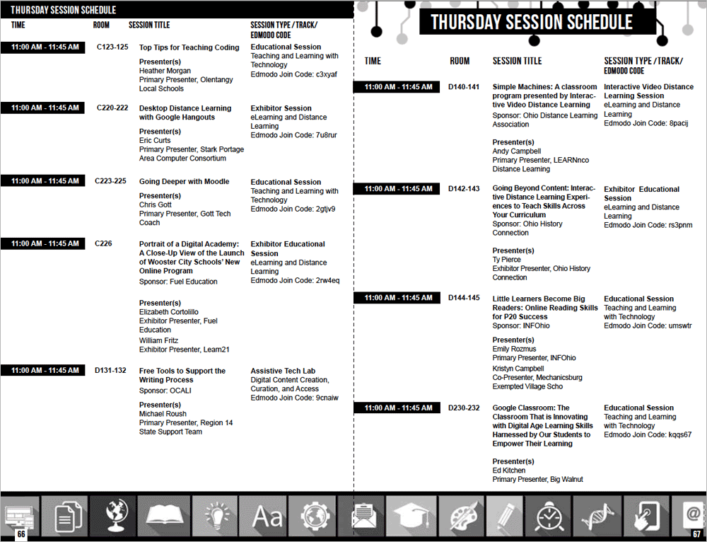
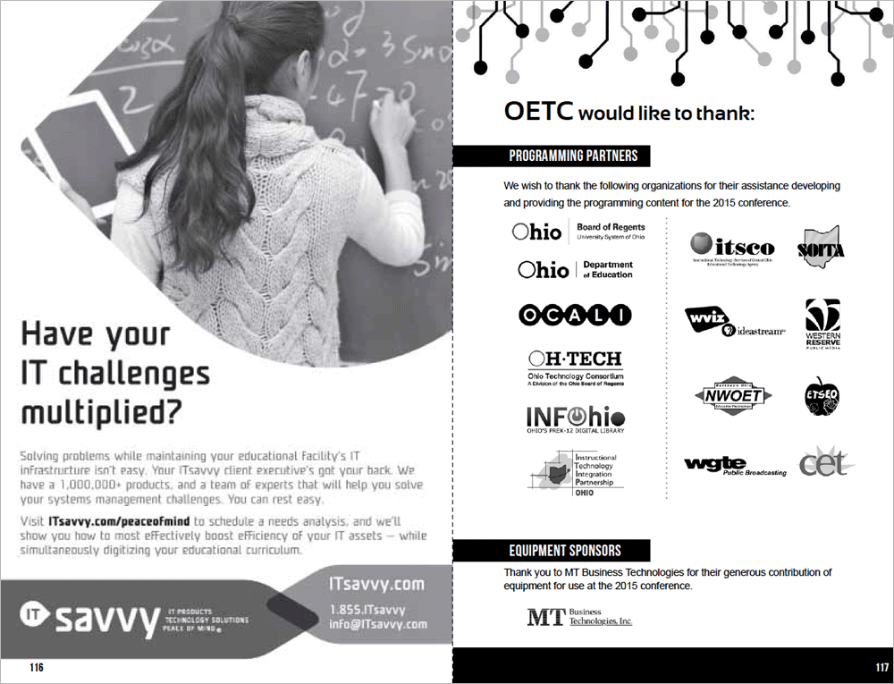
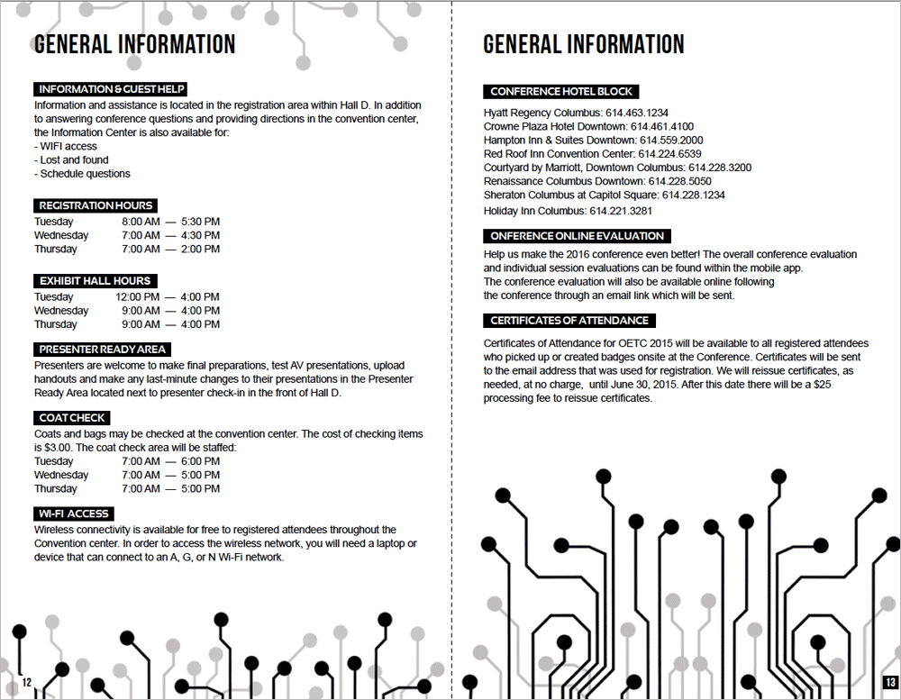
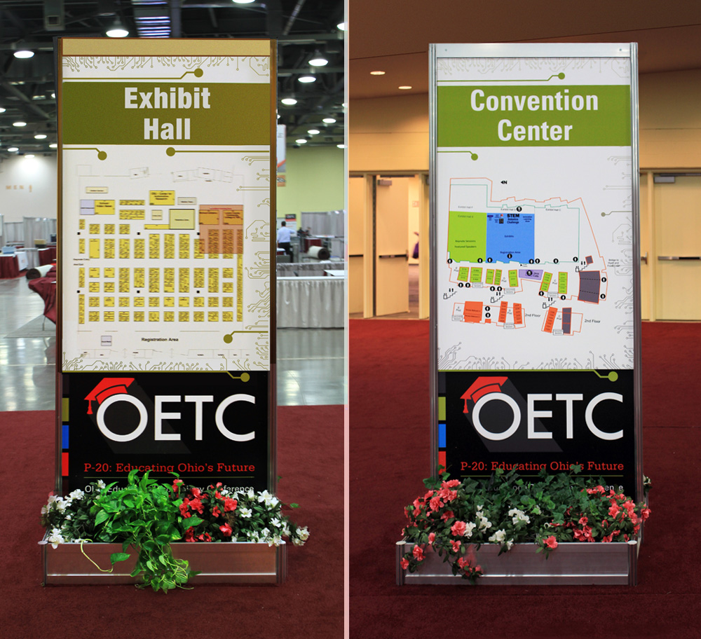
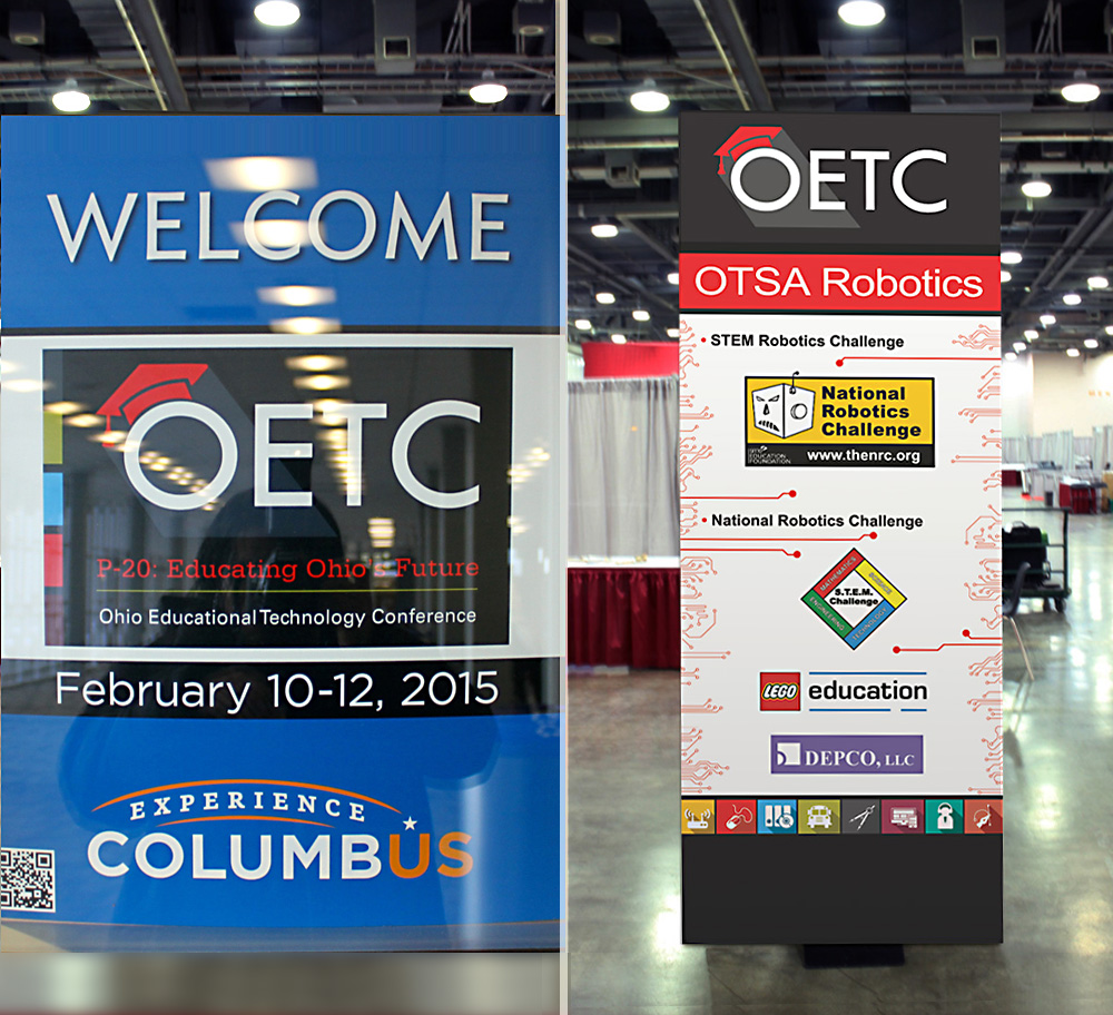
Entrance and Directional Signage
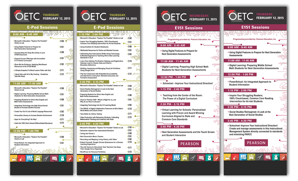
Onsite Dimensional Room Signage: Meter Board Signs (3′ × 8′)
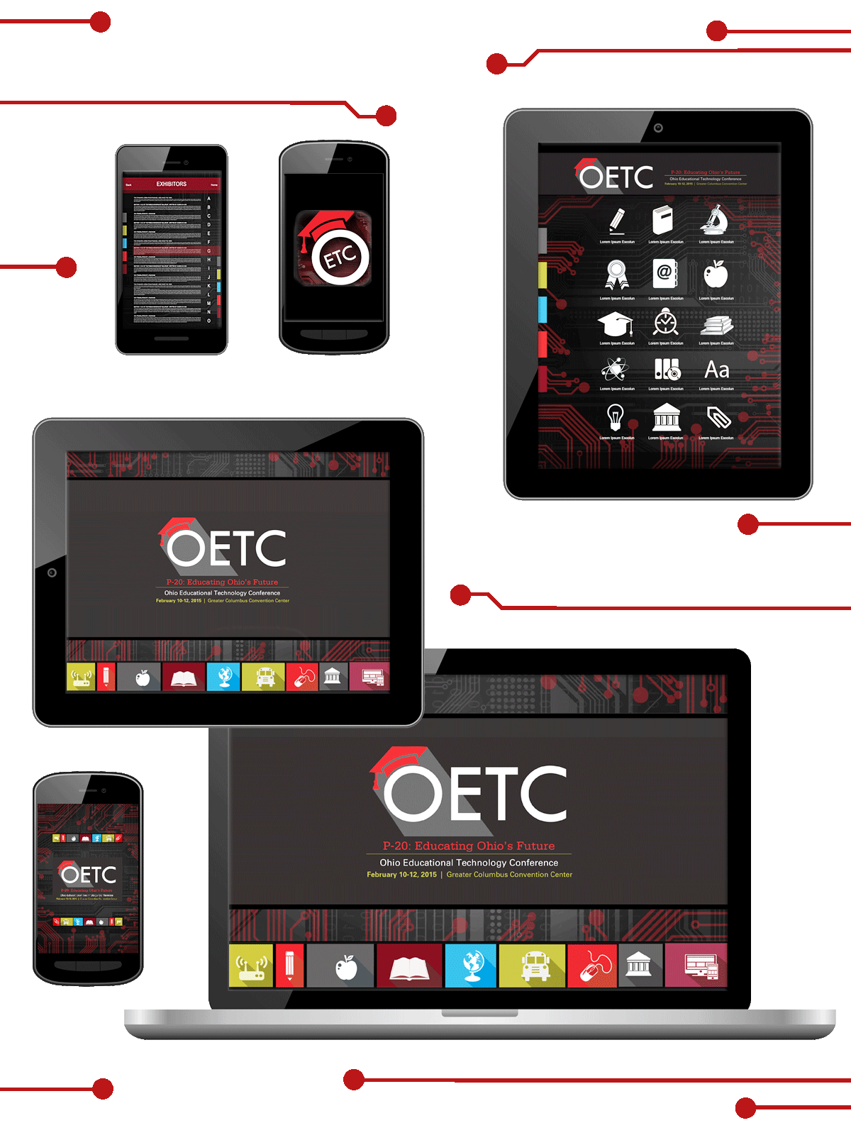
Mobile App Design Package
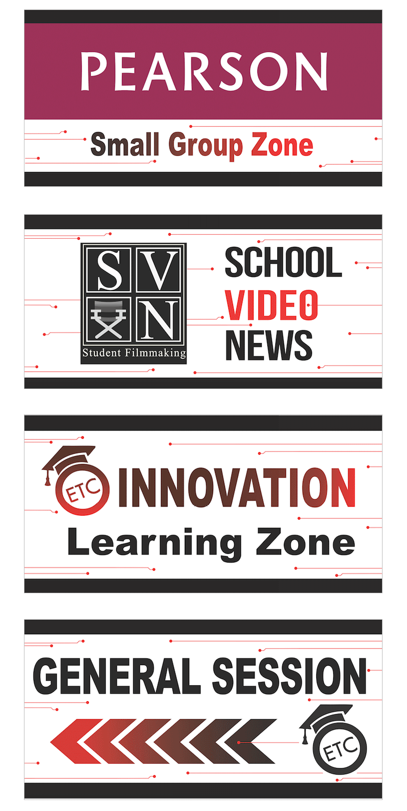
Onsite Dimensional Room Signage: Workshop Vinyl Signs (4′ × 8′)
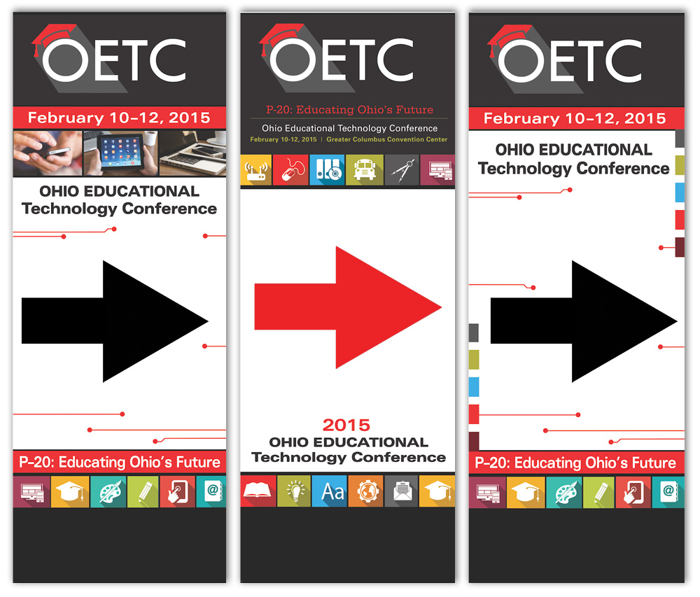
Onsite Directional Room Signage: Meter Board Signs (3′ × 8′)
Save the Date Advertising


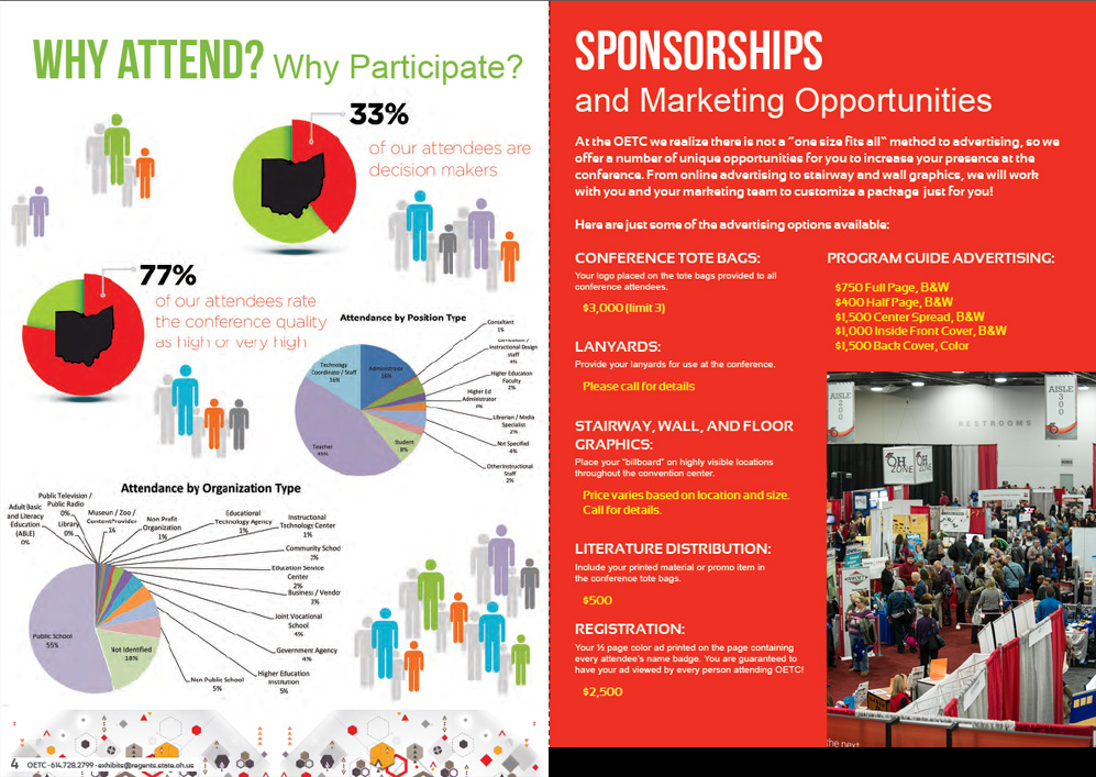
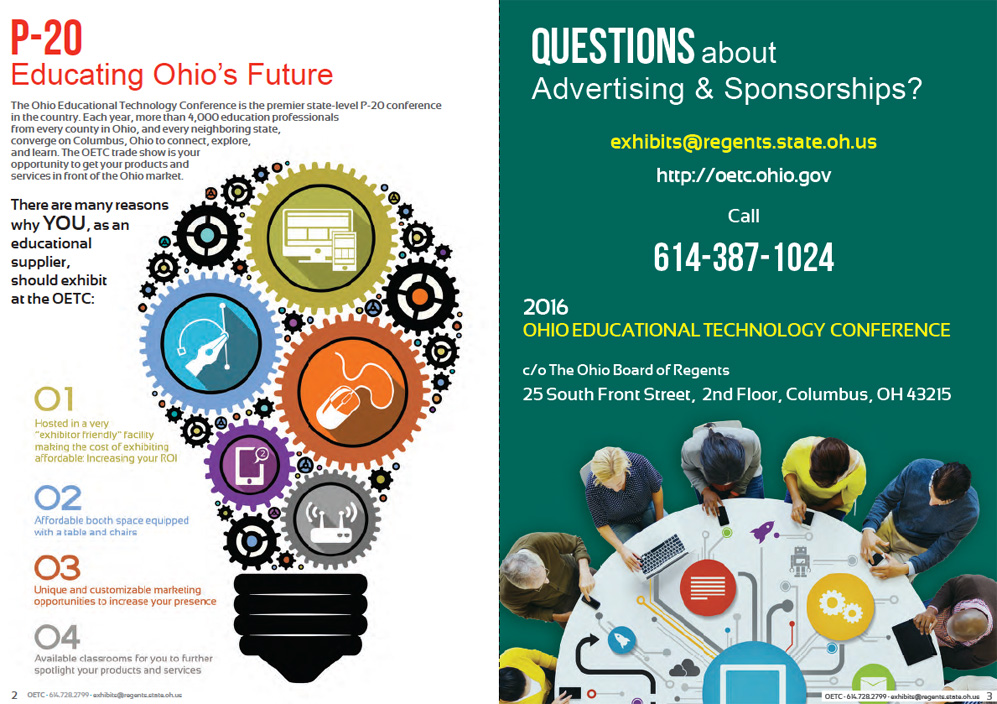
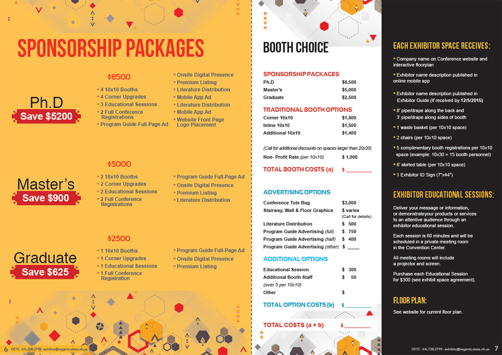
OETC 2016 Exhibitor Prospectus (12 Pages)

What This Work Demonstrates
Scale and Scope Management
This project demonstrates the ability to manage a high-volume, multi-format design engagement as a solo creative, from concept development through final production-ready files. A 120-page guidebook, 40+ pieces of environmental signage, mobile app graphics, and forward-looking prospectus work, all produced under a compressed timeline, represents a level of output that most design teams would distribute across multiple people.
Education and Technology Industry Experience
OETC was Ohio's premier educational technology conference, drawing educators, administrators, and technology leaders from across the state and country. This engagement demonstrates direct experience designing for the education and technology sector at an institutional level, with an audience of thousands of professionals whose time and attention the design had to earn.
Original Visual Concept Development
With no existing visual template to work from, the technological circuitry concept that unified the OETC visual system was developed from scratch. Building a cohesive design system that could extend from intimate guidebook pages to large-scale convention center signage, while remaining on brand and visually consistent throughout, is a distinct creative and organizational skill.
Delivery Under Pressure
When the agreed three-month timeline compressed to less than one month, there was no option to renegotiate. The conference was already in motion. The work was delivered on time, to specification, at the quality level a $30,000 state-level conference contract required. That kind of delivery, under those conditions, says something about professional commitment that a portfolio page alone cannot fully communicate.
The Impact
By opening day, thousands of attendees moved through the Greater Columbus Convention Center using a visual system they would probably never stop to think about. That was the goal. Good conference design isn't supposed to draw attention to itself. It quietly helps people find rooms, navigate schedules, discover exhibitors, attend sessions, and stay connected without friction. When it's working, the experience feels effortless.
What this project proved wasn't simply that I could produce a large volume of work under pressure. It proved that the ability to deliver does not shrink when the pressure increases. More importantly, it demonstrated my ability to build a cohesive visual communication system that held together across dozens of deliverables, multiple formats, and thousands of attendee interactions, even after the timeline collapsed.
This was not just the largest conference branding engagement I'd led at that point in my career. It fundamentally changed my understanding of the scale of work I was capable of delivering. It showed me that a single creative, with the right commitment and discipline, can deliver work at a scale that serves thousands of people without sacrificing clarity, consistency, or quality.