Case Study 14:
The Saunders Company
Persuasion by Design
Helping Organizations Earn Confidence Before They Earn Business.
Not every design engagement is built around a single campaign or product launch. Some clients need design that does the quieter, more foundational work: establishing credibility, communicating professionalism, and helping the organization put its best face forward across a range of high-stakes situations. That is exactly what the work for The Saunders Company required.
The Saunders Company is a public relations agency specializing in media relations, strategic communications, thought leadership, community outreach, and executive positioning. As a PR firm, their business is built on influence and credibility. Every piece of design produced on their behalf, whether for their own identity or for their clients, had to reflect the same standards they held their communications to: polished, purposeful, and built to persuade.
The work spanned three distinct project areas: corporate identity and brand collateral for The Saunders Company itself, proposal and editorial design for two of their client engagements, and campaign support materials for a public vote initiative. Each required a different visual approach, which is part of what makes this body of work a useful demonstration of range.
My Role
Art Director, Senior Designer & Brand Identity Designer
Across all three project areas, the work covered concept development, identity design, editorial layout, proposal design, and campaign materials. Because The Saunders Company is a PR agency, several of the projects were produced for their clients rather than the agency itself. That distinction shows up in the work: the branding identity belongs to Saunders, while the NextGen report, the recycling proposal, and the Issue 57 campaign each carry their own visual language appropriate to their specific audience and purpose.
The Challenge
Designing for a PR agency means designing for an audience that knows what good communication looks like. The Saunders Company works with executives, civic leaders, and institutional clients. Every piece produced had to clear a higher-than-average bar for professionalism and visual credibility, because the agency's reputation is partly built on the quality of its materials.
Beyond the agency's own identity, the client work presented its own set of challenges:
Project 1: Corporate Identity and Brand Collateral
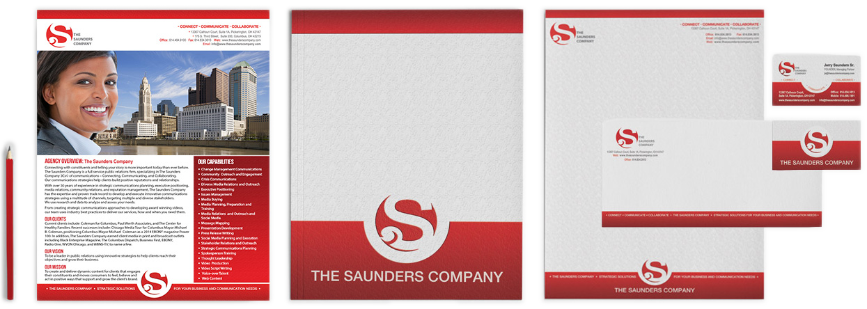
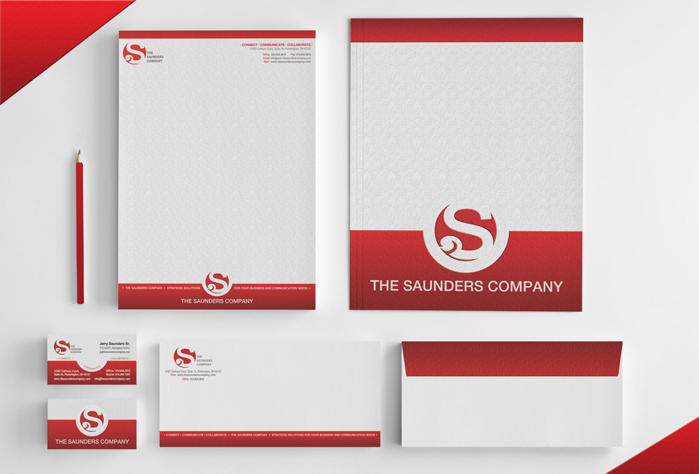
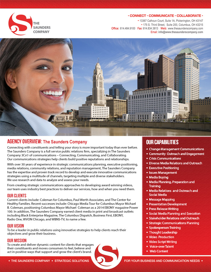
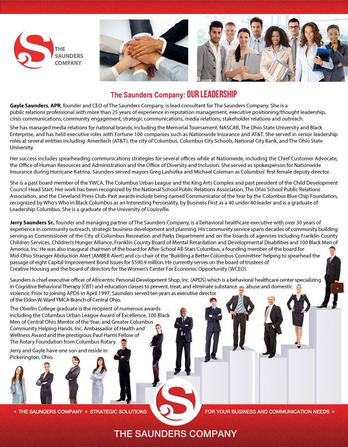
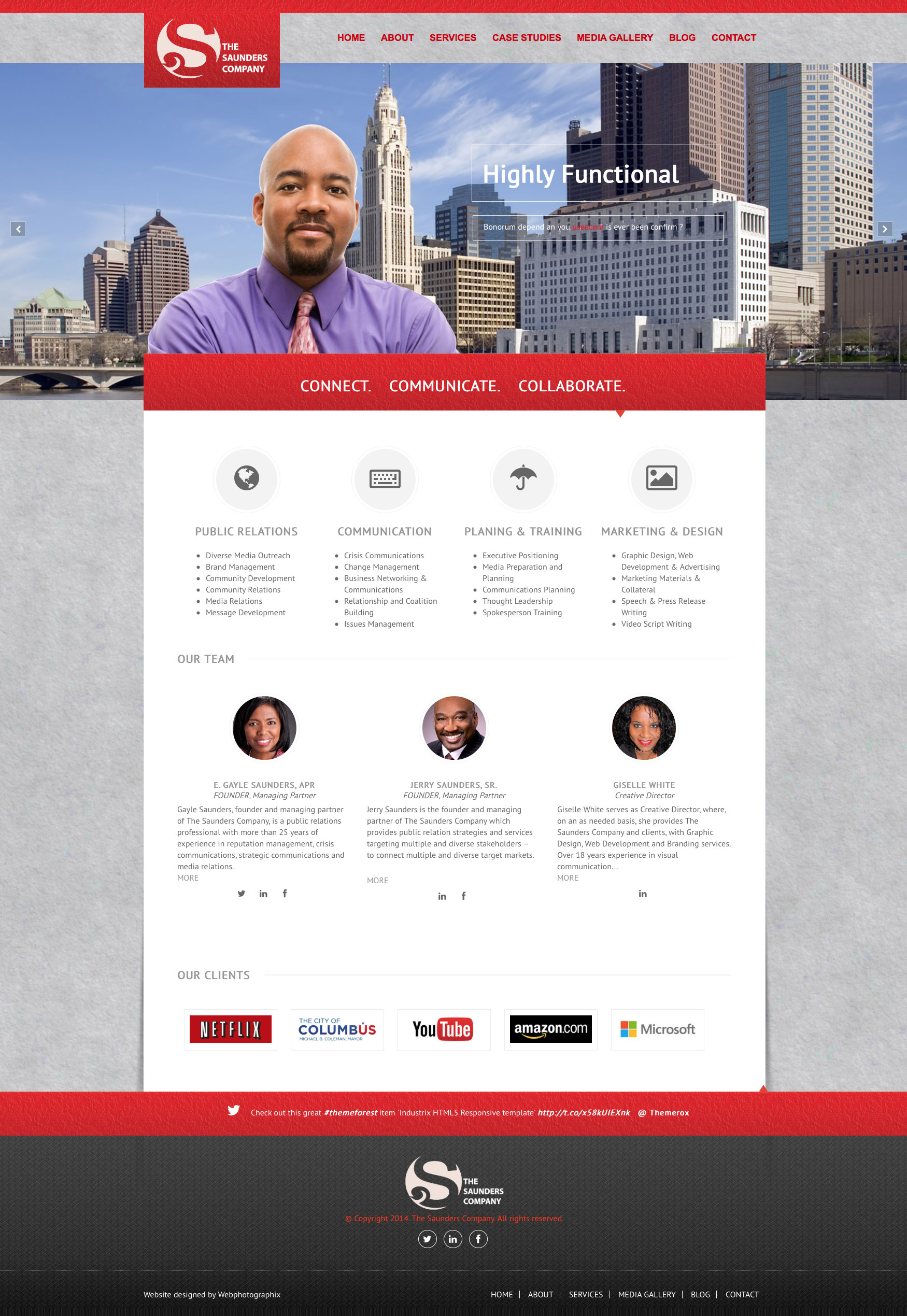
The foundation of the Saunders engagement was building the agency's own visual identity from the ground up. The brand package covered the full suite of business identity materials: Letterhead, business cards, envelope, invoice, and a presentation folder. Supporting materials included a capabilities statement, a publication advertisement, a formal proposal, and a website concept.
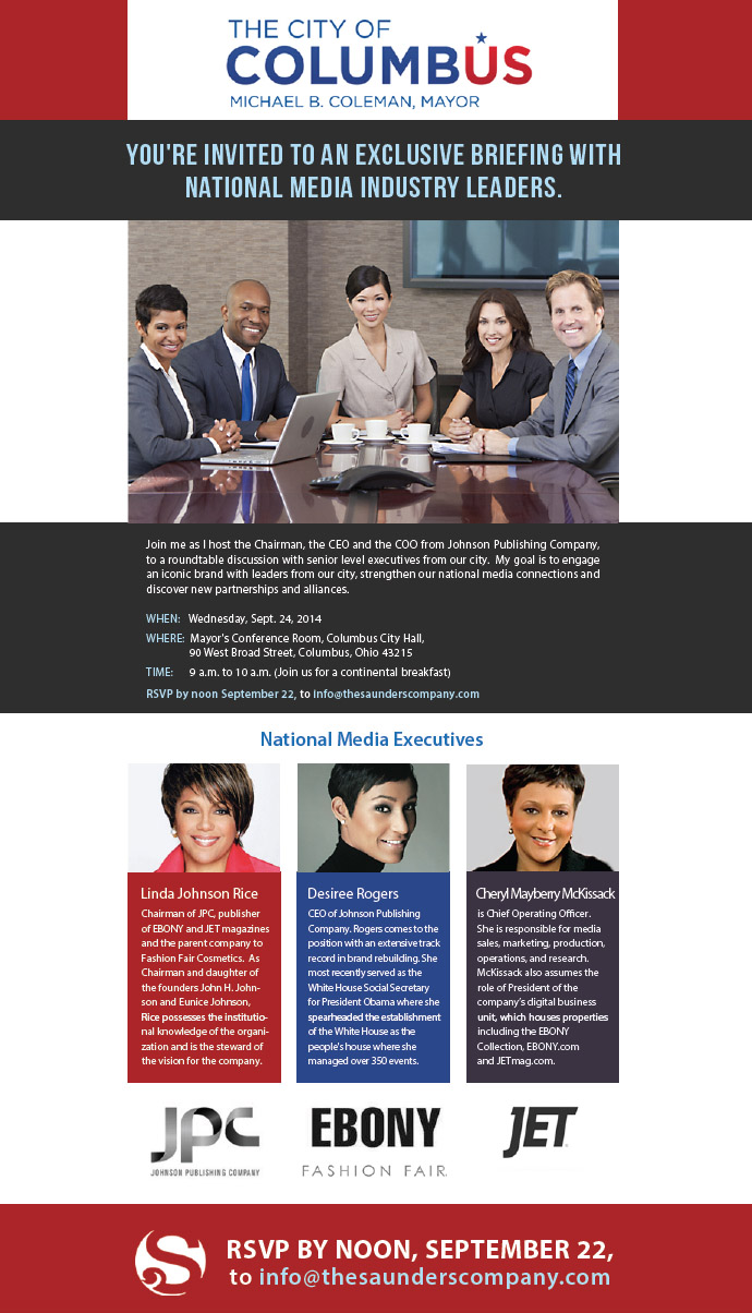
A standout piece in the collateral set was a formal invitation designed on behalf of the Mayor of Columbus, produced for a Saunders-organized event. That kind of piece demands a very specific register: Formal but not stiff, distinguished but approachable. Getting the tone right in print for a mayoral communication is a different kind of design challenge than producing marketing materials, and it shows range in the ability to calibrate design for context.
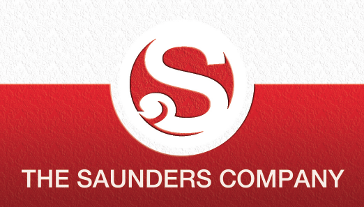
The Saunders Company Logo
Corporate Branding Suite
Capabilities Statement
An Invitation from the Mayor
Website Concept
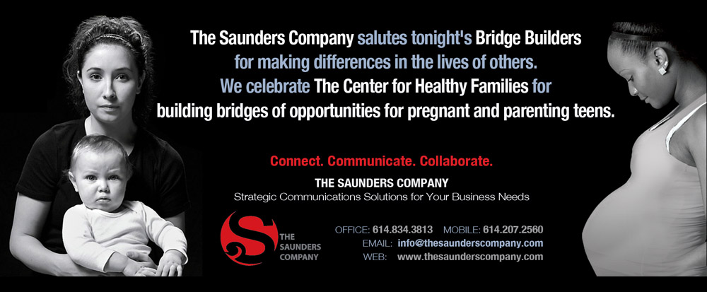
Publication Advertisement
Campaign Materials: Vote Yes on Issue 57
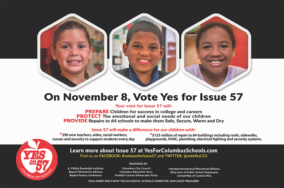
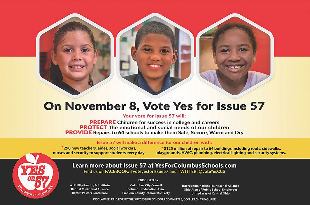
The Issue 57 materials were produced in support of a public vote campaign managed by The Saunders Company on behalf of one of their clients. Campaign materials in a civic voting context have a very specific job: they must communicate a clear position quickly, in a format that works in multiple public-facing environments, and in a visual language that feels credible and trustworthy rather than aggressive. These pieces were designed to do that, carrying the campaign message with clarity and visual authority.
Vote Yes on Issue 57
Project 2: NextGen Progress Update Report
Produced for the Columbus Next Generation Corporation on behalf of former Mayor Michael Coleman, the NextGen Progress Update was a multipage report documenting the initiative's work identifying and repositioning underutilized property in Columbus core neighborhoods. The purpose was to communicate progress to stakeholders and build public and investor confidence in the initiative's direction.
The design approach used bold shapes, diagonal geometry, and a strong color system to give the report a sense of momentum. The visual language was chosen deliberately: A civic revitalization initiative should not look like a government form. It should look like something worth reading. The layout prioritized hierarchy and flow, guiding readers through complex property data and community planning information without losing them in the process.
Two cover directions were developed for this project. The first, and the stronger of the two, used the bold graphic system developed for the full report. The second was a more restrained direction developed at the client's request. Both are shown here. Presenting an alternative when there is a genuine creative difference of opinion is part of senior design practice. The client makes the final decision, and the responsibility is to execute that decision with the same care given to the original recommendation. Good creative work includes having a point of view and knowing when to advocate for it.
NextGen Progress Update Report


Alternative Cover Design (Client-Requested Minimalist Direction)

Project 3: City of Columbus Recycling and Yard Waste RFP
A request for proposal is a high-stakes document. It is often the first and only impression a potential client receives before making a decision. The City of Columbus Recycling and Yard Waste RFP was produced to help The Saunders Company bid competitively on a significant new public relations contract, and the design was treated with the same strategic intentionality as the proposal's content.
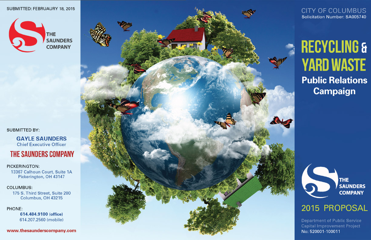
The visual approach connected directly to the subject: the color palette, graphic language, and structural choices all reflected the environmental theme of the recycling initiative. A proposal that looks like it already understands the project is a stronger bid than one that does not. Design in this context is not decoration. It is an argument.
City of Columbus Recycling and Yard Waste Proposal
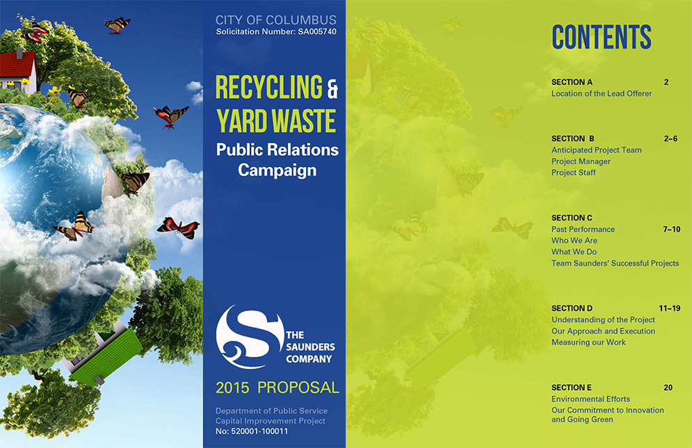
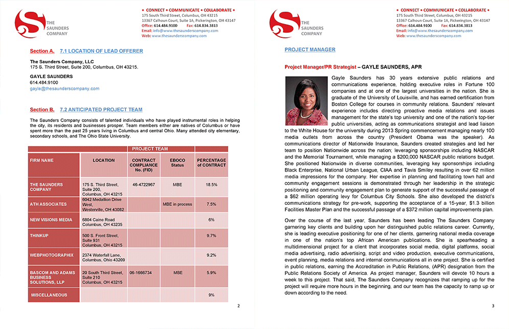
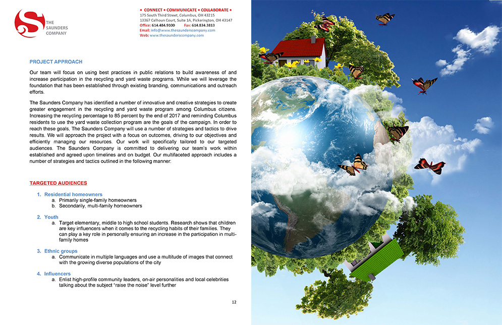
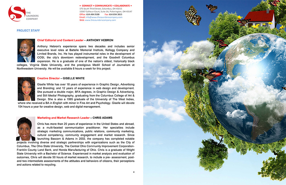
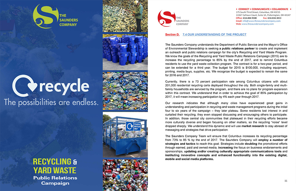
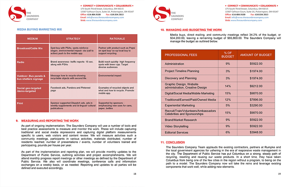
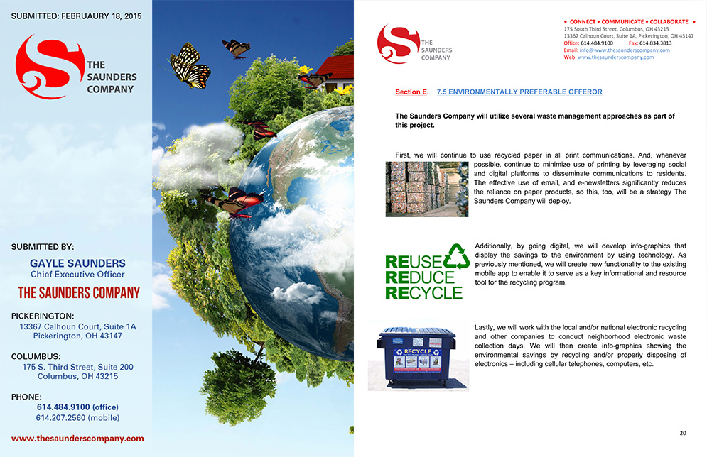
Recycling Proposal Front and Back Cover
What This Work Demonstrates
Identity Development
The Saunders Company brand package demonstrates the ability to build a cohesive visual identity for a professional services firm from concept through full collateral suite, including business identity, capabilities materials, web concept, and advertising, all held together by a consistent visual system.
Editorial and Proposal Design
The NextGen report and recycling proposal demonstrate the ability to design complex, multipage documents that communicate with authority and clarity. Proposal design in particular requires a strong understanding of how visual presentation influences perception, and how design can function as a strategic tool in a competitive context.
Working Across Multiple Client Voices
Because The Saunders Company is a PR agency, the work produced here serves multiple clients, each with different audiences, tones, and visual needs. The ability to shift registers between a corporate identity, a civic progress report, an environmental proposal, and a public vote campaign without losing design quality or consistency is a real demonstration of range.
Creative Judgment
The NextGen cover direction illustrates something important about how senior design work actually operates: having a strong recommendation and the professional confidence to present it, while delivering the client's preferred direction with equal care. Good creative direction includes knowing when to advocate and when to execute.
The Impact
The work produced for The Saunders Company and their clients covers the kind of design that does not always get the attention that brand campaigns do, but that matters just as much. A well-designed proposal can win a contract. A strong capabilities statement can open a door that a conversation alone cannot. A civic campaign that communicates clearly can move a vote.
Whether helping establish a new corporate identity, strengthen a proposal, communicate civic progress, or support a public campaign, each project served the same purpose: Helping organizations earn confidence through clear, purposeful communication. The success of this work wasn't measured by how polished the pieces looked, but by how effectively they helped clients present their ideas, build credibility, and move people to action.