
Case Study 16:
Columbus State Community College
Many Audiences. One Institution.
Communication Design for Higher Education.
Most design work is built around a defined audience. A target demographic, a customer profile, a persona. The work gets clearer when you know who you are designing for. Columbus State Community College complicated that entirely.
A community college is not a single institution serving a single kind of student. It is several institutions at once: A trade school, a transfer program, a continuing education center, a workforce development hub, and a second chance for people at every stage of life who are trying to build something better. The students walking through the doors at Columbus State ranged from recent high school graduates to working adults returning to school in their thirties and forties, from students on government grants to professionals upgrading their credentials, from people pursuing four-year transfer paths to people learning a skilled trade. Every design created for that institution had to be considered against that full range of human beings. That is a design challenge most institutions never have to face at this scale. And it shaped everything.
Employer
Columbus State Community College is one of Ohio's largest community colleges, serving more than 41,000 students drawn from all 88 Ohio counties and more than 130 countries. It offers two-year career programs across more than 50 areas, including business, health, public service, engineering technologies, and skilled trades, as well as transfer programs for students completing their first two years before moving to a four-year university, through agreements with more than 35 colleges, including a Preferred Pathway program with The Ohio State University.
The institution operates on an open-enrollment policy: No prior academic record is required for admission. That is not just an admissions policy. It is a design brief. When any person from any background can walk through the door, every piece of communication the college produces has to work for all of them. The student body reflects exactly that openness: Minority enrollment at 53%, majority Black, exceeding the state average of 37%, with students representing more than 130 countries and a majority of students, approximately 55%, identifying as female. Its mission is broad by design. And its communication needs are as varied as the people it serves.
My Role
Frontend Web Developer, Graphic Designer & Photographer
Hired primarily as a Frontend Web Developer, the role expanded naturally to include graphic design support and photography. When the college's two in-house graphic designers were at capacity, design work came my way. When smaller student events needed photography coverage without the budget for a professional shoot, I was there. The result was a body of work that spans two distinct design eras at Columbus State: The period before the college commissioned a formal rebrand, when design was event-driven and creatively open, and the period after, when a new brand standard system arrived with its own specific visual logic and constraints.
The Rebrand: A Design System and Its Limits
During my time at Columbus State, an outside advertising agency was brought in to develop a new brand identity for the college. The in-house designers, who understood the institution's needs from the inside, were not heavily consulted. That dynamic is familiar to anyone who has worked within a large organization: Leadership decisions about brand direction often arrive from outside, and the designers already in place are expected to implement them, not shape them.
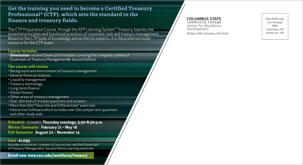
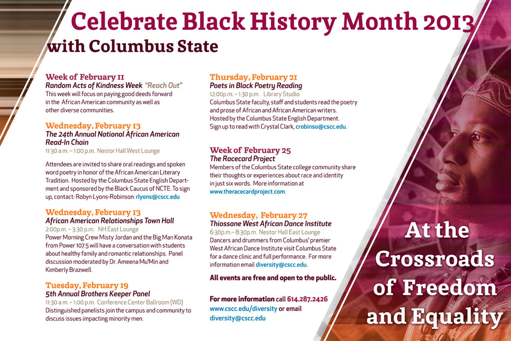
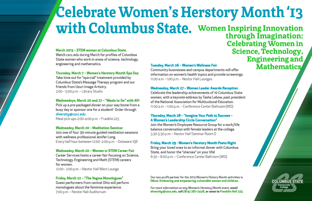
The new brand system was built around a strong diagonal line cutting through the composition, with motion-blur speed backgrounds giving the work an energetic, forward-moving feel. Visually, it was striking. As a concept, it was interesting. As a long-term system for a community college with a constant flow of varied communication needs, it had real structural problems.
The diagonal was the issue. It looked powerful on a single-image poster with room to breathe. But once you had to place text within it, the usable space shrank rapidly. A line of copy that ran full width at the top of a composition narrowed to almost nothing by the time the diagonal had cut across the layout. Centered alignment became impossible. Longer copy became a spatial problem. Any multi-page document beyond a few pages would have fought that geometry at every turn.
The brand did not survive long after the college adopted it. The diagonal system that looked so confident in the agency's presentation turned out to be too rigid for the day-to-day reality of designing for an institution with as many communication needs as Columbus State. That is a lesson no brand presentation teaches you. It only becomes visible in practice, when the tenth poster in a row has to fit within the same diagonal constraint and the layout stops working.
The work shown in the first section of this case study was produced within those brand standards. What comes after shows the more open, event-driven design work produced before the rebrand arrived, where the brief came from the theme of the event, not the rules of a style guide.
Part One: Designing Within the Brand System
Working within the new brand standards required finding creative solutions inside a defined set of constraints. The diagonal geometry, the speed-blur backgrounds, the established color palette: All of it had to be present and consistent. The challenge was making each piece feel purposeful and specific to its audience, rather than like a template with different text dropped in.
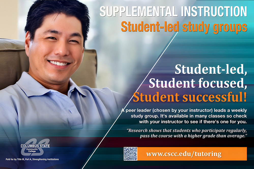
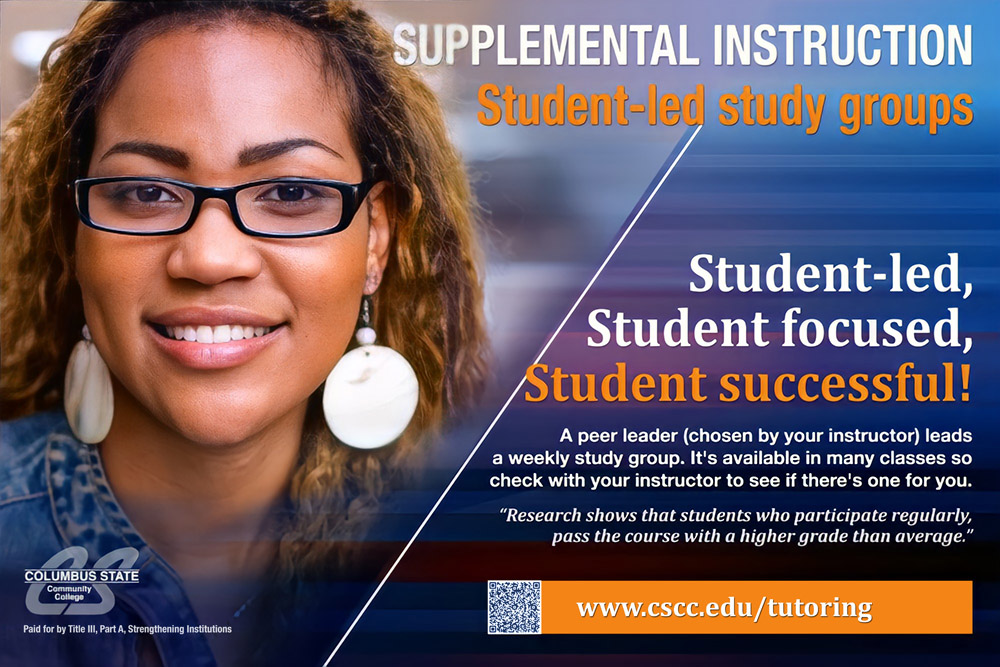
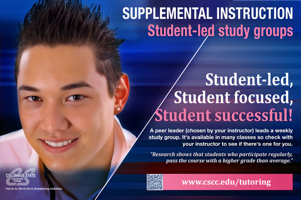
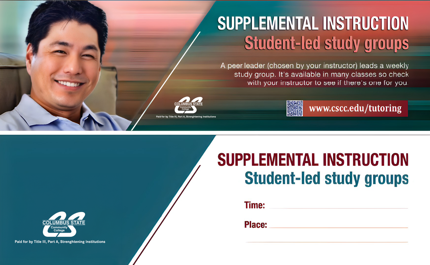
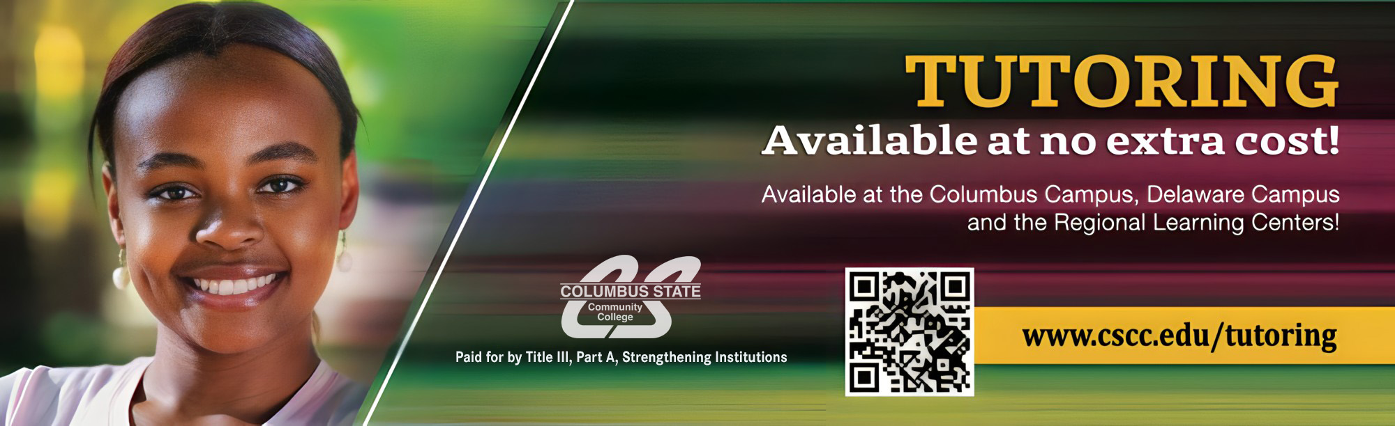
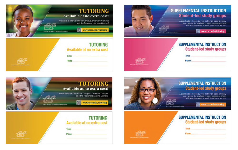
The Tutoring and Supplemental Instruction posters are a good example of where that challenge was most visible. The audience for those pieces was intentionally broad: Adult continuing education students, traditional-age students, students from multiple cultural backgrounds. The decision to represent that diversity explicitly in the imagery, a mature Asian student, an African American student, a Caucasian student, was not accidental. In a community college environment, seeing yourself reflected in the institution's communication matters. It tells you the message is for you.
Tutoring and Supplemental Instruction Posters


Tutoring Bookmarks and Banners

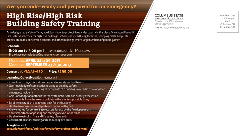
Center for Workforce Development: High-Rise/High-Hazard Building Safety Training Postcards

Center for Workforce Development: Certified Treasury Professional Postcards

Black History Month and Women's History Month Posters
Automotive Technology Department Vinyl Banners




Part Two: Before the Style Guide Arrived
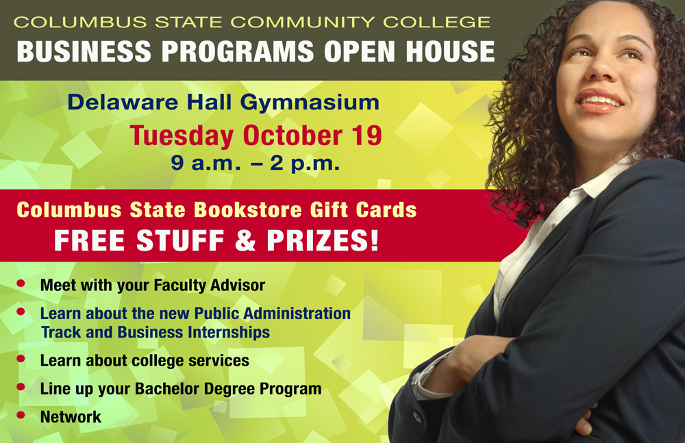
The work shown below was produced before the outside agency arrived with its diagonal system and speed-blur backgrounds. In that earlier period, Columbus State had a logo and an institutional identity, but no formal style guide governing how design should look across the college's many departments and events. Design decisions were made event by event, brief by brief, audience by audience.
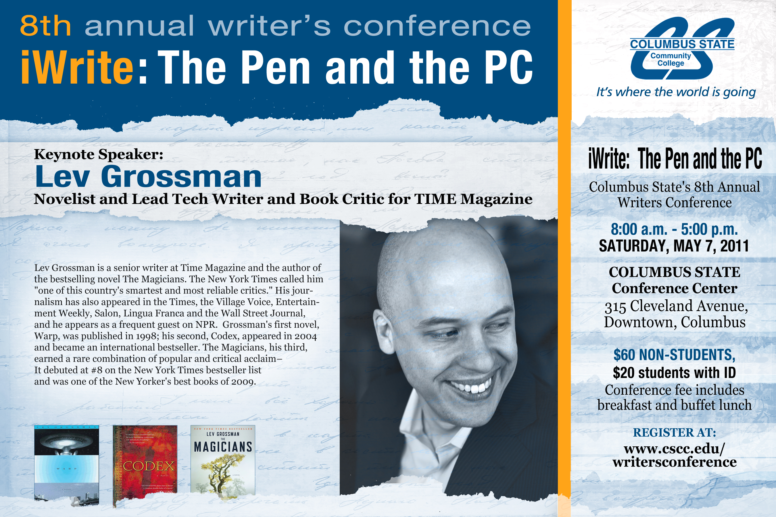
That openness was genuinely creative. Each project started with the question of what this specific event, this specific audience, this specific message needed, rather than how to fit it into a predetermined visual system. The work ranged widely: A Hispanic/Latino Family Festival, a Theater Workshop poster, a Study Abroad campaign, a Girls Volleyball schedule, a Writers' Conference flyer, a Spring Fling promotion. Each one had its own visual logic. Each one had to earn attention from a student body with a lot competing for it.
And that student body was genuinely varied. An open-enrollment institution with more than 41,000 students from 130 countries, a majority minority population, and a student base that includes recent high school graduates, working adults returning to school, trade program students, transfer-track students, and people auditing individual classes to upgrade specific skills: Designing communication for all of them, without flattening any of them into a single generic student, required real creative judgment at every step.
That freedom also carried its own discipline. Without a brand system to lean on, every design decision had to be made from the ground up. The work had to be consistent enough to feel like it came from the same institution, distinct enough to feel appropriate to its specific purpose, and visually strong enough to cut through on a campus where student attention is always in short supply.
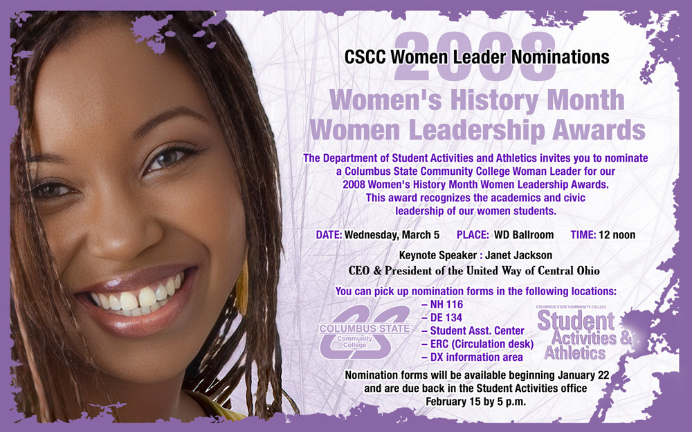
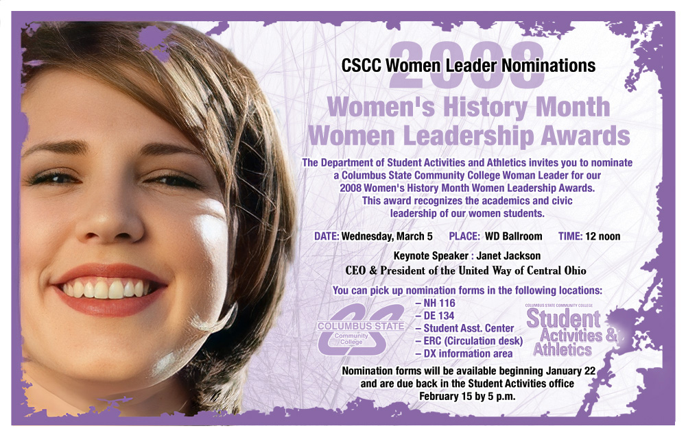
Women's History Month Event Branding: Postcards and Poster
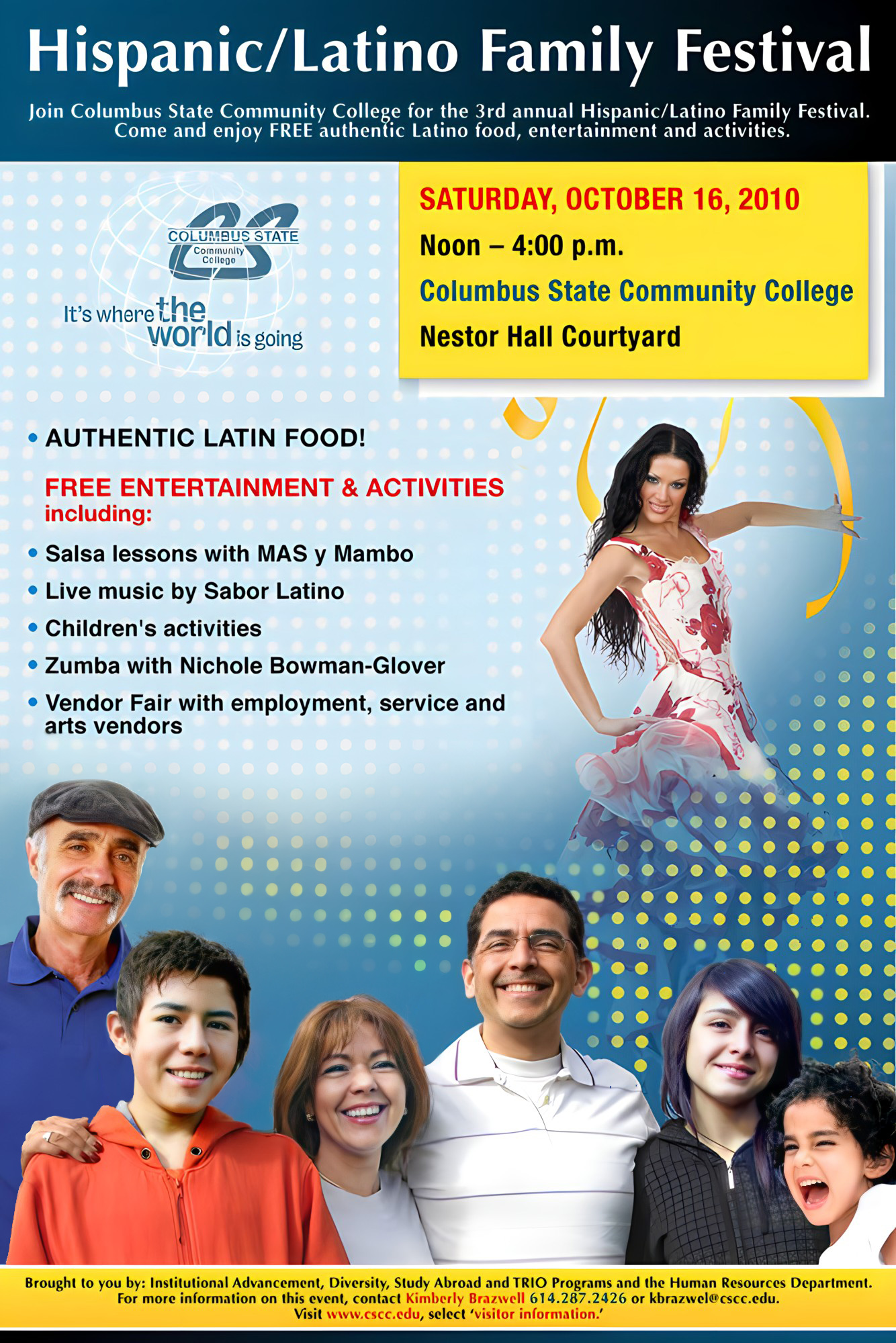
Hispanic/Latino Family Festival: Poster and Hot Card

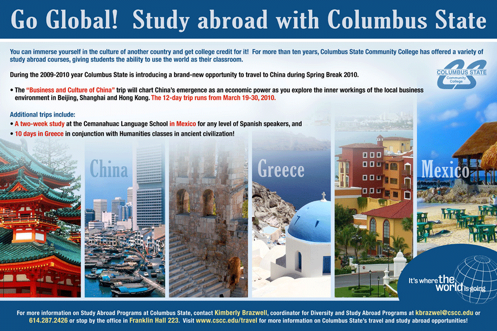
Study Abroad Poster
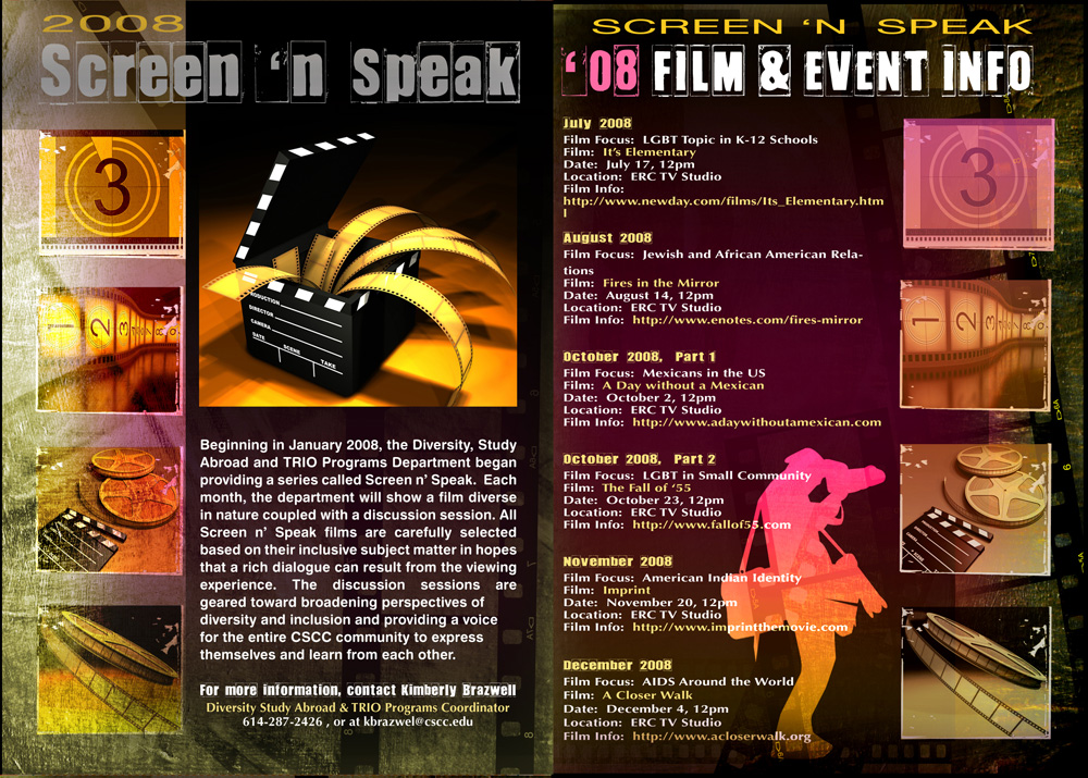
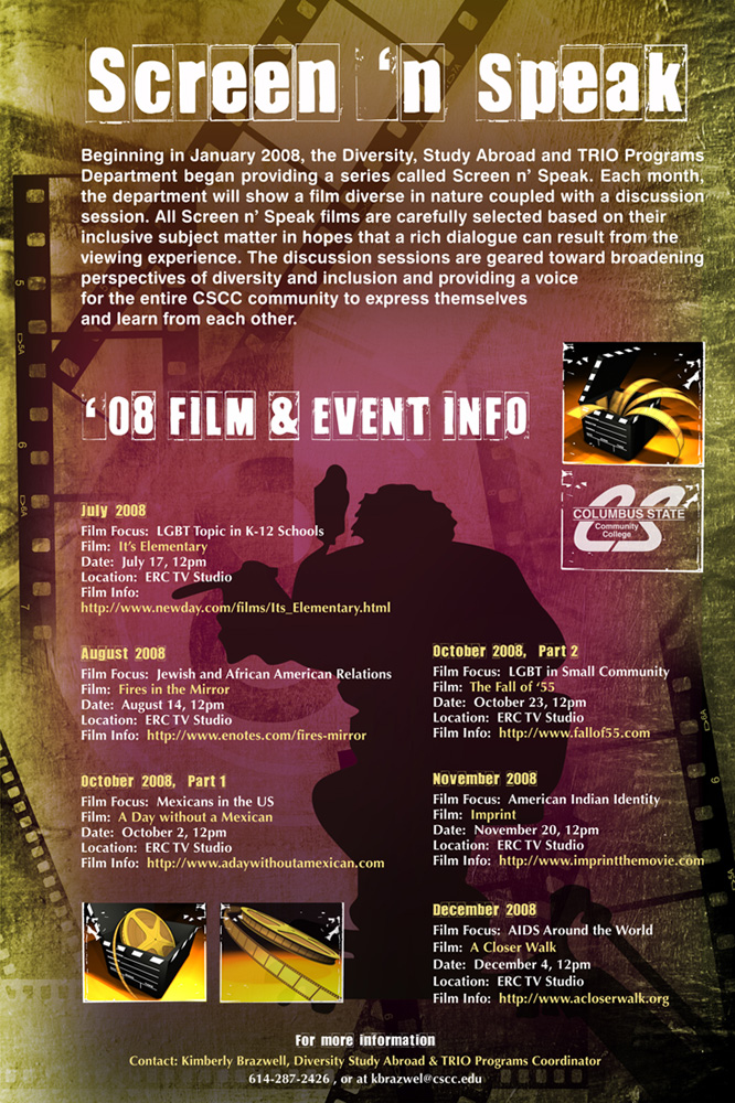
Screen and Speak: Table Tent and Poster
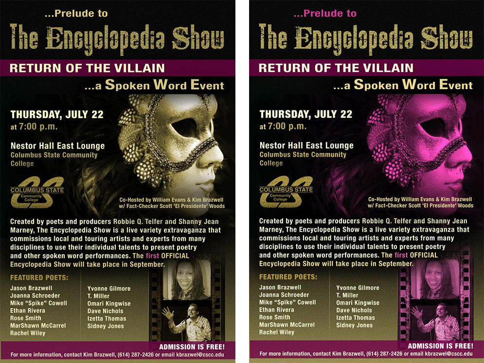
The Encyclopedia Show: Theatre Workshop Poster
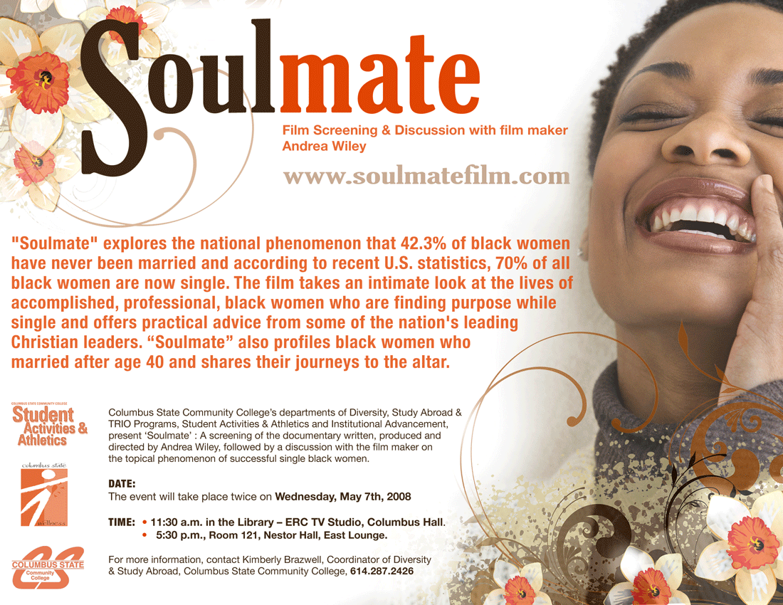
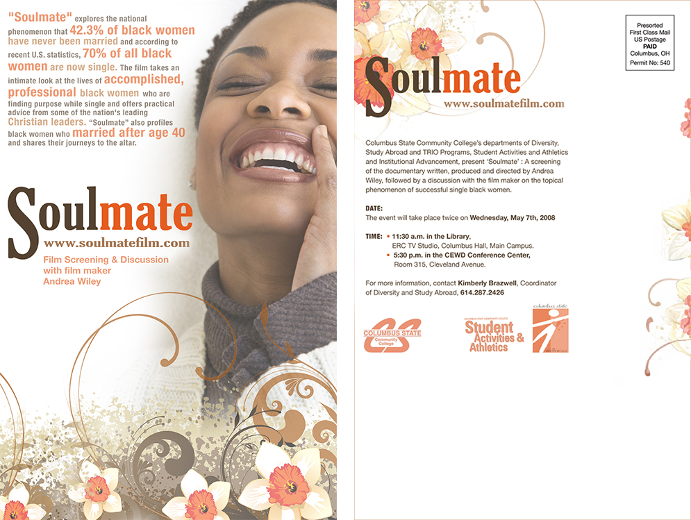
Soulmate: Flyer and Postcard
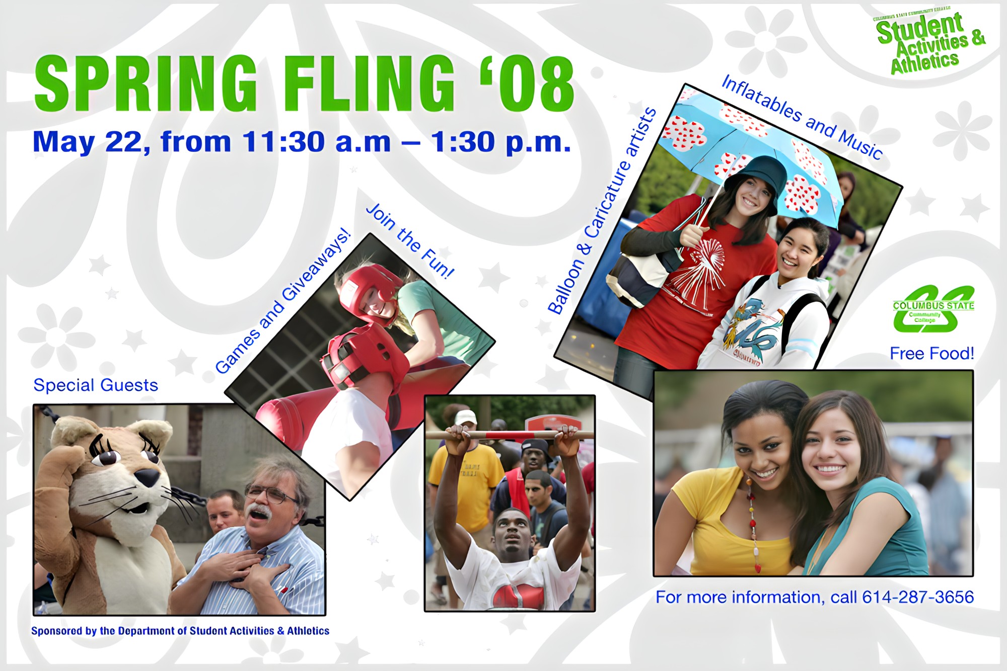
Spring Fling Poster
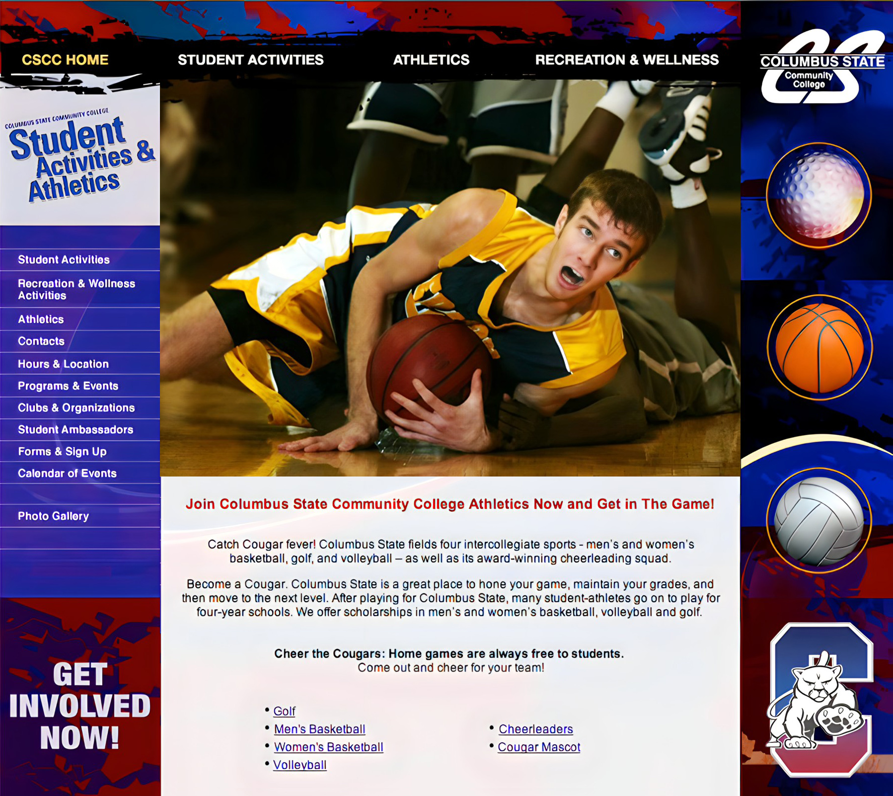
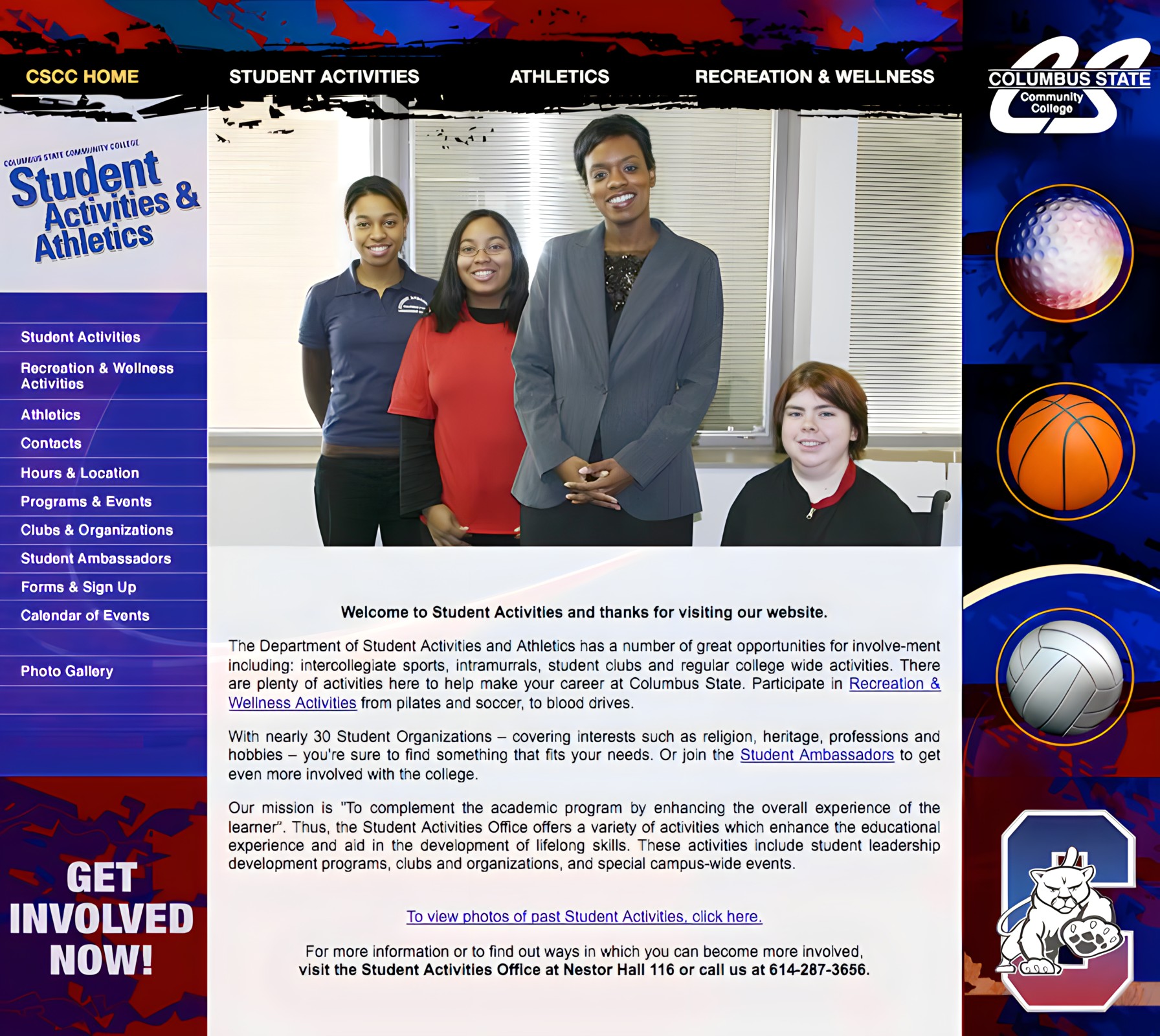
Student Activities Website
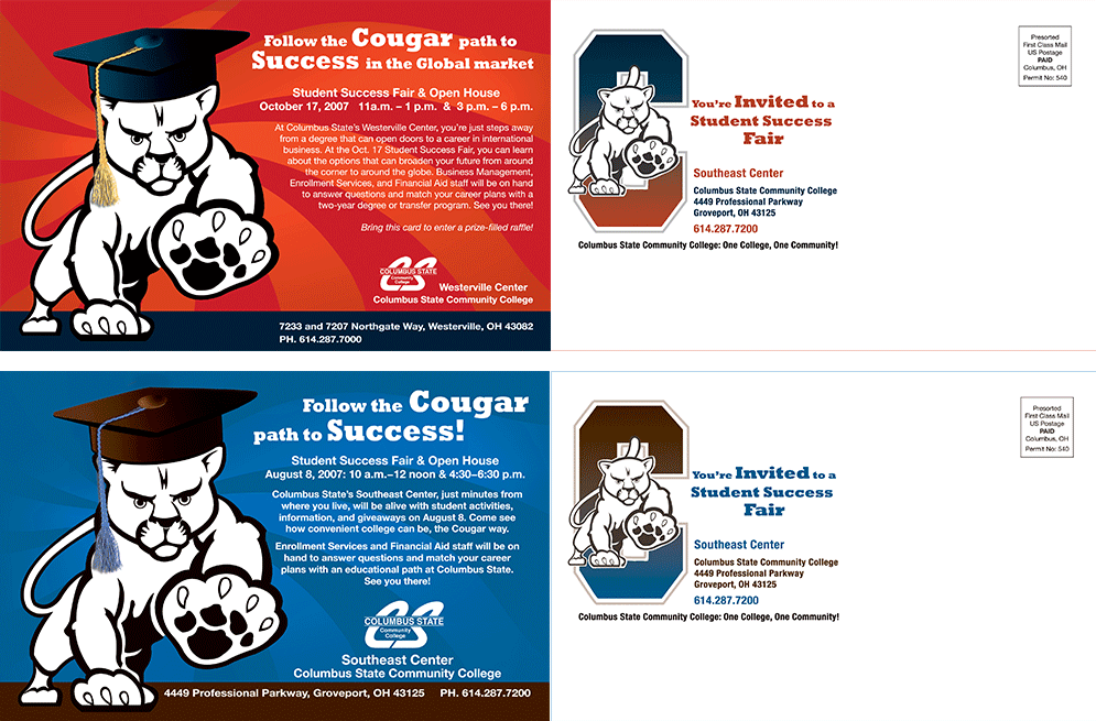
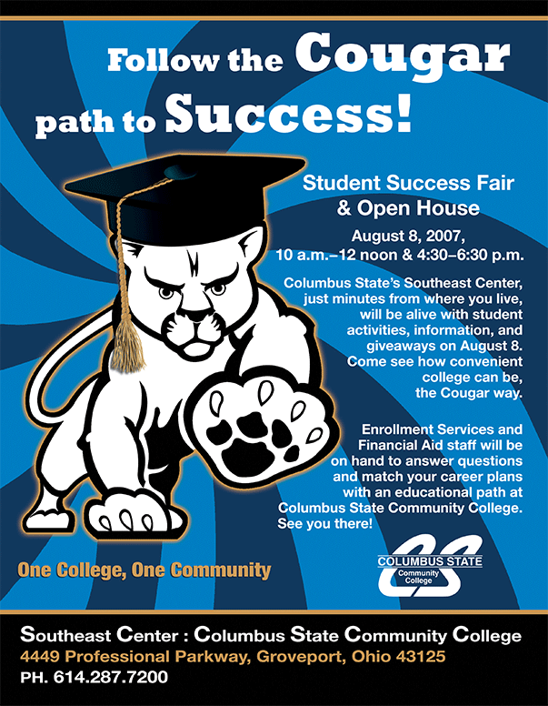
Student Activities Postcards and Poster: Cougar Mascot
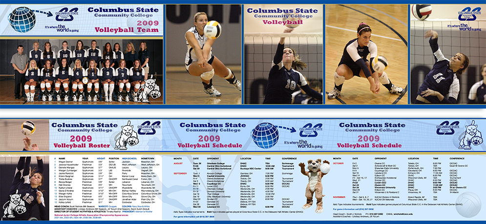
Girls Volleyball Pocket Schedule
Writer's Conference Promotional Flyer
What This Work Demonstrates
Higher Education Experience
This engagement demonstrates direct in-house design experience at a major community college, producing collateral across multiple departments, audiences, and communication contexts. The work covers student-facing promotional materials, workforce development marketing, departmental signage, event branding, and web design, representing the full breadth of a higher education institution's day-to-day design needs.
Multi-Audience Design Thinking
Designing for Columbus State required holding multiple audiences in mind simultaneously: traditional students, adult learners, continuing education enrollees, trade program students, and transfer-track students across a wide range of cultural backgrounds and socioeconomic situations. The deliberate diversity of representation in the tutoring poster series is one example of how that thinking shaped actual design decisions, not just strategy.
Brand System Fluency and Critical Thinking
Working within the new Columbus State brand standards required both technical compliance and creative problem-solving inside a defined constraint set. The ability to evaluate a brand system's strengths and real-world limitations, not just implement it, is a senior-level skill. Understanding why a design system fails in practice, and what it would have needed to sustain itself long-term, is the kind of insight that shapes better decisions the next time.
Creative Range Across Formats and Contexts
From vinyl banners to pocket schedules, from workforce development postcards to theater workshop posters, the work here spans a wide range of formats, tones, and audiences. The pre-rebrand work in particular demonstrates the ability to generate fresh creative solutions without a style guide to lean on, starting from scratch with each brief and finding the visual approach that fits the specific purpose.
The Impact
Designing for Columbus State meant changing gears constantly. One day I might be designing a workforce development postcard for banking professionals. The next, a theater workshop poster, a tutoring campaign, a student activities website, environmental graphics, or photography for a campus event. Every project served a different audience, carried a different objective, and demanded a different visual approach.
That constant change became one of the most valuable parts of the experience. It taught me to adapt quickly without sacrificing clarity, creativity, or consistency. Rather than specializing in a single format or audience, I learned to move confidently between disciplines, communication styles, and institutional priorities. Looking back, that adaptability may be the most valuable skill Columbus State gave me.