Where Every Design Decision Carries Responsibility
Public health communication has one standard that overrides everything else: It has to work for people who are not looking for it. At a state fair, in a building corridor, on a postcard, the message has to land quickly, clearly, and for an audience that includes every age, background, and level of health literacy. That is a different creative challenge than most client work, and it requires a different kind of discipline.
During a six-month design consultancy embedded within the Ohio Department of Health (ODH), the work ranged from urgent public awareness campaigns to institutional signage to multipage editorial publications. The most visible project was the trade show presence at the 2016 Ohio State Fair, built around two health issues that were front of mind for the public at the time: Zika virus awareness and childhood immunization requirements for school attendance.
Contract Engagement
The Ohio Department of Health is the state agency responsible for protecting and improving the health of all Ohioans, with responsibilities spanning infectious disease prevention, emergency health preparedness, chronic disease reduction, environmental health monitoring, and healthcare quality assurance. ODH's reach is statewide, its audiences are diverse, and its communications carry real consequences. Getting the information right, and getting it seen, matters.
My Role
Design Consultant, Art Director & Senior Designer
Brought in as a design consultant through a contract engagement, the work was fully integrated into ODH's creative operations. Day to day, that meant working directly within the department, taking direction from the creative director, and functioning as a senior member of the design team for the duration of the engagement. The output covered trade show graphics and signage, infographics, print collateral, direct mail, indoor and outdoor building signage, and multipage publications.
The Challenge
Public health design has to do something that most design does not: Communicate clearly under conditions of anxiety, distraction, and limited time. Zika was a genuinely frightening topic in 2016. Misinformation was widespread, public concern was high, and the department needed graphics that could cut through the noise at a state fair, where families are moving quickly and competing for attention in every direction.
The Work had to:
Translate complex health information into visuals that were immediately understandable to a general public audience, including families with children.
Scale from handout-sized infographics up to large-format trade show signage measuring 35 inches by 80 inches, without losing clarity or impact.
Maintain the authority and credibility of a state government agency while remaining accessible and engaging rather than bureaucratic.
Cover two distinct health campaigns, Zika awareness and immunization requirements, within the same trade show environment without visual confusion between them.
Extend across a wide range of formats and timeframes, from trade show booth graphics and building signage, to a multipage statewide immunization registry report.
Zika Awareness: The Ohio State Fair Trade Show
The Zika virus was a public health priority in the summer of 2016, and the Ohio State Fair gave ODH a direct line to hundreds of thousands of Ohioans over a two-week period. The challenge was using that opportunity effectively: Creating a booth presence that informed without alarming, and that gave visitors something to take with them after they left.
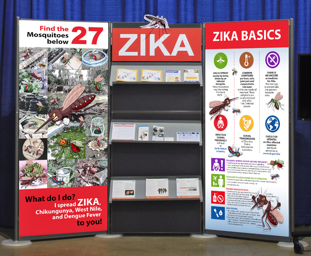
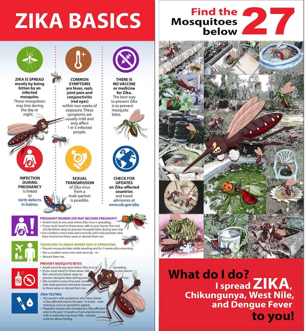
The centerpiece was a large-format Zika awareness board and a “Find The Mosquito” pictogram, a format designed to draw visitors in interactively while communicating key transmission and prevention information. The approach recognized something important about how people absorb information in a busy public environment: Engagement comes before education. An interactive element creates a moment of pause, and that pause is where the message lands.
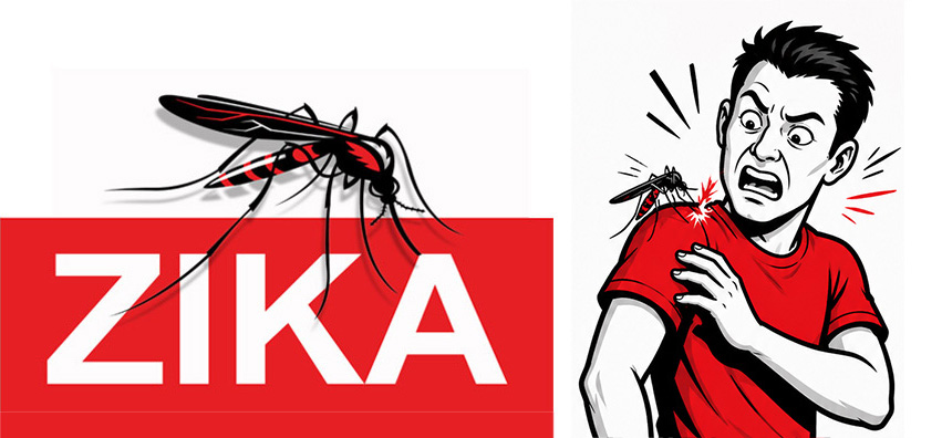
ZIKA Awareness Title Board
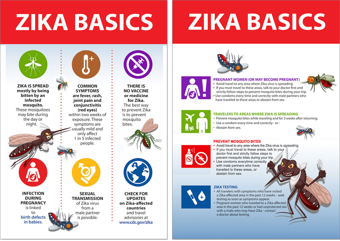
ZIKA Infographic Handout
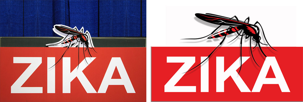
ZIKA Trade Show Booth
ZIKA Infographic Awareness Board and “Find The Mosquito” Trade Show Signage
Immunization Awareness: Back to School
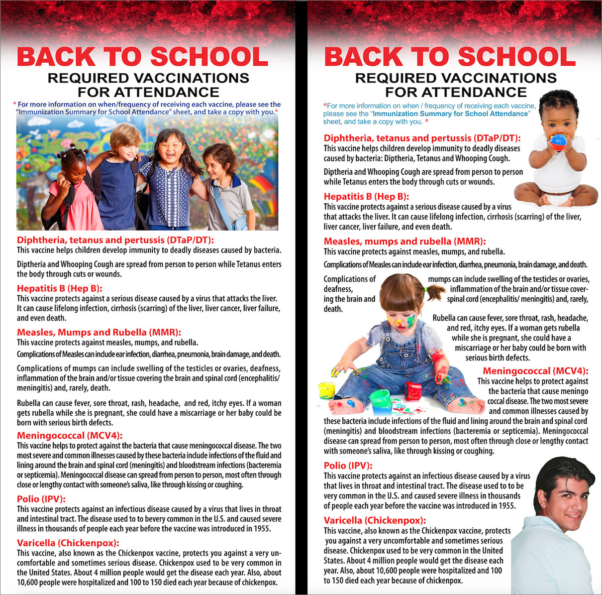
Running alongside the Zika campaign was an immunization awareness initiative focused on school attendance vaccination requirements. The challenge here was different in tone. Where Zika required urgency and reassurance, immunization messaging required clarity and authority. Parents needed to understand exactly which vaccines were required, by when, and why, without the communication feeling punitive or bureaucratic.
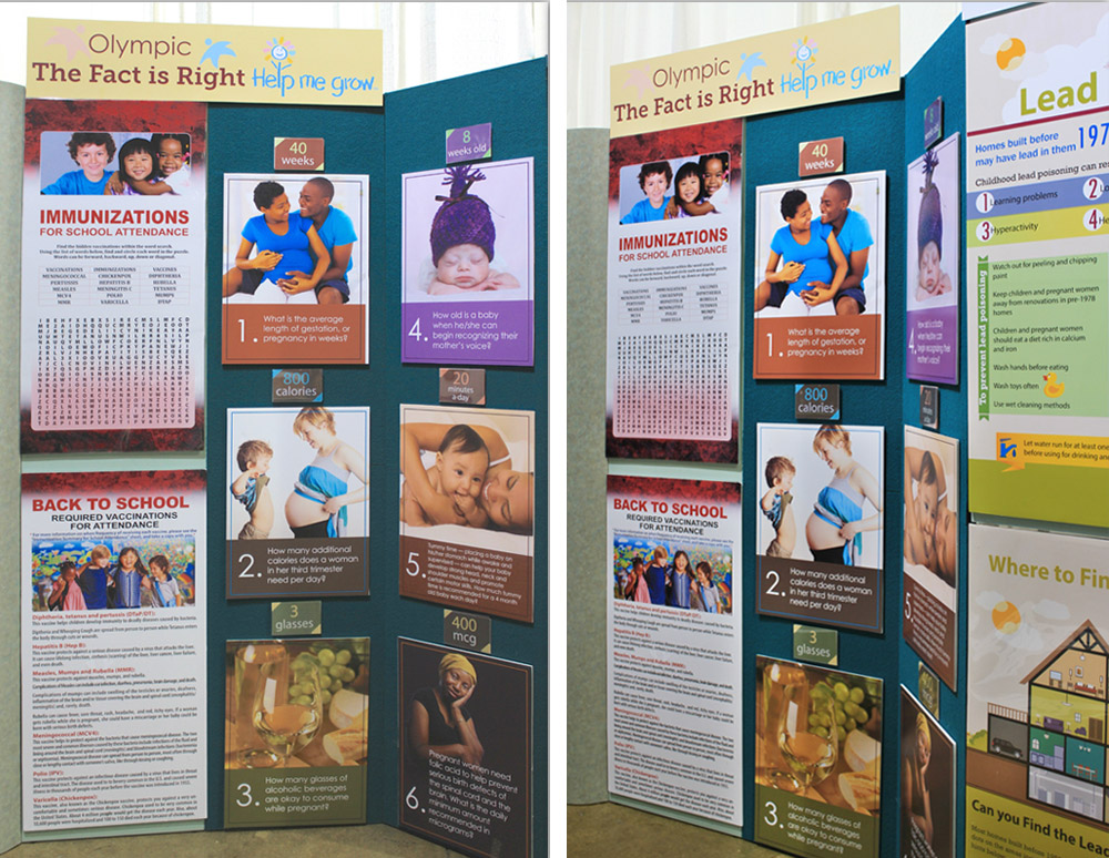
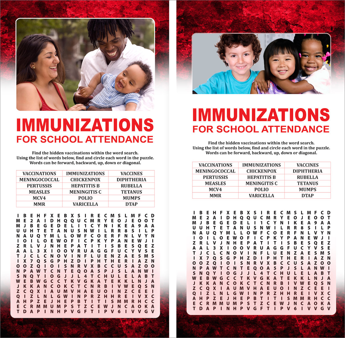
The centerpiece signage, a 22-inch by 80-inch word search format, used the same principle as the Zika pictogram: Interaction as a gateway to information. A word search embedded with vaccine names and key health terms pulled people into the content on their own terms. Supplementary handouts carried the specific, actionable information families needed to follow through.
Immunization Trade Show Booth
Back to School Required Vaccinations Word Search
Immunization Awareness Signage
Building Signage and Institutional Materials
Beyond the State Fair, the consultancy covered the full range of a state health agency's day-to-day design needs. Building and facility signage, conference materials, security signage, and promotional pieces all had to reflect the visual standards of a credible public institution while remaining clear and functional across a wide variety of physical contexts.
Unlike temporary campaign materials, environmental signage had to function as part of the department's everyday operations. Whether directing visitors, reinforcing security protocols, or supporting conferences and public events, these pieces needed to remain clear, durable, and immediately recognizable while reflecting the professionalism and credibility of the institution.
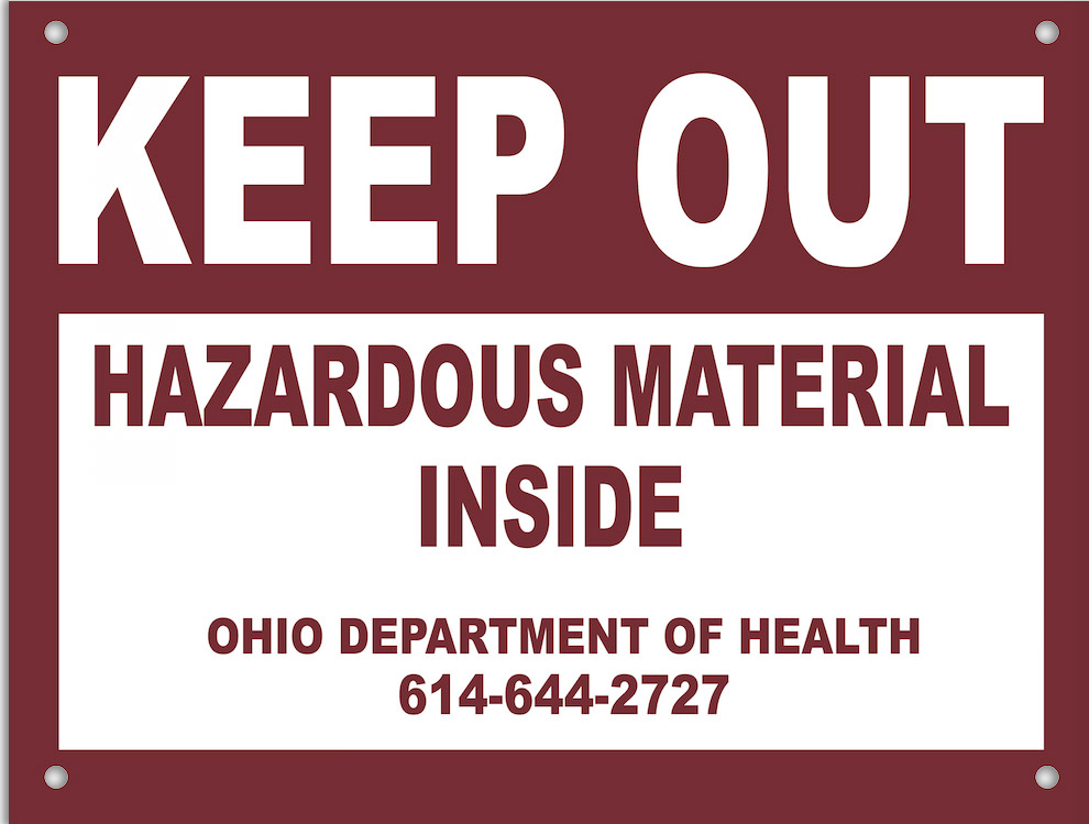
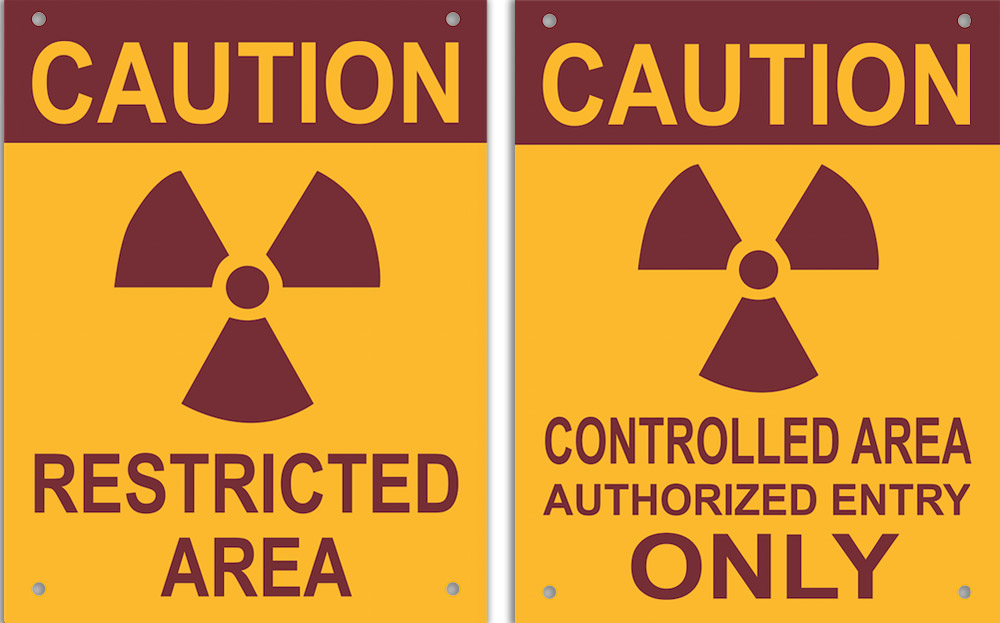
ODH Security Signage
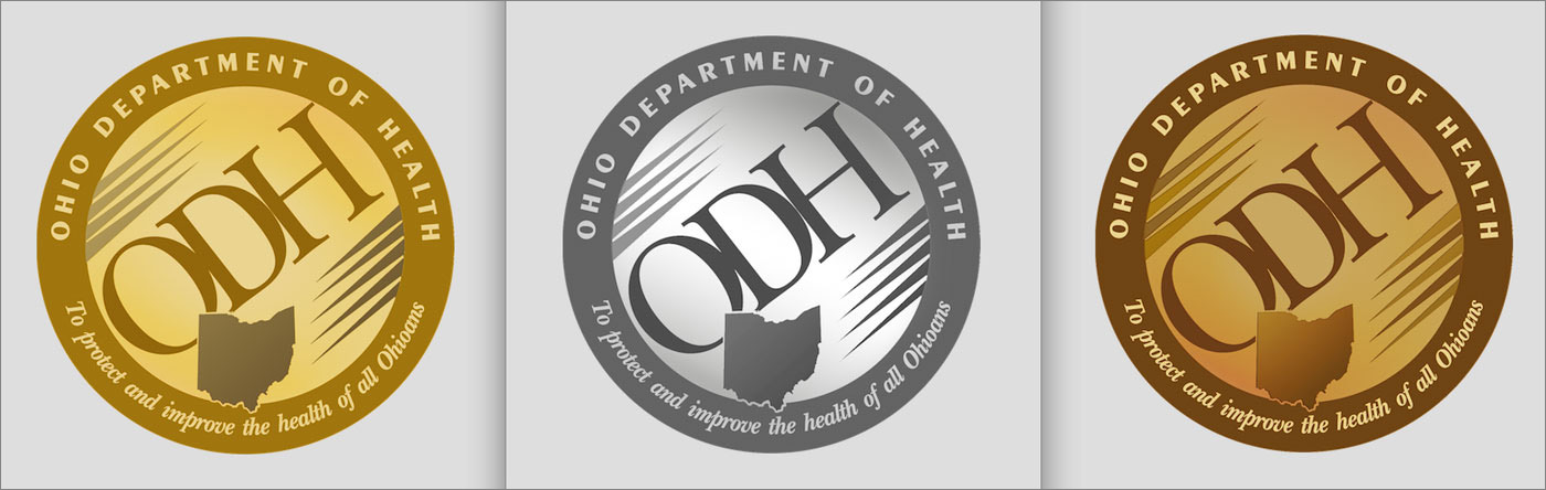
Trade Show Medals
ODH Building Signage
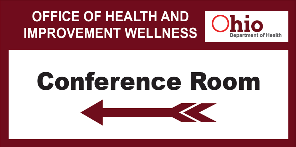
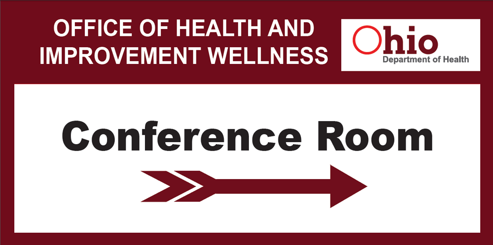
Conference Signage
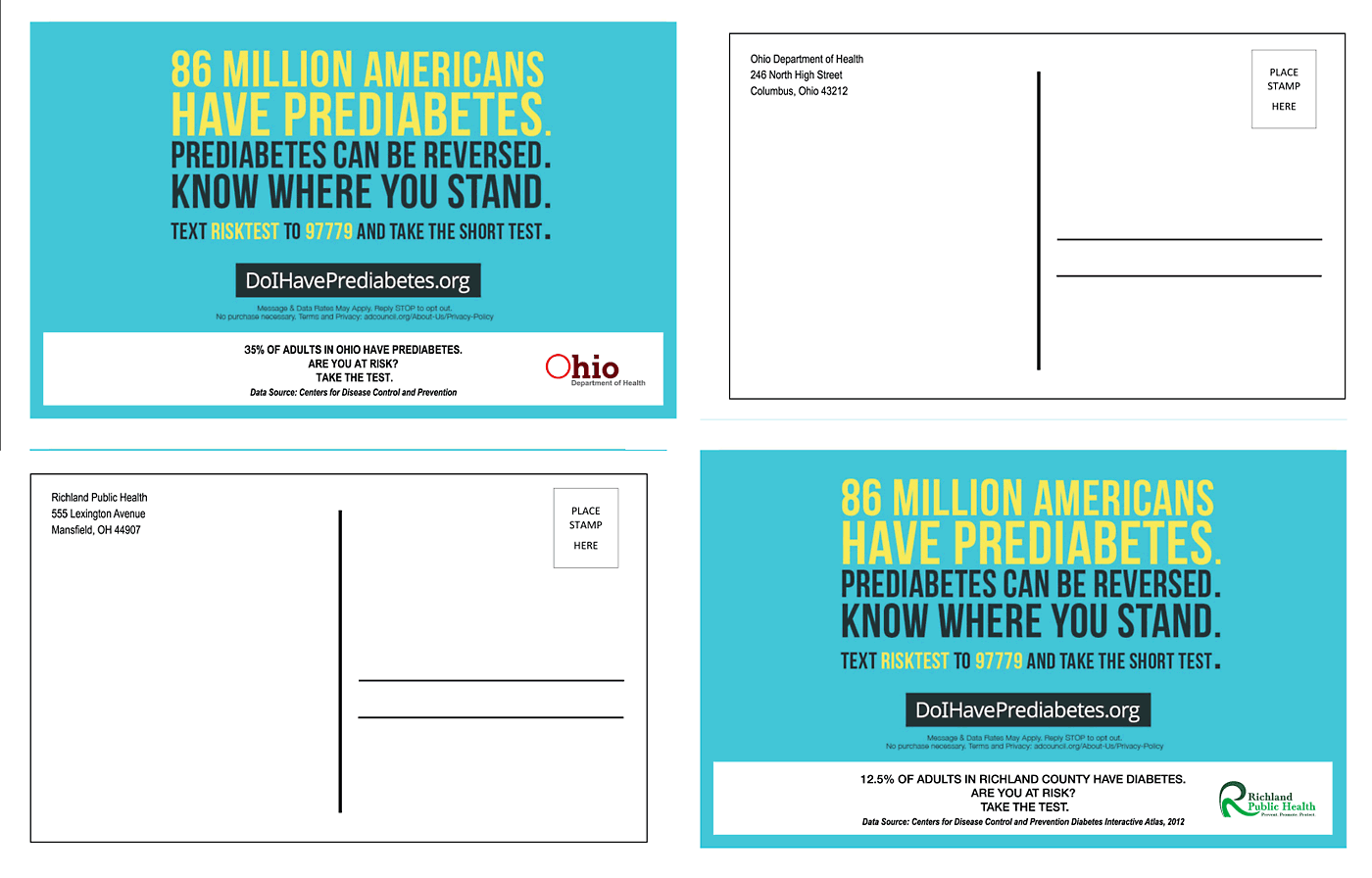
Pre-Diabetes Direct Mail Postcards
Publications: Editorial Design at the Institutional Level
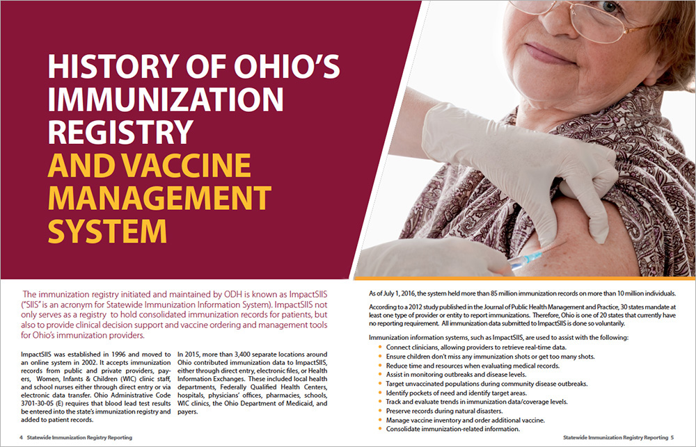
The editorial work produced during the engagement required a different mode of thinking than trade show graphics. Publications like the Statewide Immunization Registry Report and the Ohio Active health promotion materials had to carry detailed information across multiple pages while remaining readable, credible, and visually consistent with ODH's institutional identity. These were not pieces people would pick up out of curiosity. They had to earn attention through clarity and quality of presentation.
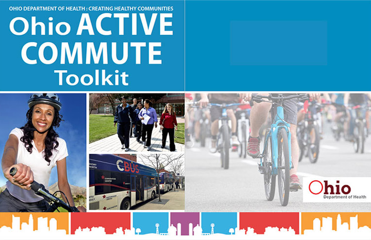
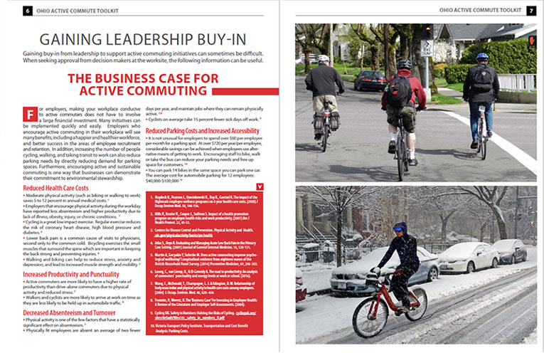
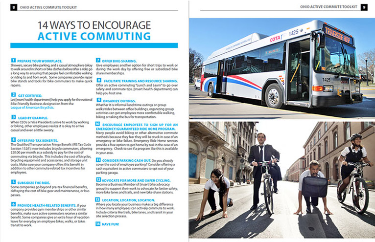
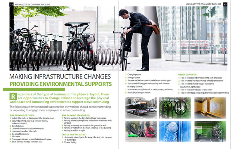
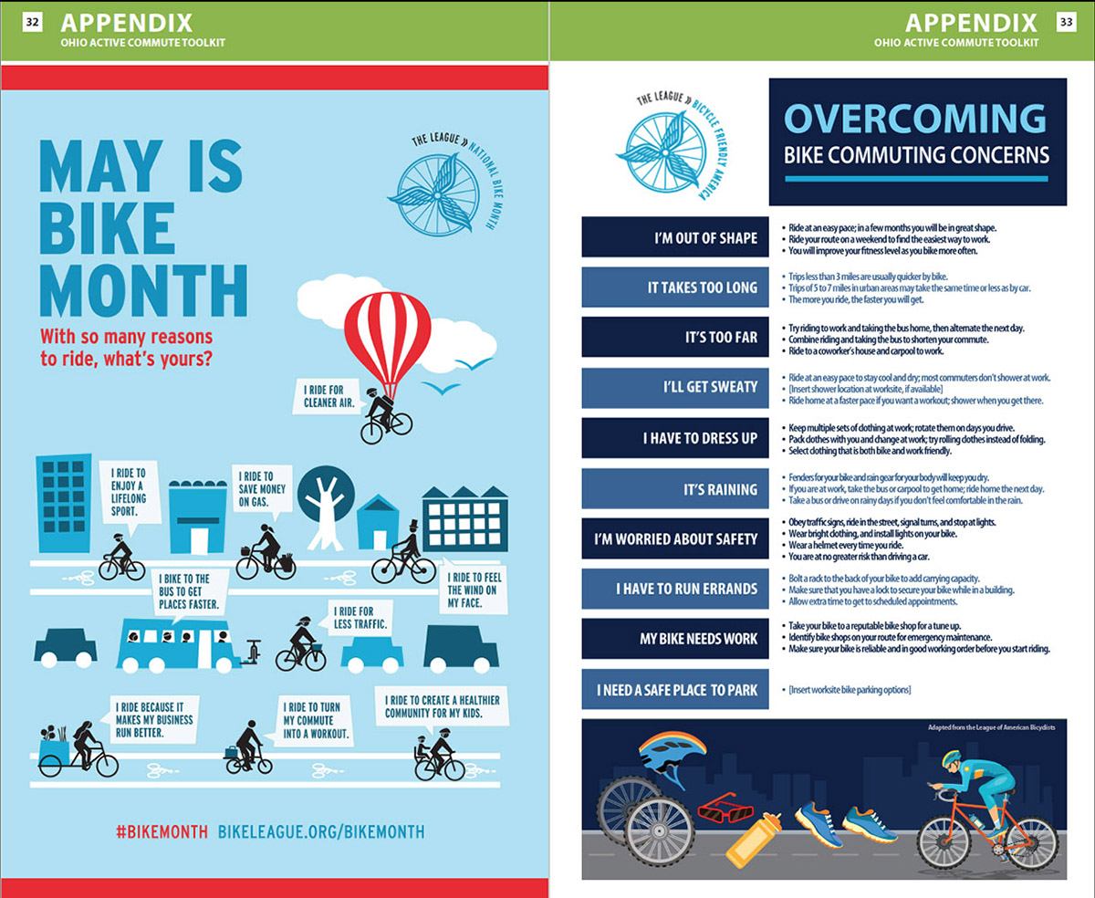
The Ohio Active suite, covering brochures, posters, flyers, and fact sheets, aimed at chronic disease prevention through healthy eating and physical activity. The design system across those pieces had to feel accessible and motivating rather than clinical, a distinction that matters when you are trying to change behavior rather than simply inform.
Statewide Immunization Registry Report
Ohio Active Health Promotion Materials
What This Work Demonstrates
01
Health Industry Experience
This engagement demonstrates direct experience designing for a public health agency at the state level. The work covered an active, high-visibility health crisis, institutional operations, and community-facing outreach, establishing a clear foundation in health industry communication.
→
02
Large-Format and Environmental Design
Trade show signage at the scale produced for ODH, including a 35 inches by 80 inches Zika awareness board, demands a different kind of spatial thinking than standard print work. This project demonstrates the ability to design for physical environments where scale, distance, and audience movement all affect how a message is received.
→
03
Information Design and Visual Communication
Translating complex health data into accessible, engaging public-facing materials is a specialized skill. The infographics, handouts, and interactive signage produced here show the ability to simplify without dumbing down, and to present information in a way that invites engagement rather than demanding attention.
→
04
Range Across Formats and Audiences
From large-scale fair signage to direct mail postcards to multipage institutional publications, this body of work spans the full range of a public health agency's design needs. The consistency of quality across those formats reflects the kind of adaptable, detail-oriented senior-level work that health organizations rely on.
The Impact
At the 2016 Ohio State Fair, thousands of Ohioans encountered public health information through graphics designed to reach them where they were: Curious, distracted, and moving. The interactive formats, the pictogram, the word search, and the large-scale visual displays were not decorative choices. They were strategic ones, built on the understanding that public health communication only works when people stop, engage, and act on the information they receive. Beyond the fair, the work extended ODH's visual standards across signage, publications, and direct mail, supporting a statewide mission that depended on clear, trustworthy communication. Although each project served a different purpose, they shared the same mission: Helping people access information that could influence their health, their decisions, and their daily lives. The success of this work wasn't measured in impressions or aesthetics, but in its ability to help people notice, understand, and respond to information that could affect their health and wellbeing.