Faith communities have a distinct relationship with design. The work has to carry weight that goes beyond aesthetics: It must honor history, reflect shared values, speak to a multigenerational audience, and help a congregation reach beyond its walls into the broader community. Both projects produced for the First Church of God required that kind of thinking, but they asked the visual language to serve very different purposes.
The engagement covered two separate but related bodies of work: Event branding for the church's landmark 75/30th Anniversary Celebration, and a complete identity system for Dream Youth Summit, a youth volunteer and mentorship initiative rooted in service, exposure, and opportunity. Different purposes, different audiences, different visual languages. Same client. Same standard of care.
The Client
The First Church of God has served its community as a place of refuge and spiritual grounding for 75 years, including 30 years under the leadership of Senior Pastor Bishop Timothy J. Clark. Known as the City of Refuge, the church has functioned as more than a place of worship, serving as a community anchor for families, mentorship, support, and outreach. A congregation with that kind of history carries real institutional identity. The design work had to honor that legacy while helping the church communicate clearly and powerfully to the people already inside its doors and those it hoped to reach beyond them.
My Role
Art Director, Senior Designer & Brand Identity Designer
Across both projects, the work covered logo and identity design, event branding, stationery, environmental and outdoor signage, digital billboard design, promotional programs, calendars, and a full 20-page booklet. Each deliverable requir
ed understanding not just what the piece needed to look like, but what it needed to communicate and who it needed to reach.
The Challenge
Designing for a faith organization is not simply a matter of making things look dignified. The visual language has to feel earned. It has to reflect the specific character of the community, not a generic idea of what a church looks like. For the 75/30th Anniversary, that meant communicating the weight and joy of a historic milestone without becoming so formal that the work lost its warmth. For Dream Youth Summit, the challenge shifted completely: create something energetic, aspirational, and relevant to teenagers at a fluid stage of becoming, while maintaining the polish and credibility expected by the church and the corporate, educational, healthcare, nonprofit, and community organizations supporting the program.
Across both projects, the work had to:
Develop distinctive logos that captured the specific spirit of each initiative, one celebratory and historically grounded, one forward-looking and youth-oriented.
Build identity systems that held together across a wide range of applications, from intimate stationery pieces to large-scale outdoor signage and digital billboards.
Speak to very different audiences, from a multigenerational congregation to teenagers at a formative stage of becoming, while maintaining credibility with families, sponsors, and community leaders.
Represent a trusted institution with the level of polish and professionalism that community trust requires.
Project 1: The 75/30th Anniversary Celebration
Seventy-five years as a church. Thirty years under the same visionary pastor. That is not a routine anniversary. It is a moment that calls for design that can hold both the depth of history and the energy of celebration simultaneously, without either canceling the other out.
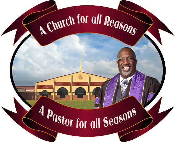
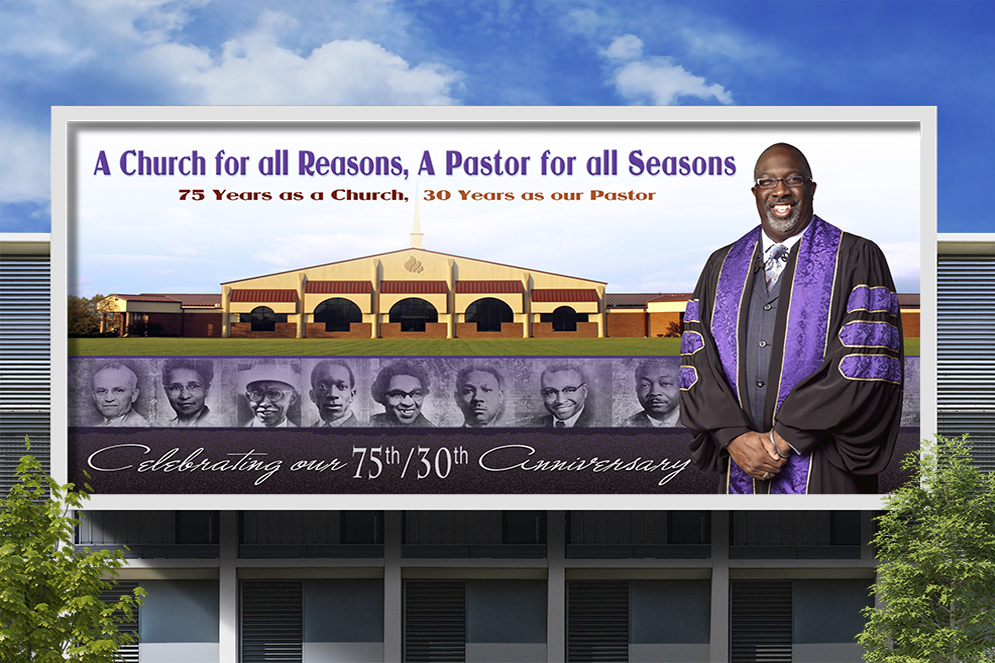
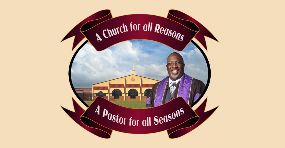
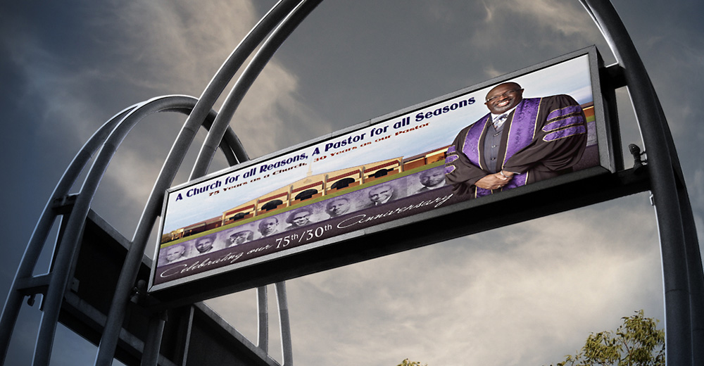
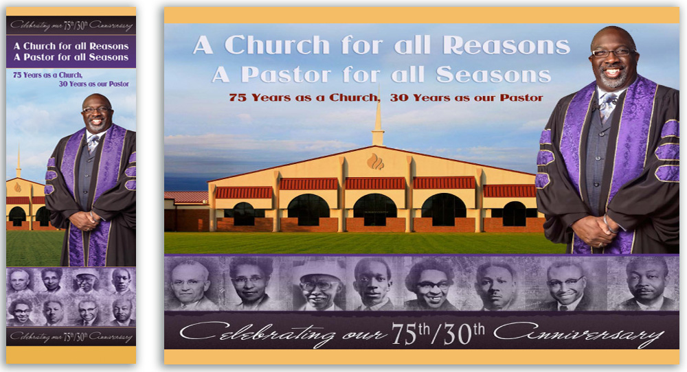
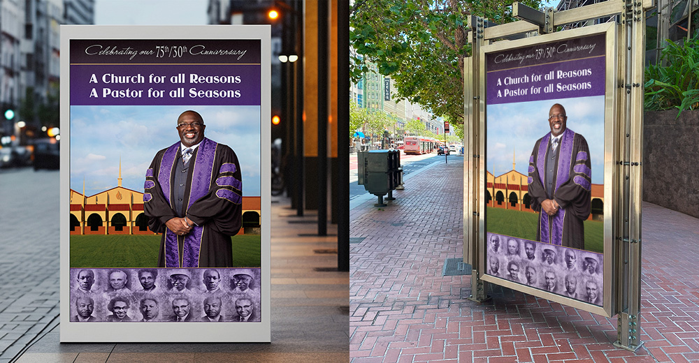
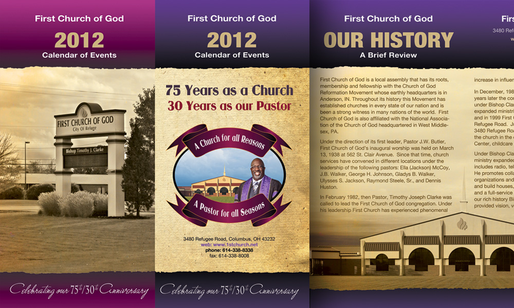
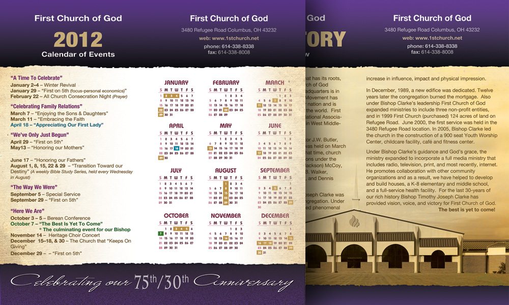
The anniversary logo was designed to feel respectful of the church's history, yet, jubilant and modern: A visual identity that a congregation could feel proud to see on a billboard, a program, or a piece of stationery. The full branding suite extended that identity across every touchpoint of the event, from the intimate letterhead and envelopes, to the large-scale outdoor banners, indoor signage, and a digital billboard, that carried the celebration into the surrounding community.
75/30th Anniversary Logo
Outdoor Signage
Anniversary Stationery
Indoor Signage and Banners
Outdoor Signage
Anniversary Program Cover and Promotional Calendar
Digital Billboard
Anniversary Photography
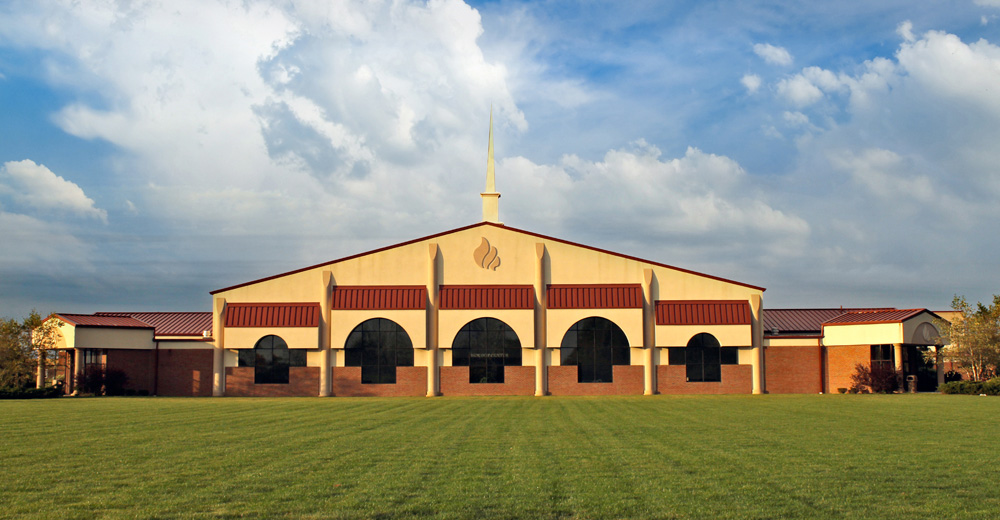
I photographed the church and then professionally retouched the hero image used throughout the anniversary campaign. The original scene was captured under overcast skies, with dry, patchy landscaping that did little to reflect the warmth of the congregation or the significance of the celebration. Through careful retouching and color enhancement, the final image became an inviting representation of the church and a visual centerpiece of the anniversary brand. Photography also played an important role in telling the church's story. Alongside newly created imagery, I carefully restored archival photographs of former pastors and incorporated them into the campaign, capturing the people and moments behind the milestone, giving the brand a human face to accompany its visual identity.
Project 2: The Dream Youth Summit
Dream Youth Summit required a different mode entirely. Where the anniversary work celebrated a history, the summit looked forward. First Church of God served as the community anchor for a youth initiative that brought teenagers, families, mentors, and sponsors together around service, aspiration, and opportunity. It was designed primarily for Black and minority teens, encouraging them to volunteer, give back to their communities, and see themselves as active participants in shaping their future.
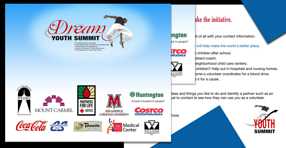
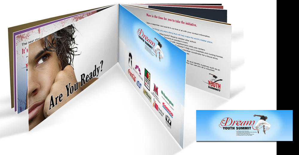
The program also connected participants directly with professionals and organizations representing real educational and career paths. The sponsor coalition included First Church of God, Mount Carmel, Coca-Cola, Columbus State Community College, Panera Bread, The Ohio State University Medical Center, Mid-America Christian University, Huntington Bank, Costco Wholesale, the American Red Cross, and Williams Interior Designs. Together, they provided exposure to healthcare, higher education, banking, business, nonprofit service, ministry, and other professional fields, making the summit not simply an event about aspiration, but a place where opportunity was made visible through real people and institutions.
The identity translated that sense of movement and possibility into the visual language itself. It had to speak to teenagers still imagining who they might become without talking down to them or defining the audience by disadvantage. At the same time, the identity needed enough polish and credibility to sit comfortably beside the sponsor coalition helping make those opportunities visible.
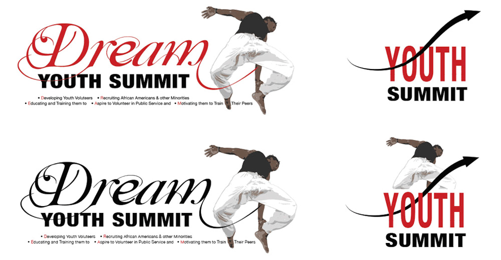
The logo became the clearest expression of that balance. Inspired by the motion of an athlete clearing a hurdle, the central figure appears to spring upward and forward, carrying momentum from the point of departure while reaching toward a fuller future. As such, the logo became a metaphor for resilience, service, ambition, and forward movement, giving the program a youthful, energetic presence without losing the professionalism required by the organizations supporting it.
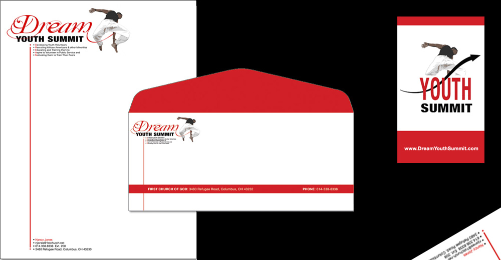
The full identity suite extended across stationery and a 20-page program booklet that gave the initiative a structured, professional presence while supporting practical event communication. The booklet also reflected the breadth of the sponsor coalition and the summit's emphasis on initiative, service, education, mentorship, and firsthand exposure to future career paths. A branded sticker and label carried the identity into smaller-scale applications.
Dream Youth Summit Logo
Stationery: Letterhead, Envelope and Contact Card
20-Page Program Booklet
Program Booklet and Branding Sticker
What This Work Demonstrates
01
Faith and Community Organization Experience
This engagement demonstrates direct experience designing for a religious organization with deep community roots. The work reflects an understanding of the specific values, tone, and visual standards that faith communities require, and the ability to translate those into design that is polished, purposeful, and mission-aligned.
→
02
Event Branding at Scale
The 75/30th Anniversary project demonstrates the ability to build a complete event brand from logo through large-format environmental applications, including outdoor signage, indoor banners, digital billboards, and promotional programs. Holding a visual identity together across that range of formats and scales is a distinct creative skill.
→
03
Youth and Community Program Branding
The Dream Youth Summit identity shows range: designing for teenagers within a faith and community context required a different visual register from the anniversary work. The logo, stationery system, and 20-page booklet demonstrate the ability to build a youth-focused identity around service, aspiration, mentorship, and opportunity while still meeting the professional expectations of sponsors and community leaders.
→
04
Multi-Project Engagement with a Single Client
Two distinct projects, two distinct design challenges, one client relationship built on trust. Working with the First Church of God across both a major anniversary celebration and a youth program launch demonstrates the ability to serve an organization across multiple needs and tonal registers while maintaining creative quality throughout.
The Impact
The First Church of God engagement produced two complete bodies of work for a faith-based community with high standards and a meaningful mission. The anniversary branding gave a 75-year institution a visual identity worthy of its history, carrying its celebration from intimate printed pieces into the surrounding community through digital billboards and large-scale signage. Dream Youth Summit extended that community mission toward the next generation, using design to support a program that connected teenagers with service, mentorship, education, professional role models, and a wider view of what their futures could hold. Although these projects served very different purposes, they were built on the same foundation:TRUST. One celebrated a 75-year legacy. The other translated that legacy of community support into forward movement and possibility. Together, they demonstrate how thoughtful design can honor history, strengthen community, and create authentic visual communication for very different audiences without losing the values of the organization behind it.