
Case Study:
SIA Healthcare Staffing Summit 2021
Designing for the C-Suite.
When the Audience Knows Exactly What Good Looks Like.
Not every design audience gives you room to experiment. Some audiences come in already knowing what professional looks like, and their tolerance for anything less is essentially zero. Healthcare staffing executives fall squarely into that category. These are C-suite leaders, working professionals aged 25 to 55, operating at the intersection of healthcare and business strategy. They attend the Healthcare Staffing Summit to learn, connect, and make decisions. The design had one job: make the conference look as authoritative as the content inside it.
This was my first conference for Staffing Industry Analysts (SIA), where I served as Graphic Design Manager for three years. The Healthcare Staffing Summit was one of six conferences SIA produced annually, four regional and two global. Each one required a full marketing package of more than 40 digital and web-based assets, built within a defined brand system and delivered to an audience that expected precision.
For this conference, I had the opportunity to propose something new. Rather than following the standard location-based approach, I built the visual identity around the conference theme. It was a creative risk within a conservative brand environment. It worked.
Website Banner Community Header
.jpg)
The Client
Founded in 1989, Staffing Industry Analysts is the global authority on staffing and workforce solutions. A division of Crain Communications and headquartered in Mountain View, California, SIA serves both suppliers and buyers of workforce solutions through proprietary research, data, training, and executive conferences. Their audience spans staffing firms, managed service providers, technology specialists, and the executives who lead them.
SIA is a B2B organization. That shapes everything about how design functions within it. The brand is conservative by intention, built for credibility with an audience that responds to professionalism and clarity over energy or trend.
The Healthcare Staffing Summit is SIA's pre-eminent annual destination for leaders serving the healthcare staffing industry, a sector valued at over $39 billion in the US alone. Attendees come from across the most complex and fast-moving segments of that industry: locum tenens, travel nursing, allied health, and per diem care. They are not there for general inspiration. They are there for data-backed intelligence, actionable strategy, and direct access to the peers and policy experts shaping their field. The design had to meet that expectation before the first session started.
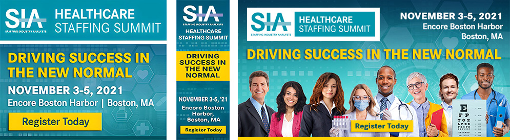
Square Conference Badge, Skyscraper Ad and Social Media Badge
My Role
Graphic Design Manager, Art Director & Digital Designer
As Graphic Design Manager, I was responsible for the full visual identity of the Healthcare Staffing Summit. That meant conceiving the design direction, building every asset in the marketing package, and ensuring consistency across more than 40 deliverables spanning web, digital, social media, and presentation formats. The work was primarily digital. SIA operated as a remote-first company, and the vast majority of conference design lived online: web banners, social badges, email blasts, LinkedIn and Twitter advertising, website layouts, and PowerPoint presentations, with occasional press or magazine ads rounding out the package.
The Challenge
SIA's brand guidelines were specific and non-negotiable. The conference color palette was teal, white, and sun yellow. The typeface was Corporate S Pro throughout. The logo appeared top left on every marketing piece. Dates and location appeared on the right. These were not suggestions.
Within that structure, the creative challenge was finding room to make the conference feel distinctive. A marketing package of 40-plus assets all operating within the same brand guidelines risks looking like a template exercise rather than a designed system. The goal was coherence without uniformity, and a visual identity that felt specific to this conference rather than interchangeable with any other SIA event.
The Design Approach
The visual identity was built around the conference theme rather than its location. That was a deliberate departure from SIA's established practice, and it required more than a creative instinct. It required research.
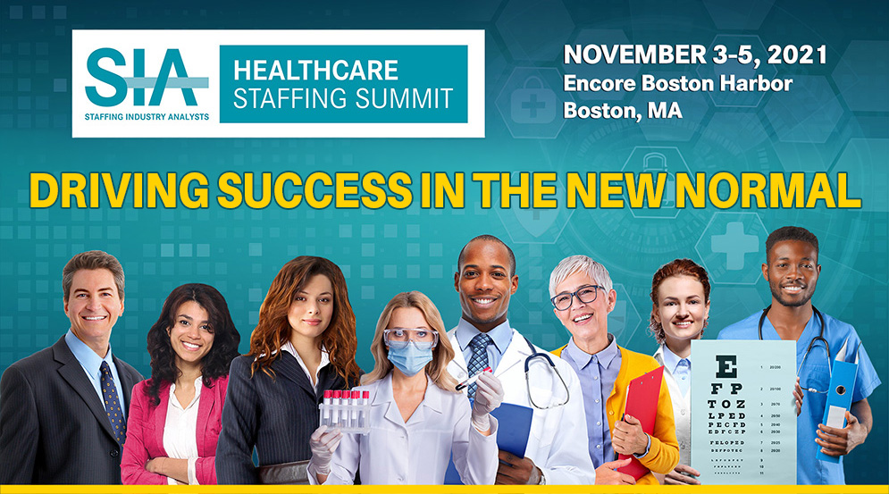
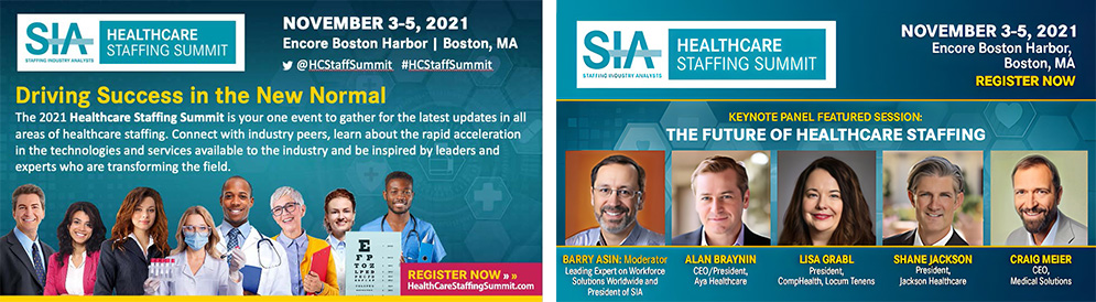
I studied the audience: who attends the Healthcare Staffing Summit, what they do, how they work, and what the experience of healthcare staffing looks like at the leadership level. That research shaped the hero image directly. Rather than using a single stock photograph, I sourced and arranged a deliberate collage of healthcare professionals, doctors, nurses, administrators, and allied health workers, composed to communicate teamwork and networking. The image was not found. It was built. Every element chosen for a reason, every face representing someone the audience would recognize as part of their world.
The right background came after the image was settled: a supporting layer that gave the system visual cohesion without competing with the people in it. Working within the teal, white, and sun yellow brand palette, the result was a conference identity that felt grounded in the audience rather than imposed on them. Templates built from that foundation held together across more than 40 assets without any of them looking generic.
For this audience, the approach mattered. Minimalism was the right register. But minimalism with a clear point of view is different from minimalism by default. This was the former.
HCSS Hero Image
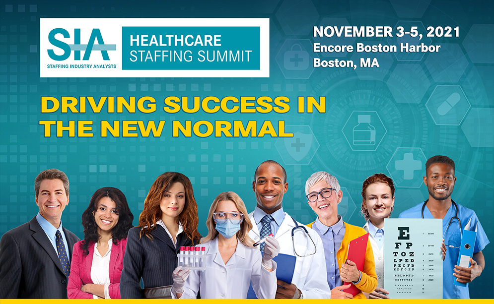
Website Subpage Header

SIA Website Slider
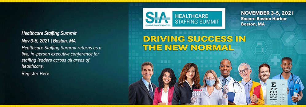
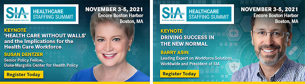
LinkedIn and Twitter Conference Keynote Speaker and Event Social Badges
Branded Twitter Header Background

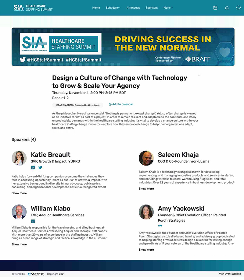
CVENT Website
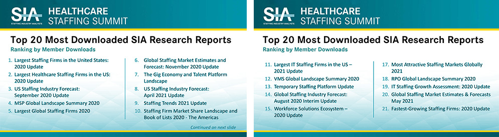
PowerPoint Marketing Slides
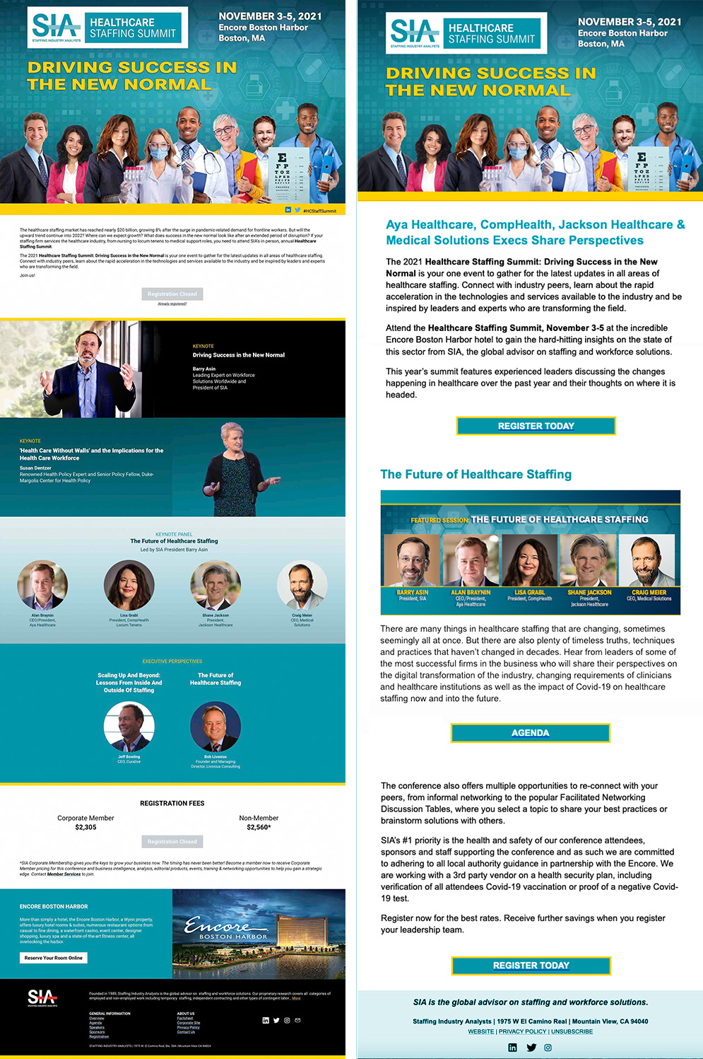
Conference Website Design
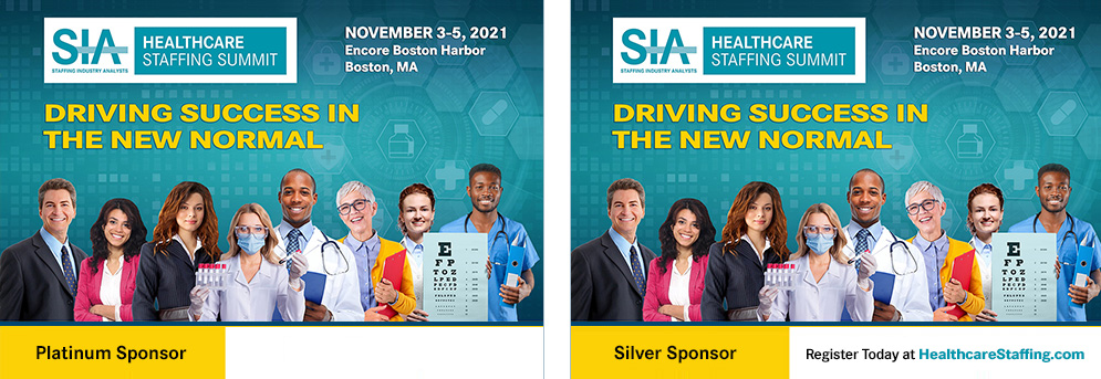
LinkedIn Sponsor Badges
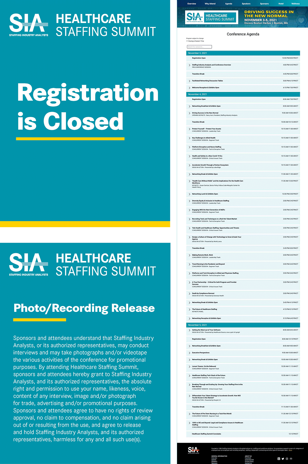
Conference Signage and Website
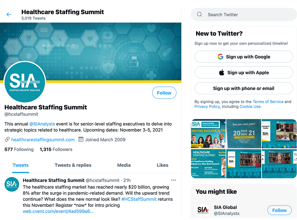
Twitter Account Screenshot
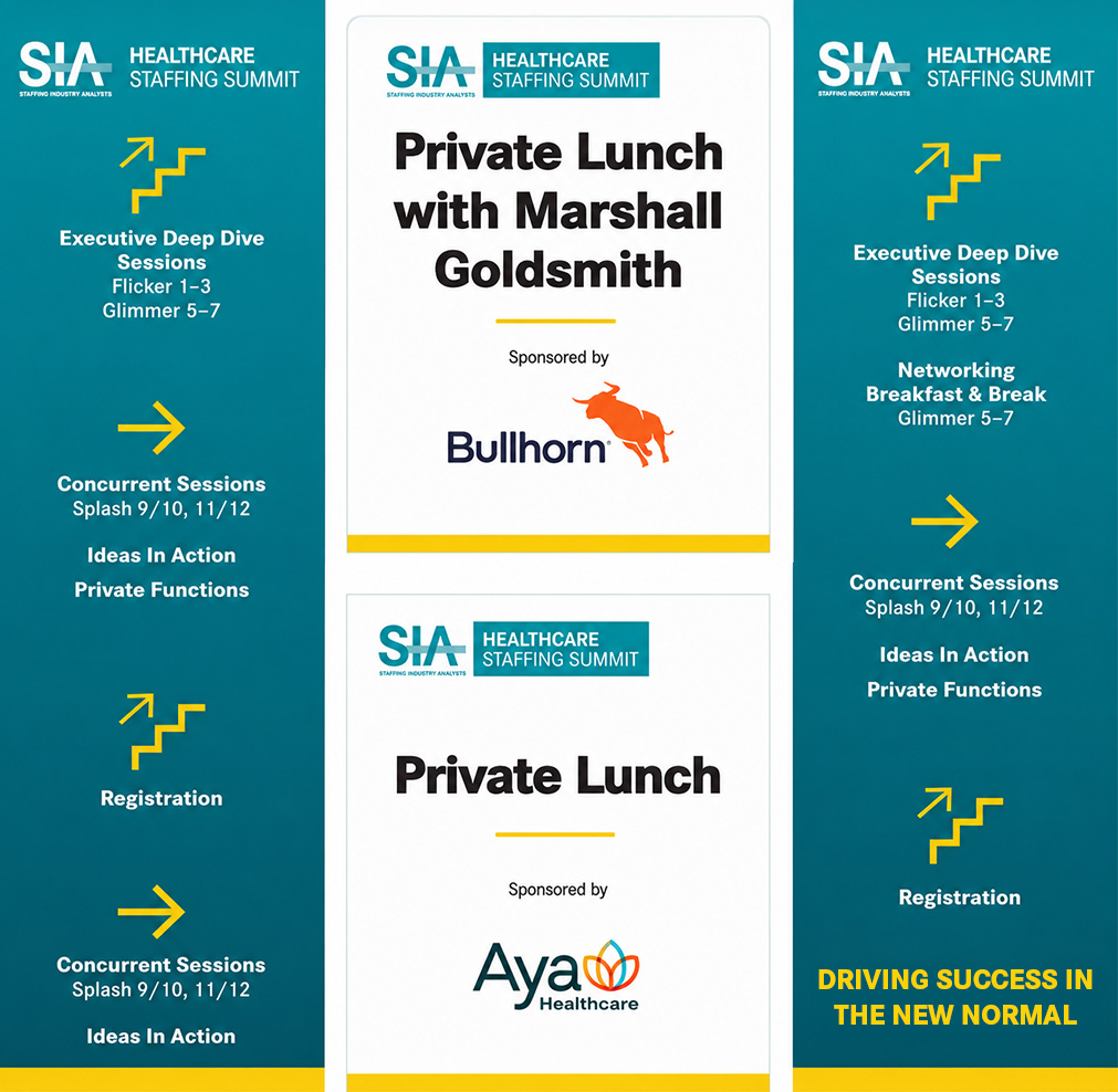
Conference Environmental Signs
What This Work Demonstrates
Healthcare Industry Experience
The Healthcare Staffing Summit was designed specifically for executives operating at the intersection of healthcare and staffing. This engagement demonstrates direct experience designing for a healthcare industry audience at the executive level, with a clear understanding of the professional tone, visual standards, and brand discipline that audience expects.
High-Volume Digital Design Management
A marketing package of 40-plus assets spanning web, social media, email, presentation, and signage formats is not a single design task. It is a system. Managing that volume while maintaining visual consistency across every asset, every format, and every channel requires both design skill and organizational discipline. This engagement demonstrates both.
Creative Direction Within Brand Constraints
Proposing a theme-based visual identity within a brand system as structured as SIA's required more than creative instinct. It required understanding the brand well enough to push it forward without breaking it. The theme approach was new for this conference. It was accepted, it worked, and it energized the audience. That is what creative leadership inside a constrained environment looks like.
B2B and Executive Audience Design
Designing for a B2B audience of healthcare staffing executives demands a different sensibility than consumer or general public design. Clarity, authority, and professionalism are non-negotiable. This engagement demonstrates the ability to calibrate design for a sophisticated professional audience, where the standard for what "good" looks like is set by the people in the room.
The Impact
The Healthcare Staffing Summit marketing package reached healthcare staffing executives across the country through LinkedIn, Twitter, SIA's daily online news channel, and the conference website itself. Every asset in the package, from the hero image down to the smallest sponsor badge, carried the same visual identity. That consistency is not accidental. It is the result of building a design system rather than a collection of individual pieces.
The theme-based approach proposed for this conference was a first for HCSS. It was also a risk in a brand environment where consistency and conservatism were the established norm. The fact that it was accepted, executed successfully, and resonated with the audience demonstrated something important: that creative leadership is not about ignoring constraints. It is about understanding them well enough to know exactly where there is room to move.