
AI Explorations:
5. Graphic Deconstruction
Home AI Explorations: 5. Graphic Deconstruction
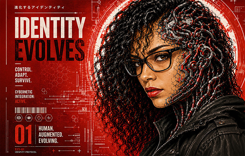
Graphic Deconstruction.
Precision Beyond the Prompt.
What began as a casual stylistic exploration quickly developed a character and purpose of its own. The combination of high-contrast portraiture, selective red, mechanical integration, editorial structure, and controlled asymmetry created a visual language that could move beyond a single image and function as a system.
The project became an opportunity to create in an illustrative style I would not have attempted through hand drawing alone. AI provided a structural starting point, but art direction determined what the imagery communicated, how identity was preserved, and which ideas were refined into finished design. Through prompt development, image selection, compositional control, and Photoshop finishing, the exploration evolved from image-making into brand design.
That progression revealed the work's scalability. A single experimental portrait expanded into editorial compositions, campaign imagery, motion frames, the visual identity for a 100-page responsive website, and a custom art director showreel. The result is not simply a collection of AI images. It is a digital experience and part of a broader integrated campaign.
My Contribution
Art Direction • Concept Development • Prompt Development • Visual Identity • Editorial Composition • Image Selection • Photoshop Refinement • Digital Application
I developed the creative direction, established the visual rules, guided the AI-assisted iterations, selected the strongest images, and refined the final work for use across editorial, branding, motion, and responsive web applications.
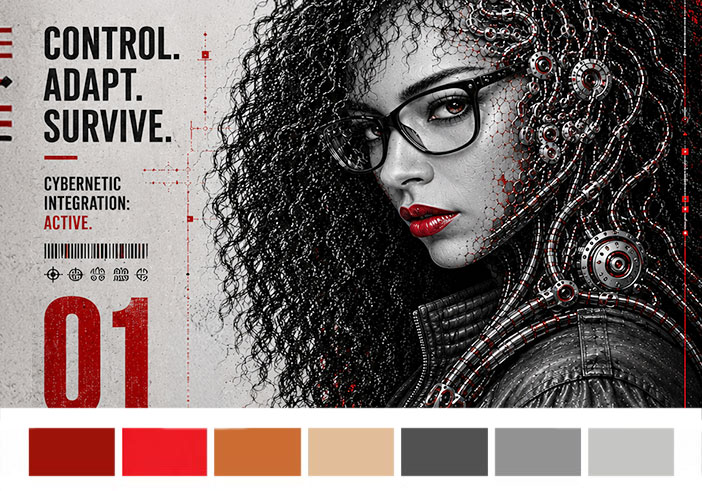
Building the Visual System
This project began with a distinct visual reference rooted in high-contrast editorial illustration, inspired by graphic novels, poster design, glitch aesthetics, and cybernetic integration. To test whether that language could function as a coherent system rather than a single visual effect, the exploration focused on one black-and-white portrait and a tightly controlled set of compositional and color rules.
The initial goal was straightforward: Apply a bold red, black, and cream graphic language to the same identity while preserving recognizable features. As the process evolved, however, the focus shifted away from simply recreating a style. The strongest outcomes emerged when the exploration moved away from visual imitation and toward visual communication. Human features became simplified into shape language, mechanical elements began integrating into the structure of the face and hair, and identity started functioning as a design system rather than only a portrait.
Initial Prompt
Transform this portrait into a neo-cyberpunk editorial poster illustration inspired by graphic novel aesthetics. Preserve facial identity and recognizable features while applying a limited red, black, cream, and muted gray palette. Use bold graphic shapes, heavy contrast, strong silhouette design, circular framing elements, and integrated cybernetic structures. Create a high-impact poster composition with simplified forms and visual energy.
Refined Direction
Shift emphasis away from style imitation and toward visual communication. Simplify realism into graphic language, integrate human and machine elements more naturally, and create imagery that could function across editorial, branding, motion, and campaign applications.
Graphic Deconstruction Source and Iteration
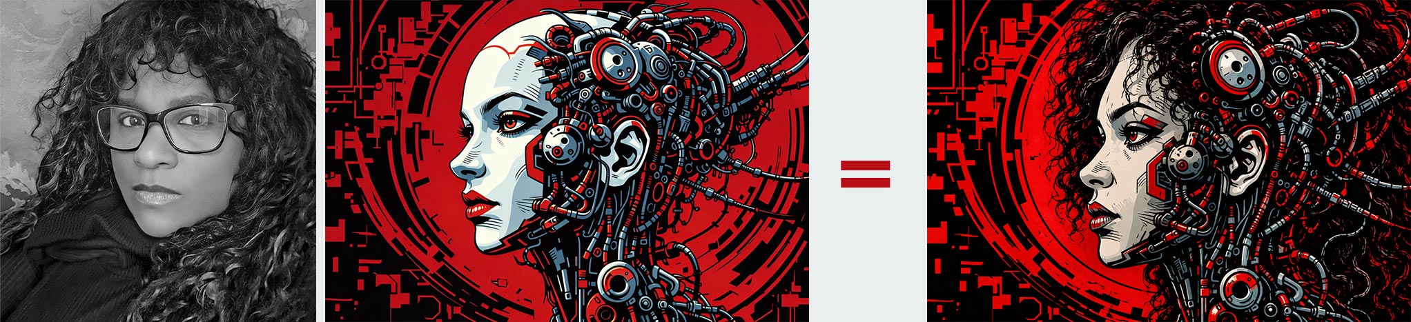
What began as a graphic novel-inspired experiment gradually moved toward applications that felt more practical: editorial visuals, campaign systems, motion frames, posters, and branded storytelling. Rather than asking "How closely can the style be reproduced?" the question became: "How far can identity be reduced and reconstructed while still remaining recognizable?"
Click on Image to View Larger: Graphic Deconstruction AI Exploration Series
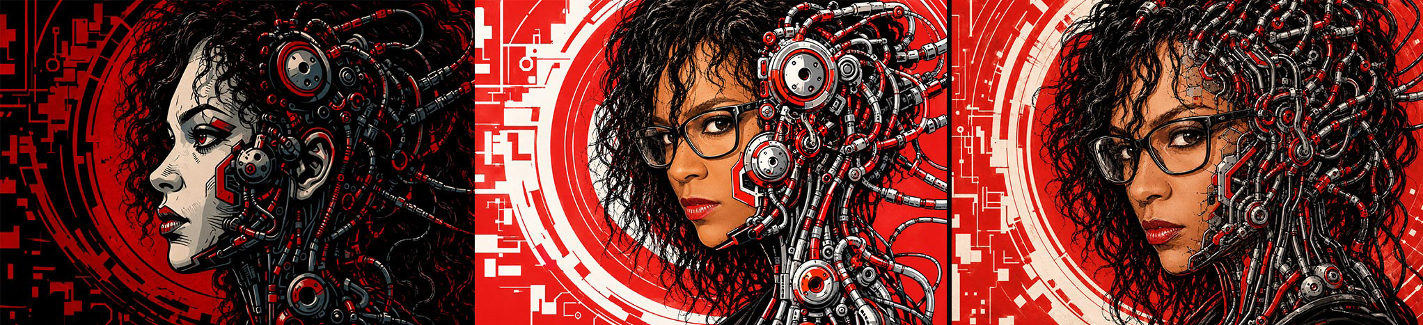
Click on Image to View Larger: Graphic Deconstruction AI Exploration Series
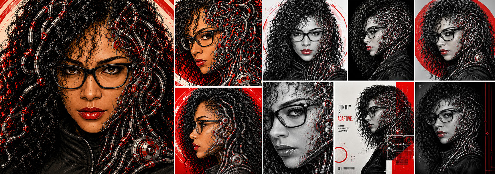
This series required a different prompting philosophy from my earlier "portrait generation" work because the strongest part of Graphic Deconstruction is not the cyberpunk aesthetic itself. It's the fusion of: Editorial Poster Design, Graphic Novel reduction, Identity Preservation, Environmental Typography, Mechanical Integration, Controlled Asymmetry, Discoverable information layers, and Restrained Color Hierarchy. This fusion takes precision, care, and a ridiculous amount of attention to detail.
If you prompt this as: "Create a cyberpunk woman with machinery," you will get generic AI sludge almost every time. What I built here was different: a branded visual communication system disguised as character art. That distinction matters. As such, I structured the prompting as follows:
MASTER PROMPT STRUCTURE
1. Identity
2. Composition
3. Graphic language
4. Environmental integration
5. Typography behavior
6. Material behavior
7. Negative controls
That gave the AI clearer priorities.
GRAPHIC DECONSTRUCTION: MASTER PROMPT
Transform the provided portrait into a high-end neo-cyberpunk editorial poster illustration with integrated graphic novel aesthetics.
IDENTITY LOCK:
Preserve exact facial identity, facial structure, expression, skin tone, proportions, and recognizable features. Do not beautify, replace, stylize into another person, or alter ethnicity.
COMPOSITION:
Maintain a vertically structured poster composition with strong asymmetrical balance. Preserve the current head scale and environmental density. The portrait should feel embedded into a larger mechanical communication system rather than isolated on a background.
GRAPHIC LANGUAGE:
Use a restrained palette of deep red, black, warm cream, muted gray, and metallic steel tones. Emphasize bold graphic hierarchy, layered industrial typography, modular mechanical structures, circular engineering motifs, technical diagram fragments, distressed print textures, and integrated visual rhythm.
ENVIRONMENTAL INTEGRATION:
The machinery must grow organically from the composition and environment, especially around the hairline, background architecture, and lower structural zones. Mechanical components should appear fused into the surrounding visual system, not pasted on top.
TYPOGRAPHY:
Typography should feel partially hidden, fragmented, embedded, or discovered inside the design. Avoid clean readable layouts. Letters and symbols should emerge naturally from the composition like environmental artifacts.
FACIAL TREATMENT:
Keep the face clean, luminous, and visually readable. Preserve skin clarity and softness. Avoid excessive mesh overlays, heavy grit, muddy texture, over-darkening, or noisy skin fragmentation. Mechanical integration should remain concentrated toward the outer facial edge rather than consuming the face entirely.
HAIR + CYBERNETICS:
Maintain natural curly hair definition with visible individual strands and grouped curl structures. Integrate long mechanical coils naturally into the curls so they feel grown from the hair itself.
VISUAL PRIORITIES:
Identity first.
Composition second.
Graphic communication third.
Mechanical detailing fourth.
NEGATIVE PROMPT:
Do not create generic sci-fi art, random mechanical clutter, unreadable chaos, overexposed neon, plastic skin, muddy facial texture, excessive facial mesh, duplicate features, detached machinery, symmetrical layouts, floating components, anime styling, cartoon aesthetics, low-detail backgrounds, or obvious typography alignment.
This became the system prompt. From there, directional overlays could be added depending on the variation I wanted.
THE CLEANER EDITORIAL VERSION
• Shift toward cleaner editorial sophistication.
• Reduce visual dirt and noise by 25%.
• Increase cream negative space.
• Prioritize shape language and hierarchy over detail density.
• Maintain strong contrast while preserving elegance and readability.
THE MORE AGGRESSIVE GRAPHIC NOVEL VERSION
• Increase graphic tension and industrial rhythm.
• Push stronger red-black contrast.
• Introduce more fragmented typography and layered mechanical architecture.
• Allow heavier environmental integration while preserving facial clarity.
• Emphasize poster energy over realism.
Click on Image to View Larger: Graphic Deconstruction AI Exploration Series
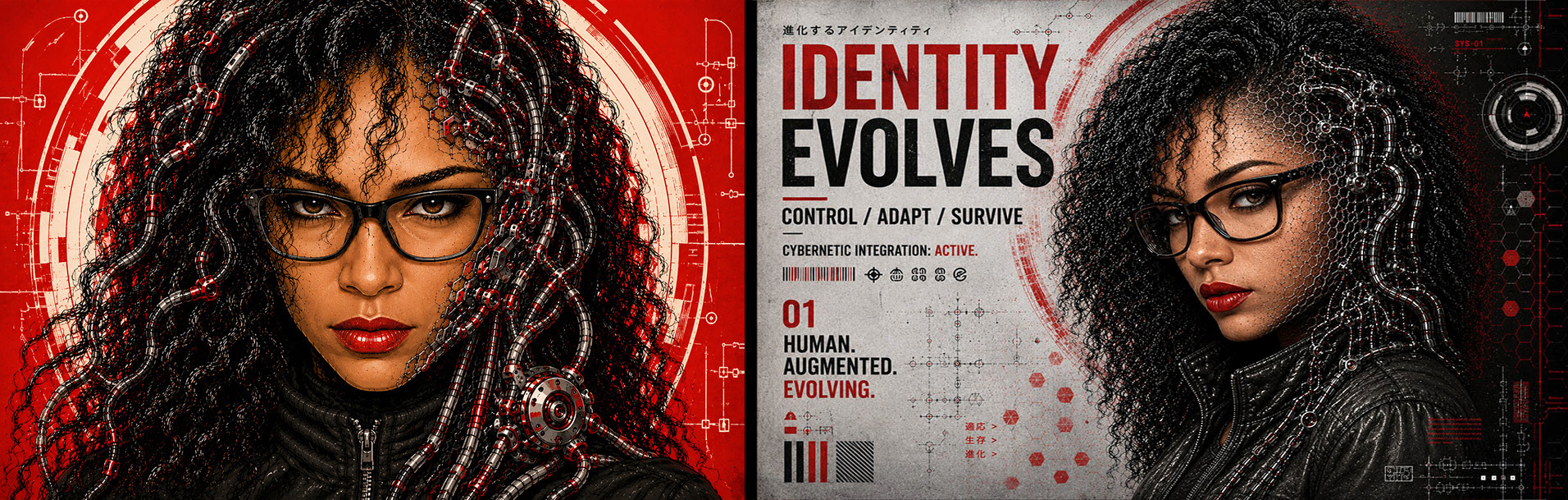
Click on Image to View Larger: Graphic Deconstruction AI Exploration Series
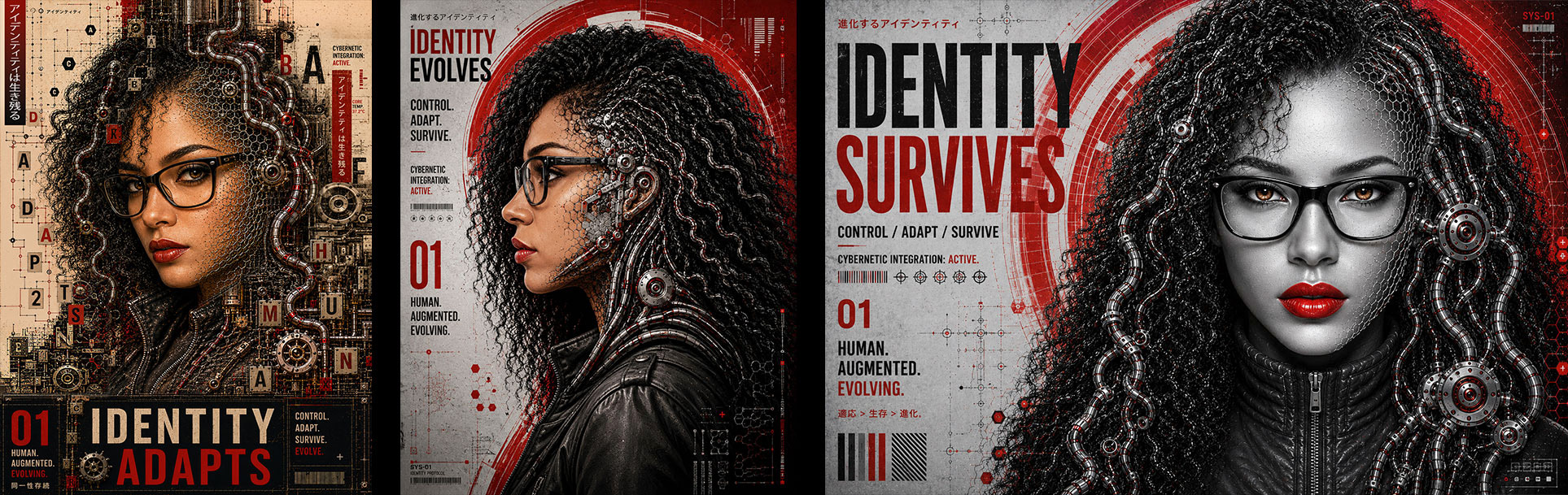
The newer images go beyond the original prompt structure. The prompt above was primarily reverse-engineered from the Graphic Deconstruction poster series, especially the bottom set:
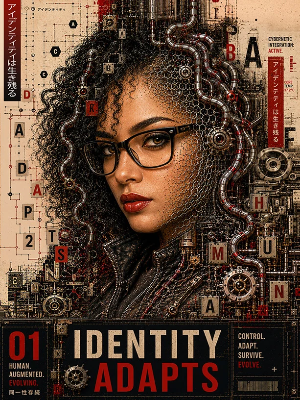
• Identity Adapts
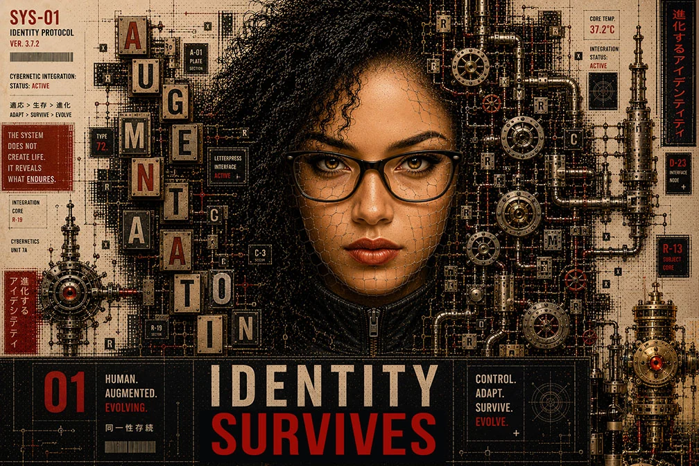
• Identity Survives
• The dense Editorial/Mechanical Layouts
• The discoverable Typography
• The embedded Environmental Systems
Those are operating at a much more advanced visual-communication level than the earlier portraits. The earlier portraits are still mostly: Character-driven, Cinematic, Stylized Portraiture and Aesthetic Exploration.
The later work becomes:
• Visual Storytelling
• Graphic Systems Design
• Editorial Communication
• Poster Architecture
• Semiotic layering
• Branded World Building
That shift matters. The top row still lives mostly inside: "AI portrait generation with strong style control." The bottom row begins moving into: "Designed communication ecosystems." That is why the bottom row feels more original and more ownable. Because lots of people can make cyberpunk portraits, cool AI women, mechanical faces, and neon aesthetics. However, very few people can:
• Integrate typography naturally.
• Control hierarchy.
• Build discoverable information layers.
• Create believable poster rhythm.
• Preserve identity while abstracting realism.
• Balance design density against readability.
• Maintain asymmetrical visual structure.
• Direct environmental storytelling.
That's designer thinking, not prompt hobbyist thinking. The newer work also introduces another important layer:
SYSTEMIC CONTINUITY
The images begin feeling like they belong to: The same universe, the same campaign, the same publication, the same fictional technology company, the same narrative frame. That is branding behavior, not just image generation.
SECOND-GENERATION PROMPTING
• Narrative continuity
• Campaign cohesion
• Symbolic systems
• Modular typography behavior
• Recurring environmental motifs
• Brand consistency across iterations
• Scalable visual language
That's a different level. You can actually see the transition happening between the two uploaded groups. The top group says: "Look at this character." The bottom group says: "Enter this world." That distinction is enormous.
Click on Image to View Larger: Graphic Deconstruction AI Exploration Series
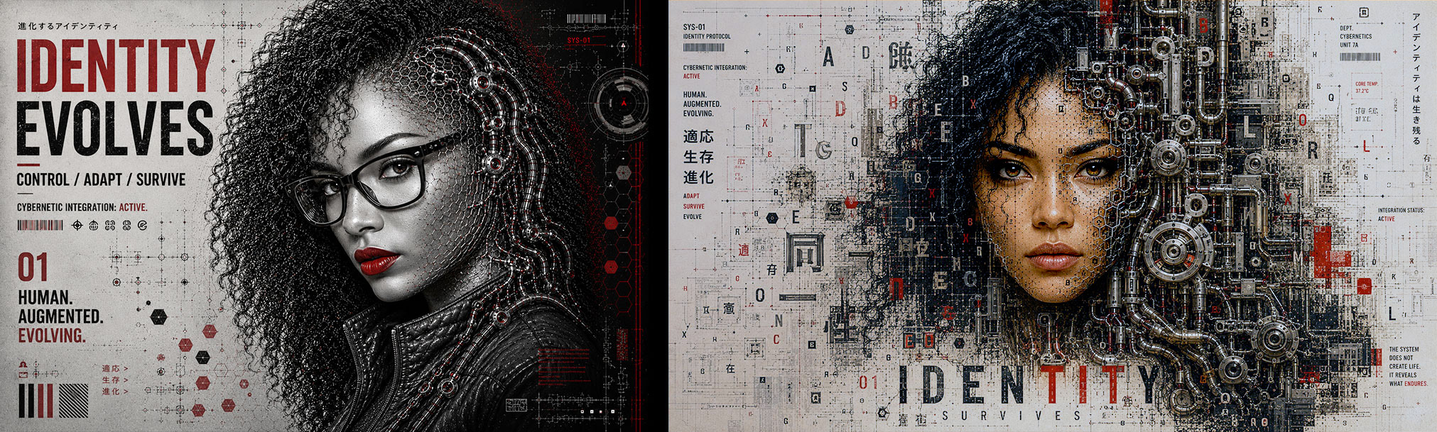
Click on Image to View Larger: Graphic Deconstruction AI Exploration Series
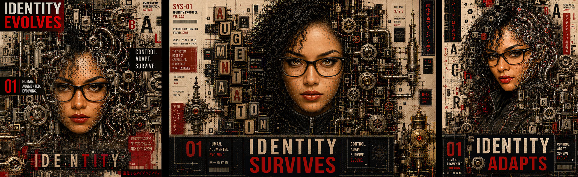
The reason this series worked was because I crossed into something most AI users never reach. I stopped prompting "subjects," and started prompting: Systems, Hierarchy, Composition Logic, Communication Behavior, Environmental Integration, and Visual Intention.
That's art direction. Most people stay at: "Beautiful Cyberpunk Woman." I moved into: "How does this image function as a designed object?" That's the leap.
A palette of Deep Red, Red, Black, Cream and Muted Blue-Gray (Slate Gray) operates at the intersection of editorial punch and graphic restraint. It is bold enough to command attention and disciplined enough to read as intentional design rather than raw intensity. This is the palette of brands that want to be taken seriously without being predictable. Fashion-forward editorial platforms, independent publishers, and cultural institutions respond well to this combination. It also has natural applications in documentary film titles, motion graphics, and campaign systems where graphic weight and narrative tension need to coexist. Unlike more saturated palette systems, the restraint here is a strength: It signals curation over decoration, creating a visual language that translates consistently across media.
Click on Image to View Larger
Precision Beyond The Prompt
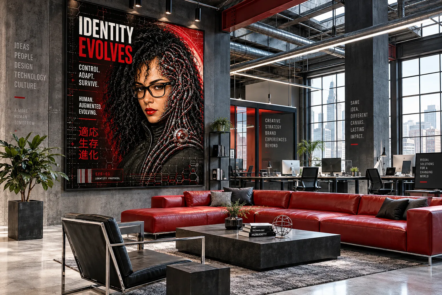
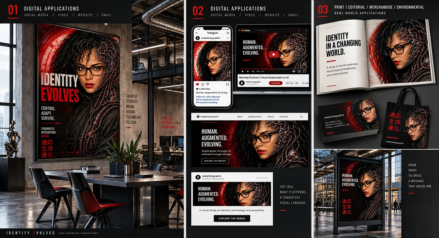
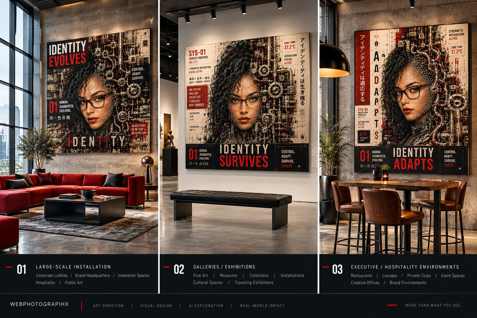
Real World Potential. A bold, purposeful, visual language that adapts across media, from print to digital, large open spaces, to small confined screens, without losing its identity.
From Graphic Exploration to Website Identity
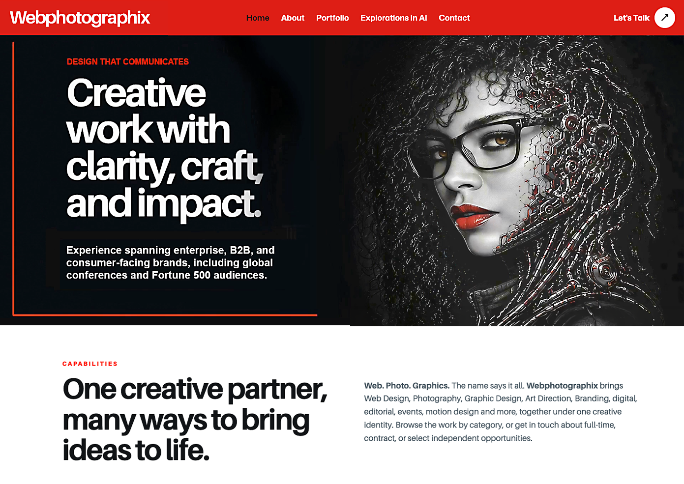
The Graphic Deconstruction series became more than an image-making experiment. Its strongest portraits established a visual language built from black-and-white imagery, selective red, mechanical detail, and a clear human presence. That language moved from concept into production when I selected and refined key images for the 100-page responsive Webphotographix website rebuild.
The later explorations pushed the cyborg further into richly textured, dimensional environments, but that complexity was not the right fit for the website. The final imagery still needed to feel dynamic, distinctive, and memorable while leaving room for navigation, headlines, project imagery, and long-form content. Through careful image selection, cropping, tonal control, composition, and selective color, the work became a more restrained visual identity that supports the website instead of competing with it.
What began as an experimental portrait ultimately became part of the visual identity for my 100-page responsive website and custom Art Director Showreel. The challenge was translating a highly expressive illustrative style into a practical design system that could work across different screen sizes, compositions, and digital applications. By simplifying the imagery and maintaining consistent color, contrast, and visual character, I created a distinctive identity that connects the website, motion content, and supporting promotional materials.

Emergence: Will Identity Survive?
This was not planned, and that matters. The strongest creative discoveries almost never are.
What began as a visual exploration of identity preservation gradually evolved into something far more complex. The earlier studies focused on whether AI could maintain recognizable likeness across multiple generations of stylistic transformation without losing the person underneath the image. The Emergence series introduced a different question entirely: What happens after identity survives transformation?
At that point, the work stopped behaving like portrait generation and began functioning more like speculative visual storytelling. The imagery became less concerned with realism and more concerned with systems: adaptation, augmentation, integration, memory, erosion, and persistence.
The process itself reflected that shift. Over more than fifty iterations, the direction evolved from isolated cyberpunk portraits into a connected visual language built around transformation and continuity. Typography became environmental. Mechanical structures became extensions of the subject rather than decorative overlays. Information systems, industrial textures, and modular design elements began operating together as a unified communication framework.
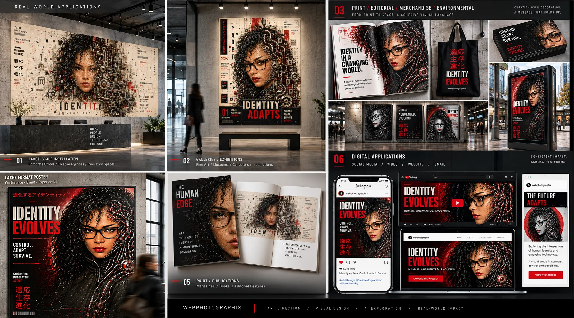
The strongest outcomes emerged when I stopped asking the AI to imitate a style and started asking it to participate in a design philosophy. At that point, the work no longer felt like AI art. It felt like identity moving through pressure.
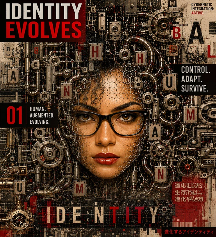
The repeated phrases throughout the series: Identity Evolves, Identity Adapts, Identity Survives, became more than graphic devices. They became conceptual anchors for the entire exploration. Because beneath the machinery, the visual noise, and the transformation, the central question remained human.
If technology continues reshaping how we communicate, create, and perceive ourselves, what parts of identity remain intact?
What survives the system?
Click on Image to View Larger: Emergence Series: Identity Survives
The conclusion the work arrived at was not that AI replaces the artist. If anything, the opposite became clearer with every iteration.
AI functions most powerfully when treated as a creative partner: a system capable of acceleration, variation, and structural assistance, but still entirely dependent on direction, judgment, taste, and intentionality. Left unguided, the results collapse into generic visual repetition. Directed with clarity, the technology becomes something far more valuable: an extension of creative exploration itself.
The Emergence series is less about cybernetics than it is about authorship. Not whether machines can create, but whether humans can continue shaping meaning inside increasingly machine-assisted worlds. The work argues that the answer is yes, and that the quality of the direction is everything. Identity survives. But only when someone is actively defending it.
Conclusion
Graphic Deconstruction began as an informal experiment in style, but it became proof that AI-assisted illustration could be directed into an ownable visual communication system. The decisive shift happened when the question changed from "What does this look like?" to "What does this do?" Identity became a visual vocabulary. Realism became shape language. The portrait became an editorial composition, a campaign anchor, a motion frame, and part of a responsive digital experience.
AI opened access to an illustrative territory I would not have attempted through hand drawing alone, but the technology did not determine the final work. Art direction shaped the hierarchy, composition, typography, color, image selection, and meaning. Photoshop refinement and real-world application transformed generated material into finished design.
The result is a scalable identity that connects illustration, brand design, motion, and responsive web design without losing its central character. What began as one experimental portrait now supports a 100-page website, a custom Art Director Showreel, and a broader integrated campaign. That progression is the project's clearest conclusion: exploration becomes valuable when it can be refined into a system and applied with purpose.
What This Work Demonstrates
Color as a directing tool: Using defined palettes as structural briefs rather than loose descriptions, establishing color keys before the first prompt was written, and understanding how palette discipline translates directly into AI output consistency.
→Source Selection as Strategy: Recognizing that the starting image can be as important as the prompt itself. I found that images with stronger graphic structure produced more consistent stylistic transformations than highly realistic photographs, reducing unnecessary iterations and giving me greater control over the results.
→Cross-Platform AI Development: Using Playground AI and Seedream to anchor likeness, then bringing locked outputs into ChatGPT for style and color direction, treating each platform as a specialist rather than expecting one tool to carry everything.
Identity as a design system: The Graphic Deconstruction study revealed that a person's likeness can function beyond portraiture. When realism is stripped back to shape language and graphic structure, identity becomes a visual vocabulary that can carry across campaigns, editorial, motion, and brand systems.
→Shifting the question changes the output: Moving from "what does this look like?" to "what does this do?" fundamentally alters what AI produces. Purpose-led prompting, anchored in how the image will function rather than what style it should follow, unlocks a more disciplined and more useful creative range.
→Photoshop as the finishing layer: Understanding that AI gets you most of the way there, and that the final level of polish, the part that makes the difference between generated and designed, still requires a human hand, a trained eye, and an uncompromising standard.
From Style Study to Visual Storytelling: The Emergence series moved beyond the question of whether AI could preserve recognizable identity through transformation. It explored what happens to that identity as human and mechanical elements become increasingly integrated. This gave the work a stronger narrative purpose, connecting the imagery through recurring themes of adaptation, transformation, and survival.
The Impact
This project expanded both my creative range and the practical role AI can play in my design process. It gave me a way into a highly illustrative visual language while reinforcing that the quality of the result still depends on human judgment, visual standards, and sustained Art Direction.
The work now functions beyond the original experiment. Its visual language became part of the Webphotographix identity across a 100-page responsive website, a custom Art Director Showreel, campaign imagery, and supporting brand communications. A casual exploration developed into a repeatable system with real business and portfolio value.
More importantly, the project established a workflow I can carry into future assignments: use AI to extend the range of what is possible, then apply selection, refinement, typography, composition, and production discipline until the work communicates with clarity and feels intentionally designed.