Evaluate & Select
Assess template components, animations, and layout options against the needs of the business and the creative work.

Rebuilding a 100-page creative business website in under a month through hands-on Art Direction, strategic template customization, and practical AI collaboration.
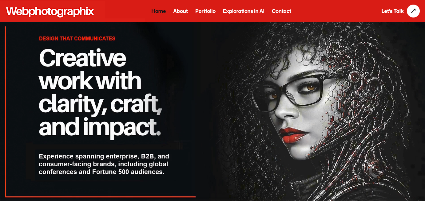
I see a template as a starting point, not a finished design. Its layouts, animation, and components are materials I can adapt to my own direction.
For Webphotographix, I retained the template’s responsive functionality, combined its strongest components, and redesigned the presentation around my business.
My website needed to present years of creative work clearly, make projects easier to explore, and support client and career opportunities. This was a working business website, not an AI experiment.
Built and expanded over roughly ten years, the original website held an extensive portfolio of branding, advertising, conference design, publications, web projects, photography, and retouching. Its legacy layout was difficult to navigate on modern devices.
I rebuilt it as a responsive, approximately 100-page portfolio with clearer navigation and galleries tailored to each type of work.
The cyborg imagery on my Art Director site established the human-machine theme. For Webphotographix, I developed it further through the Graphic Deconstruction study in Painting The Machine: Illustration-inspired portraits, strong black-and-white contrast, and selective red.
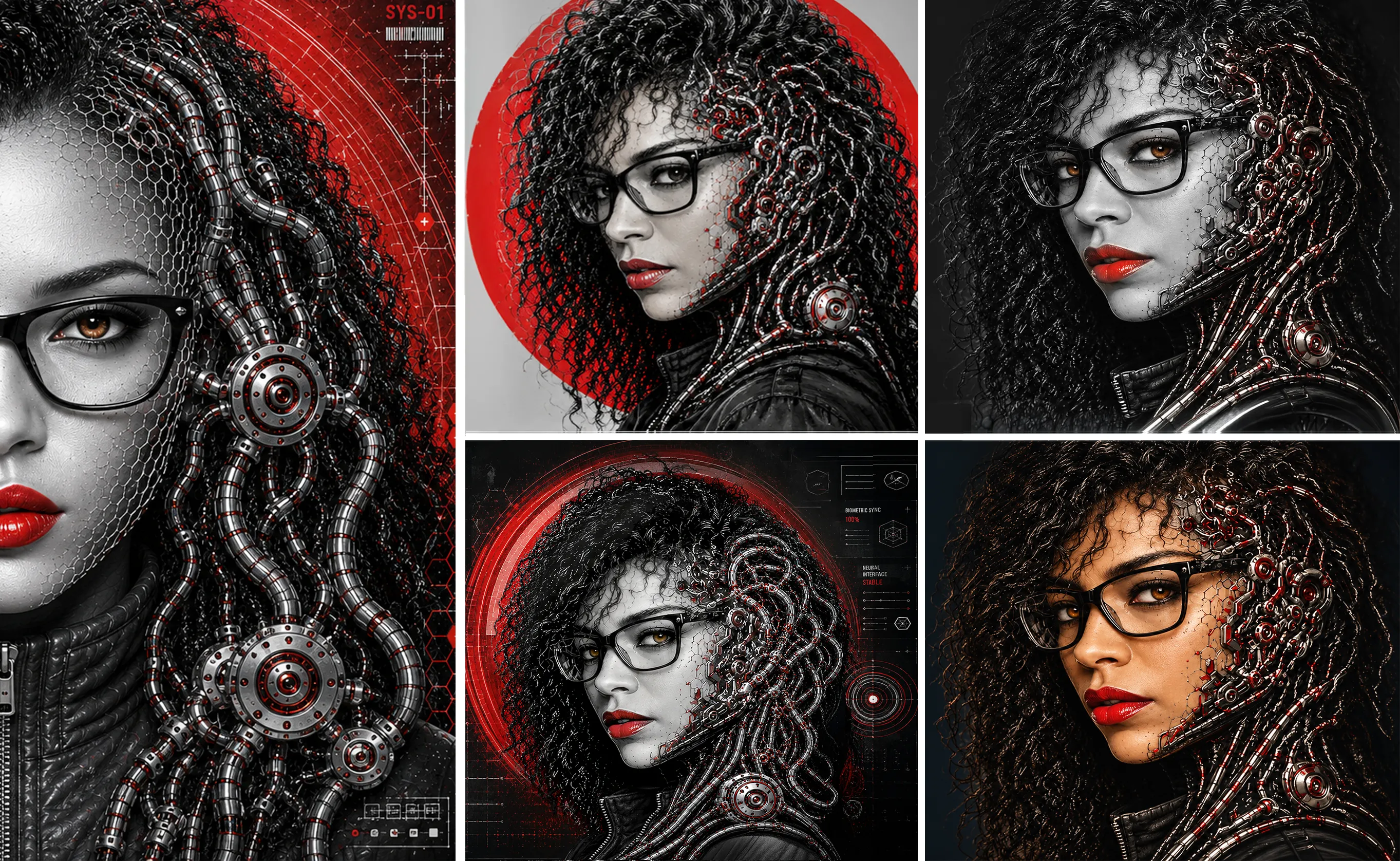
The study revived my interest in black-and-white photography and design. Instead of filling the site with color, I used monochrome imagery and one strong accent. Cyborg portraits suggest AI and emerging technology; my image selection, compositions, and refinements keep the result grounded in Art Direction.
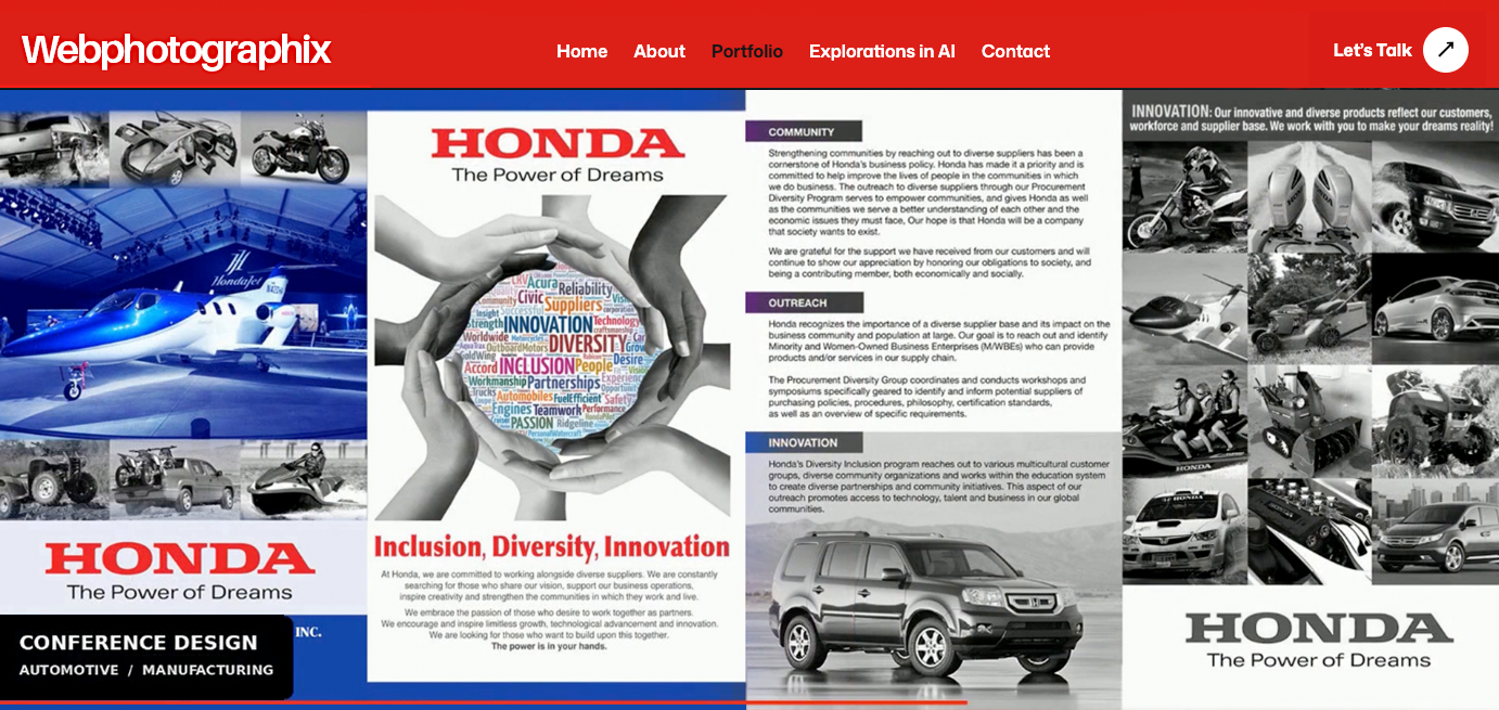
RED directs attention across the monochrome site. In the showreel, a moving red line adds energy and guides the eye through featured projects without covering the work.

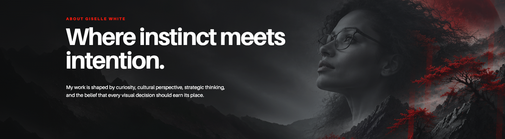
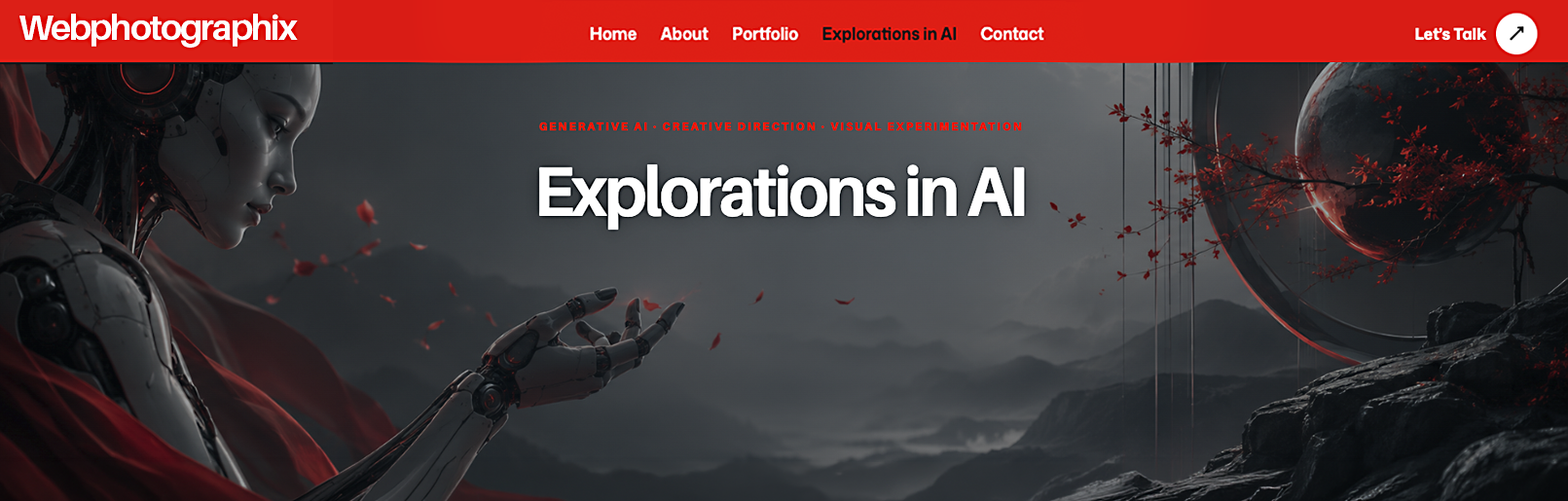
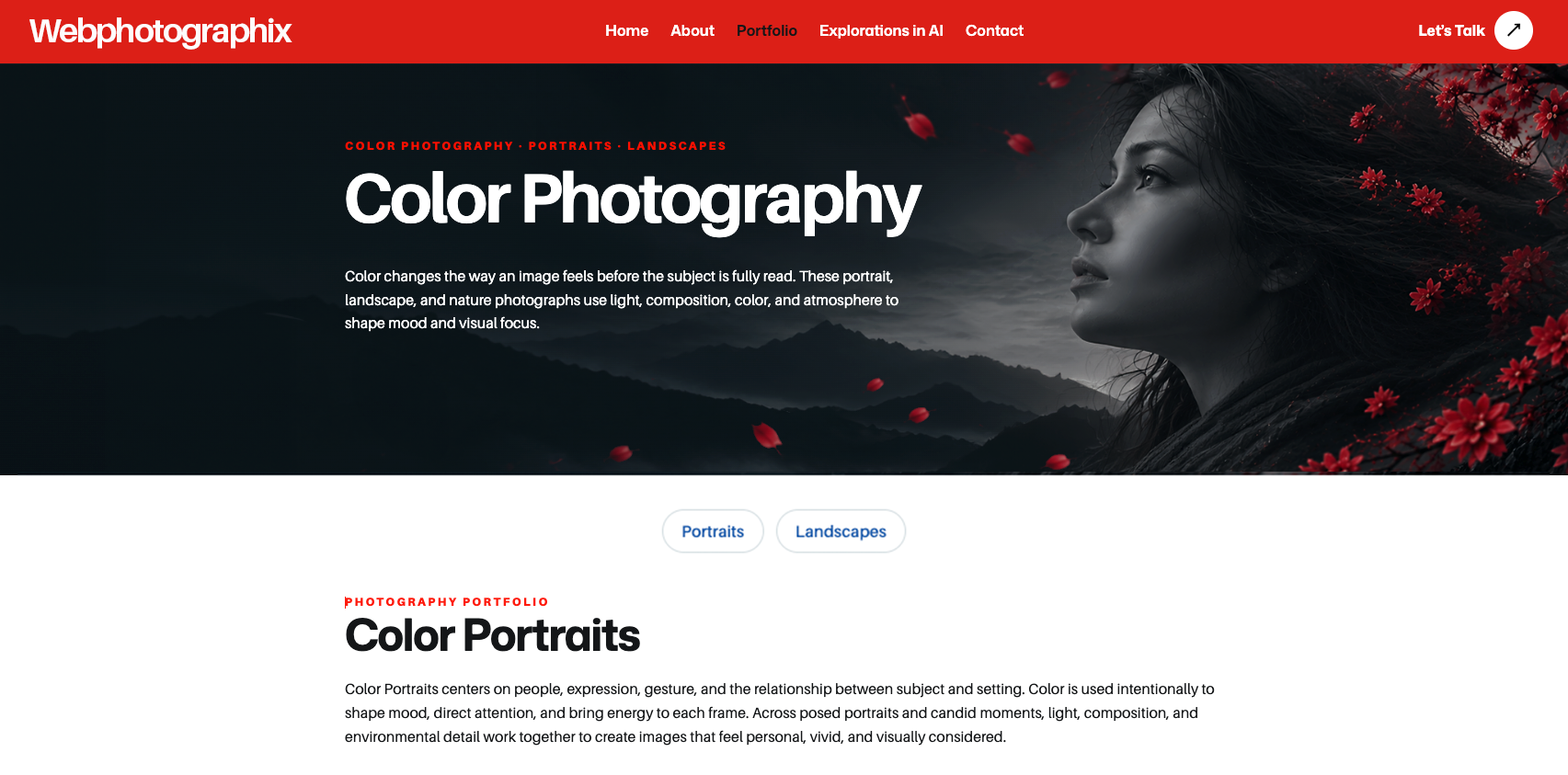
The banner series uses two complementary treatments. Simple, text-led banners support project-detail pages, where client names, project titles, and introductory copy may be long. Their restraint protects readability and keeps attention on the individual case study. Branded ethereal banners introduce the main navigation and portfolio sections with more energy, tone, and atmosphere. Monochrome figures, dramatic landscapes, and selective red create a stronger emotional entrance while preserving the same Webphotographix identity.

Art Direction • Visual Design • Template Customization • Layout & Content Strategy • Image Selection • AI Collaboration • Review & Refinement
I selected and adapted template components, directed the color and layout, prepared imagery, organized projects, and approved the final designs.
ChatGPT and Codex assisted with HTML/CSS, galleries, captions, page refinements, and troubleshooting. I reviewed the results and directed corrections.
I retained control of the creative direction and final quality.
The template supplied the technical foundation: responsive layouts, navigation, galleries, and carefully timed animations that move smoothly between sections. I compared its 11 homepage variations and supporting pages, selecting individual components and behaviors rather than adopting one complete design. I supplied the design direction.
I love taking a template designed for one audience and turning it into something entirely different. This one began with a reserved corporate aesthetic, intended for a traditional business audience. I wanted Webphotographix to appeal to a broader audience, from businesses seeking professional design services to creative agencies, marketing teams, and prospective employers looking for original thinking and strong visual design.
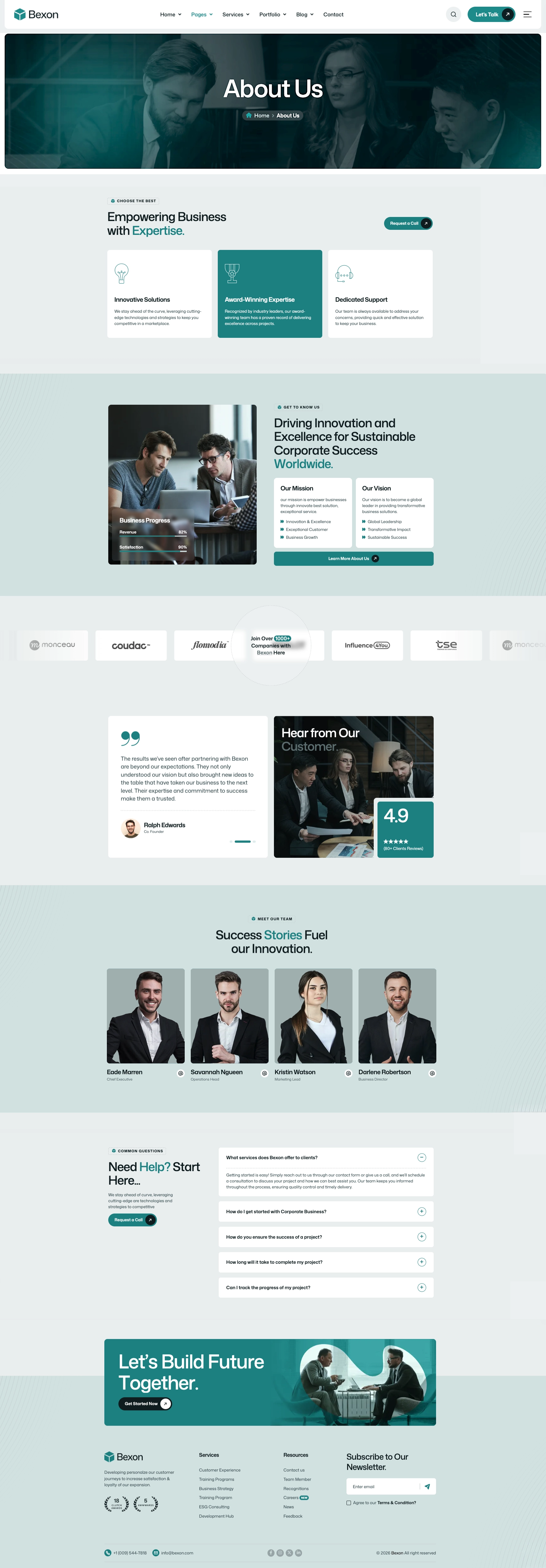
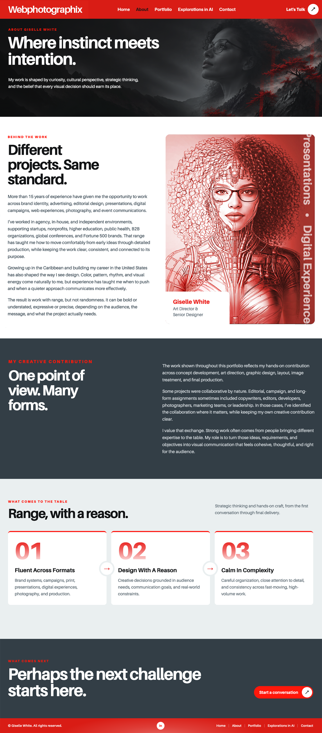
The About page demonstrates that process clearly. I retained the subtle image movement from one homepage variation and adapted another variation's prominent outlined vertical marquee into a quieter, solid typographic treatment at lower opacity along the portrait. Combining and refining those elements preserved the template's sense of motion without allowing it to compete with the content.
I transformed its palette, typography, imagery, and page layouts into a bold, high-contrast design built around black-and-white photography, graphic illustrations, futuristic cyborg imagery, and vivid red accents. The result feels distinctly Webphotographix, with a visual personality that reflects the creative work being showcased, while retaining the sophisticated animations and functionality that made the original template worth choosing.
Three views of the transformation: the decade-old site, the corporate Bexon template, and the finished Webphotographix design. Scroll within each screenshot to explore the full page, or open it at full size.
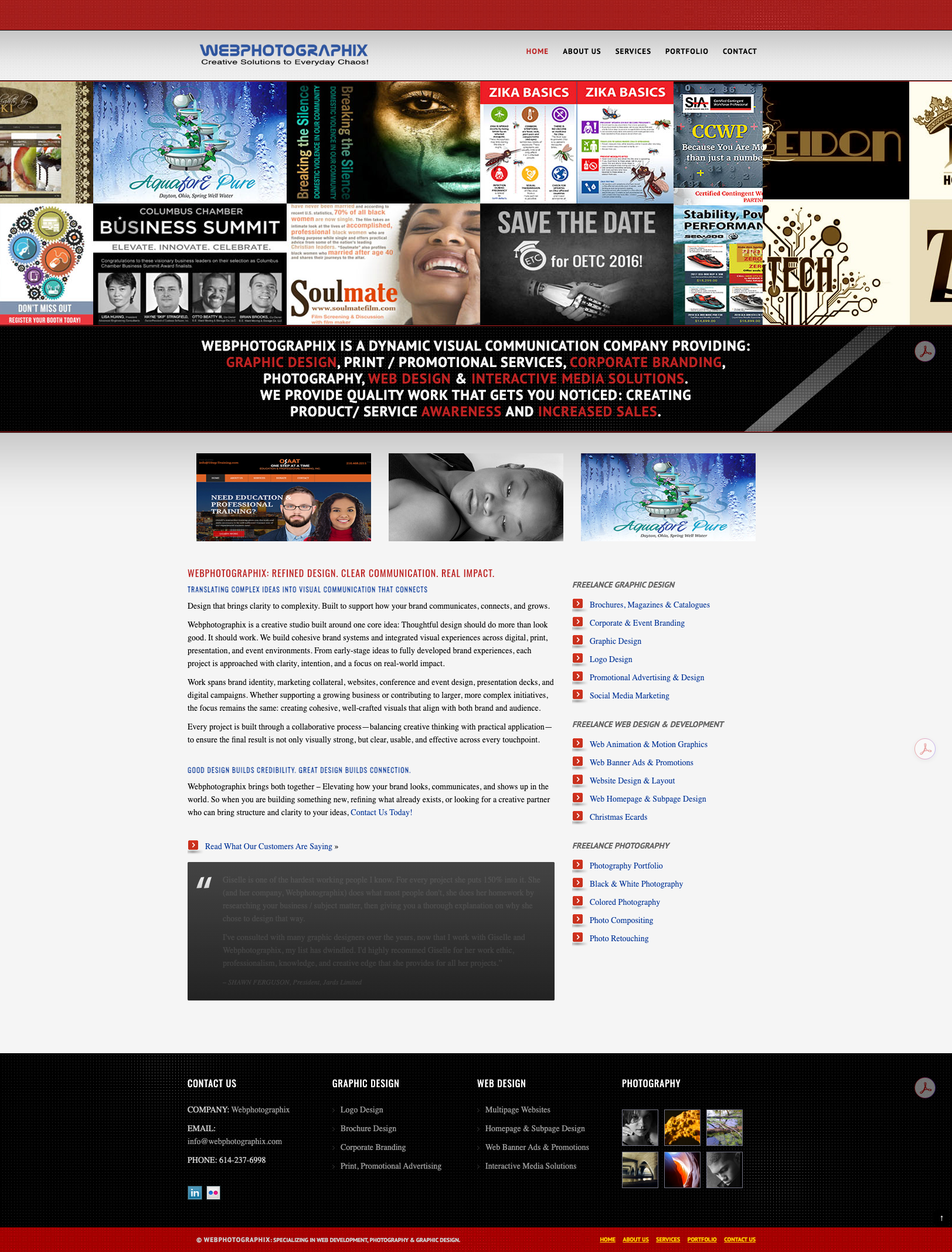

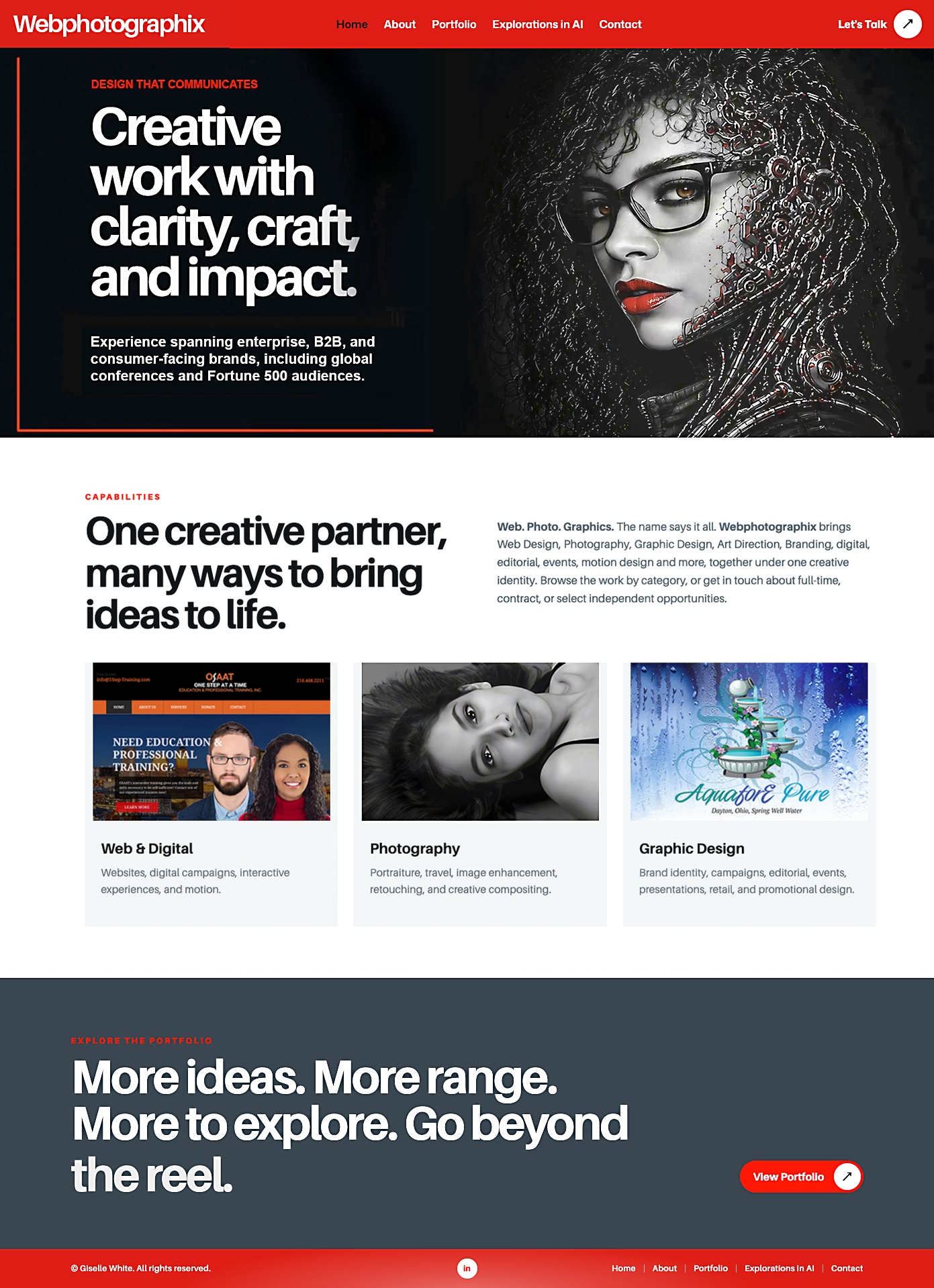
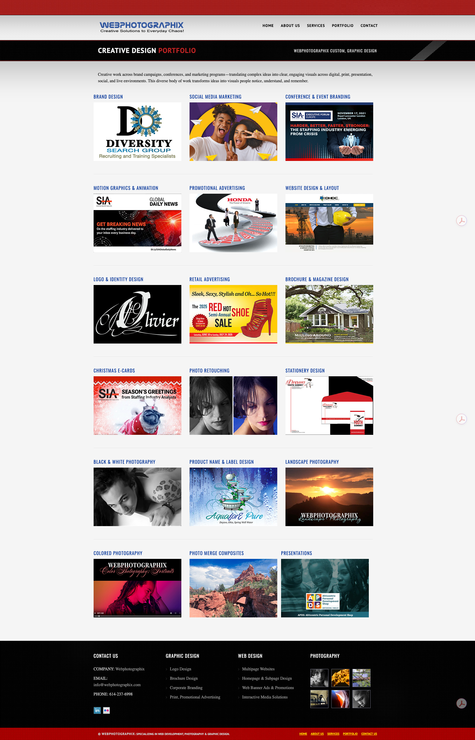
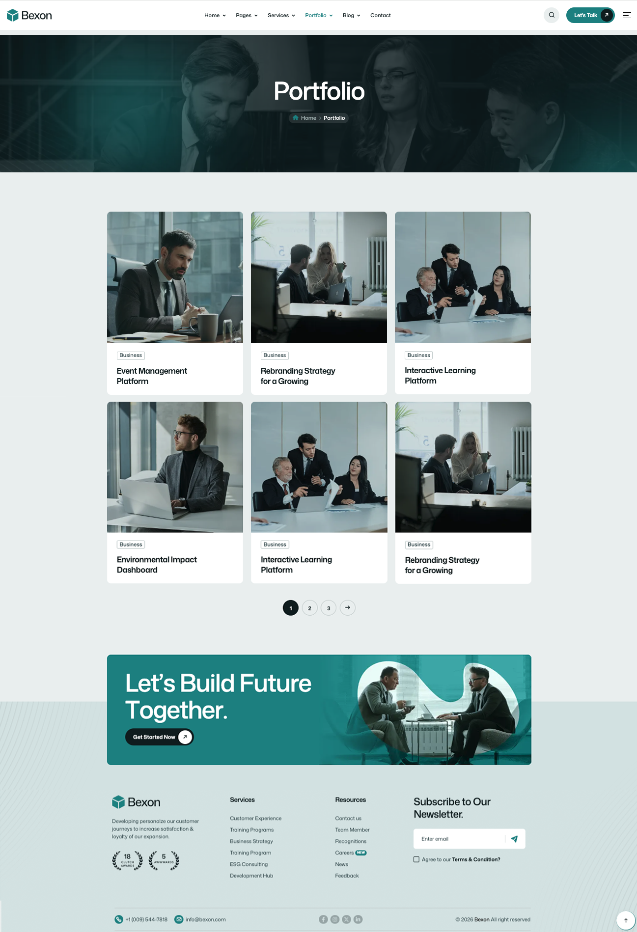
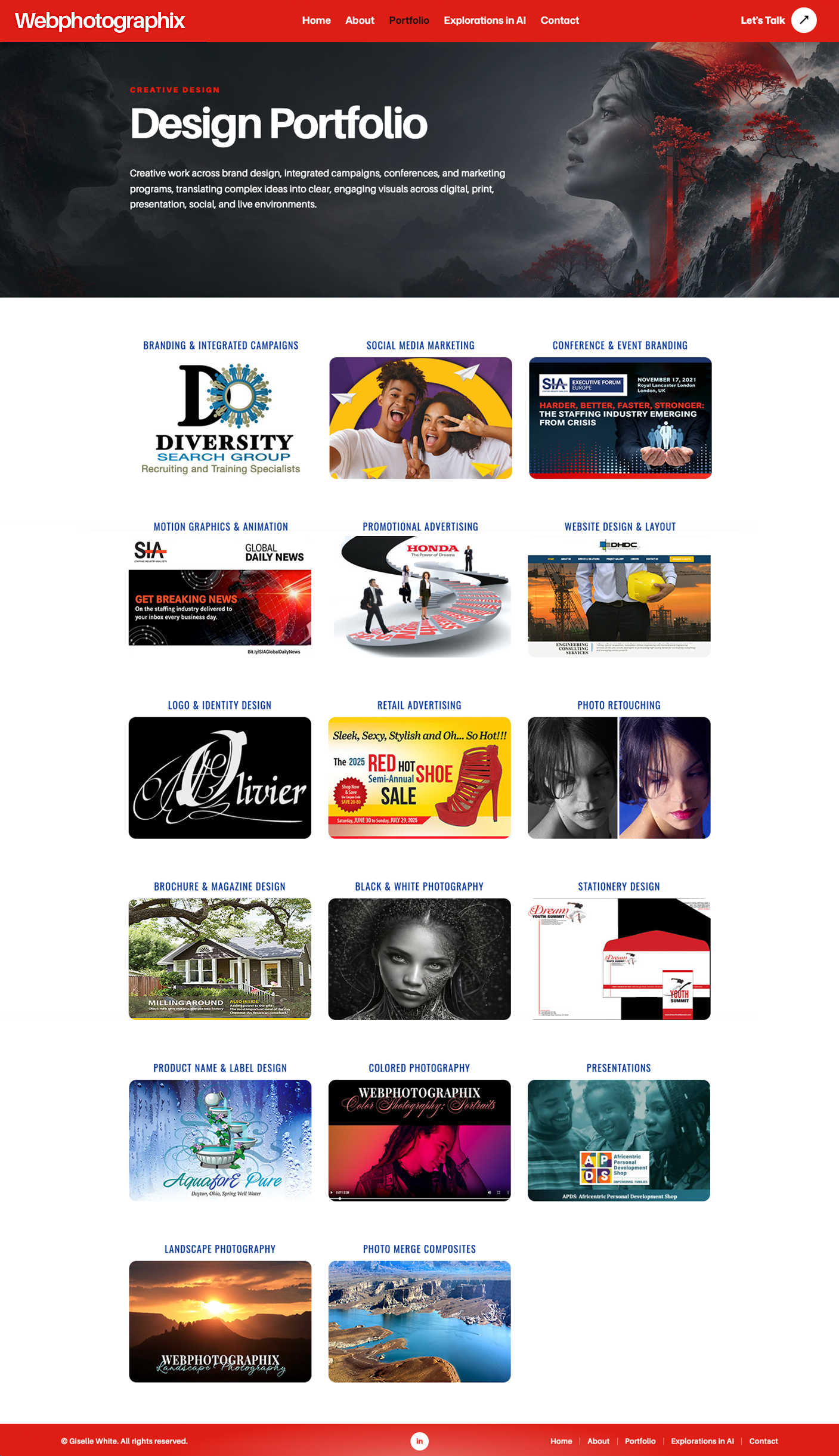


The template supplied the functionality and animation. The finished pages show how thoroughly the visual design and presentation were changed.
ChatGPT and Codex turned design instructions into HTML/CSS changes, built galleries, refined captions, corrected layouts, and handled repetitive updates across the site.
Different projects needed different presentations: conference signage, photography galleries, publications, and detailed case studies.
I directed and reviewed each stage, from broad layout decisions to image order, caption wording, color, and alignment.
A decade of additions had left website images in at least five locations, with deeply nested folders and inconsistent file paths. I knew where things lived because I built the site. Someone maintaining it after me would have had a harder time.
ChatGPT and Codex helped locate and collect those files through terminal commands, build a central image library, group assets by project and category, and rename files for clearer, more consistent paths. Where appropriate, filenames used lowercase letters and hyphens instead of spaces.
The reorganization was guided by my knowledge of the work. I identified the clients, projects, and categories that mattered and reviewed what belonged in each location. ChatGPT and Codex used terminal searches to inventory image files and page references, surface duplicates and outliers, collect the approved assets, and verify the new paths. I reviewed the pages and galleries, flagged missing or incorrect images, and directed corrections until the right files loaded in the right places.
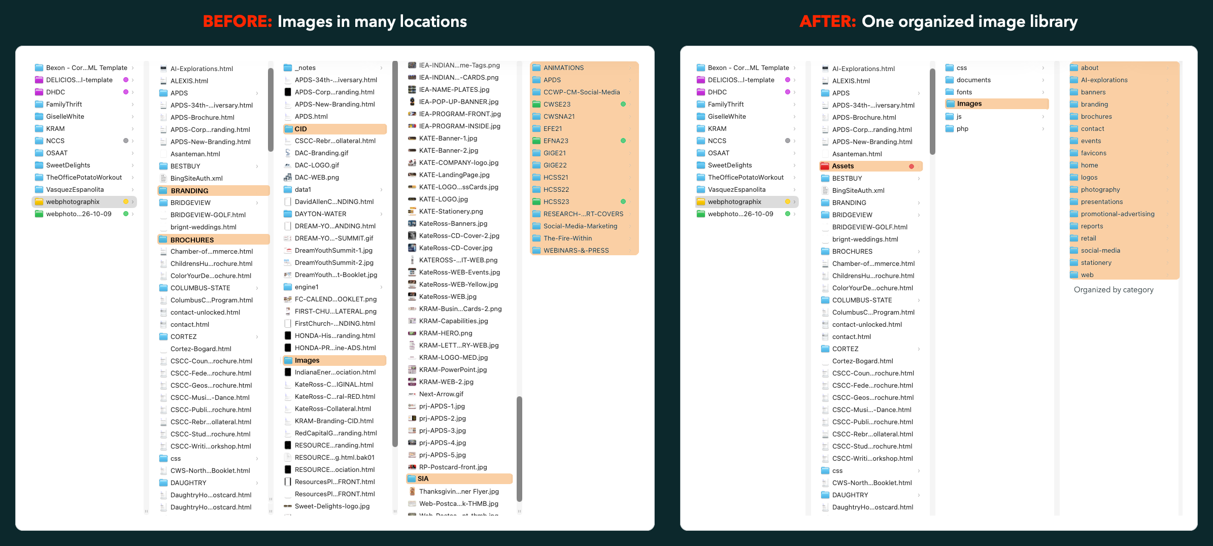
Assets/images, organizes them by purpose, and makes the library easier to understand and maintain.View full-size comparisonJust as important, we treated existing links carefully. Some legacy filenames had mixed capitalization and had worked for years. Changing their spelling or case without updating the references could have broken images and pages. We checked paths and accounted for old references while reorganizing the library.
Assess template components, animations, and layout options against the needs of the business and the creative work.
Set the visual direction and guide AI-assisted changes to page layouts, CSS, content structure, and galleries.
Arrange projects, write and revise captions, choose image sequences, and adapt presentation to the content.
Check hierarchy, spacing, alignment, responsive presentation, imagery, and the effects of changes on approved pages.
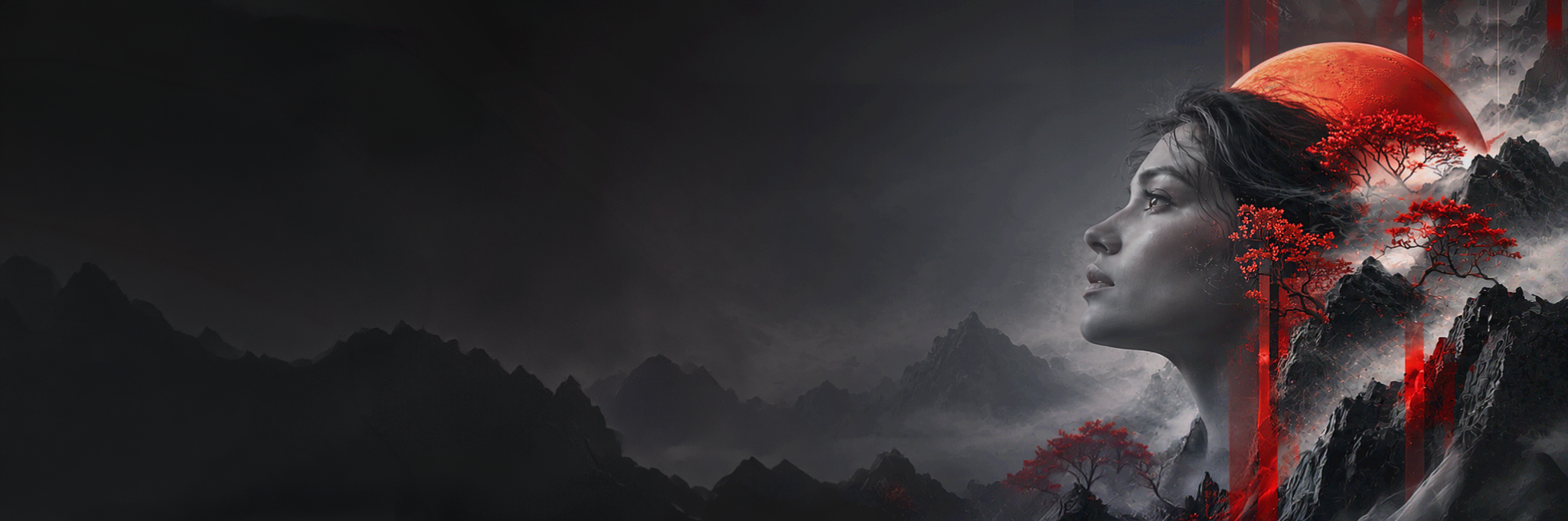
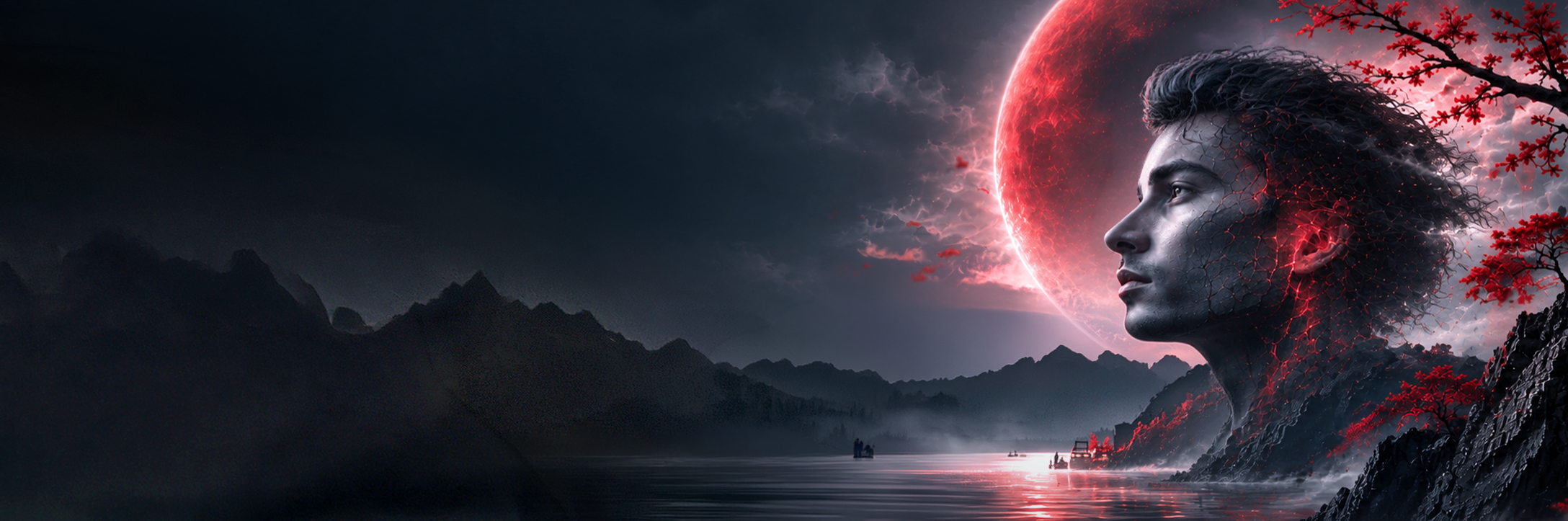
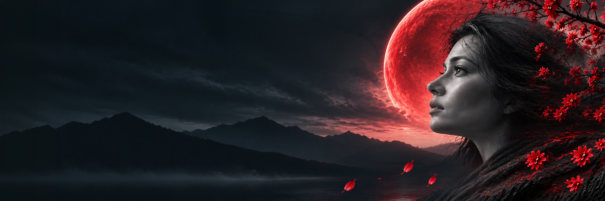
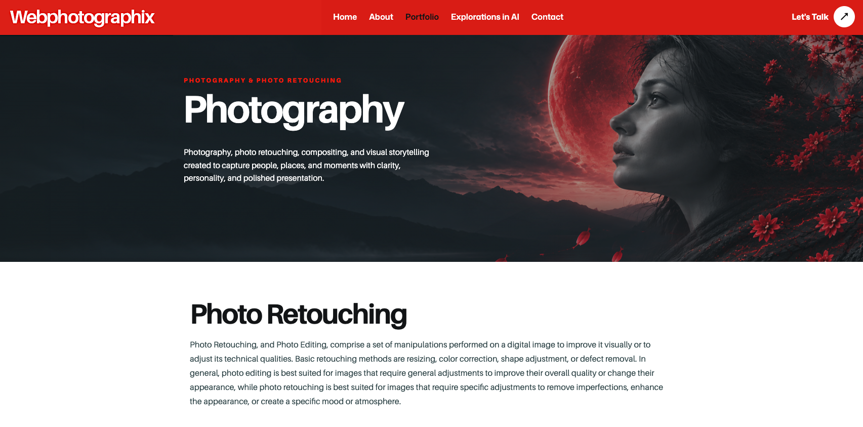
For the Photography, Retouching, and Compositing galleries, I directed new female banners to complement two existing designs. Cherry blossoms add movement while the dark left side keeps page headings readable.
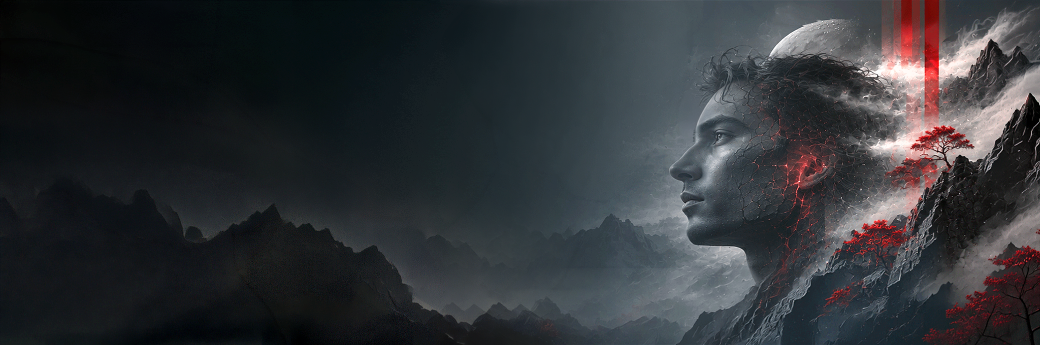
The early AI images looked dramatic but missed the brief. The woman's face departed from the established monochrome treatment; jagged mountains and heavily textured clouds made the background too busy; and a cherry blossom branch appeared to sprout from her head. Even when the scenery became quieter, the branch could look stiff, while changes to her forehead and nose made the face unnaturally angular. I kept directing the composition toward softer mist, fewer mountains, believable anatomy, natural branches, and a darker left side that wouldn't compete with the heading and introductory text.
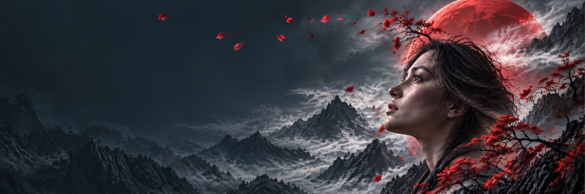
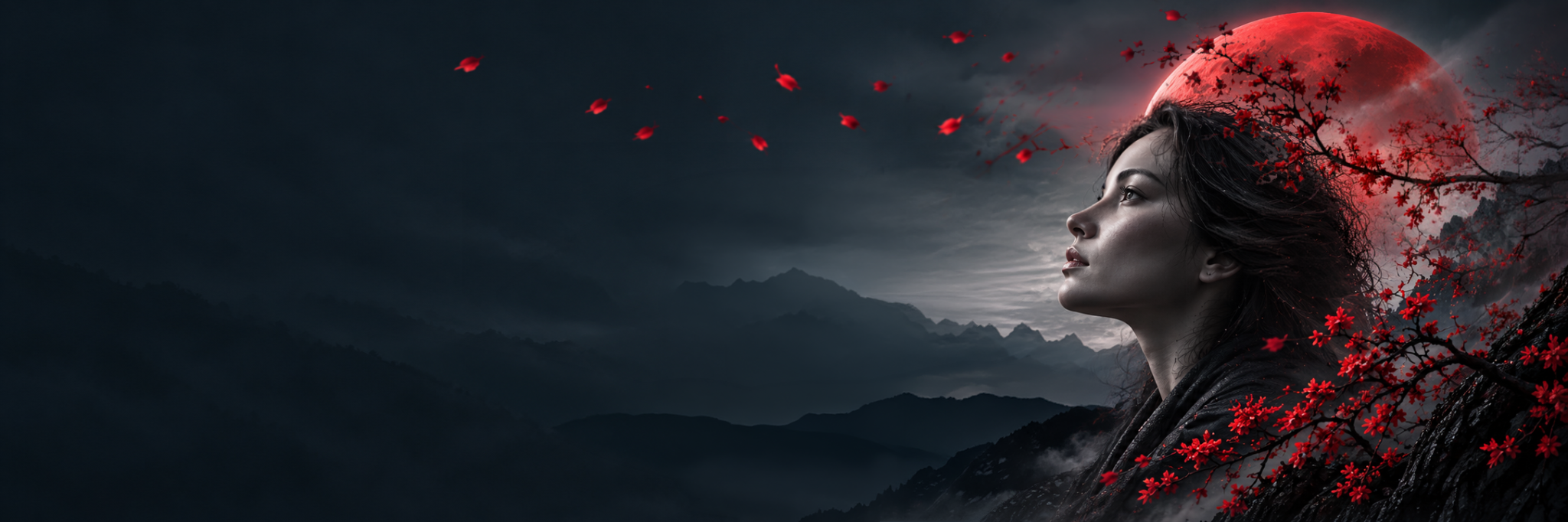
I built a Photoshop mockup to clarify the composition, selected the strongest AI result, and finished the image in Photoshop. I adjusted the blossoms, mountains, highlights, contrast, and opacity until the final Photography banner felt connected to the rest of the series.
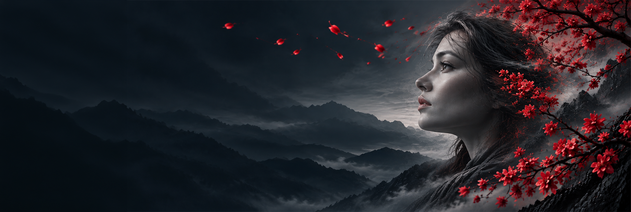
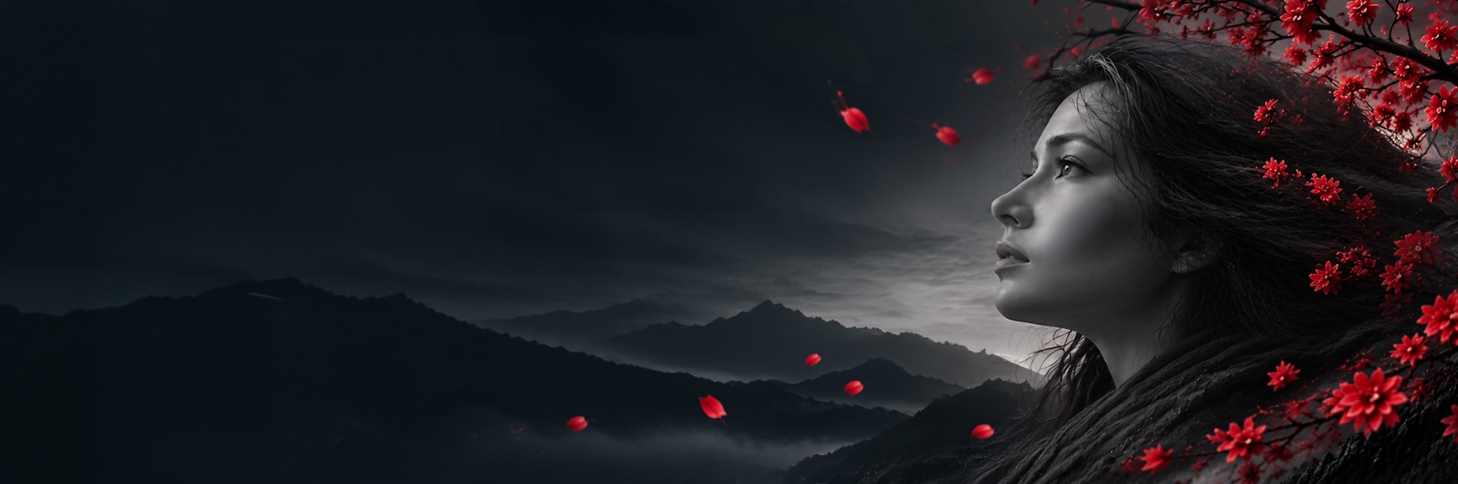
The second banner followed a related but separate direction, with a red planet behind the woman to complement the male gallery image. The AI variation shown here had a quieter landscape, but the long, rigid branch still looked unnatural, and the face needed better proportions. I refined the gallery banner in Photoshop so its portrait, branches, atmosphere, and red accents belonged alongside its companion.
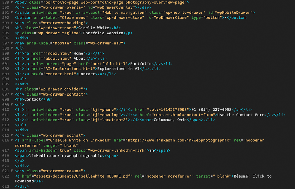
ChatGPT helped modernize legacy HTML/CSS and adapt pages for responsive screens. I also needed clean, readable code for maintaining the site in Dreamweaver.
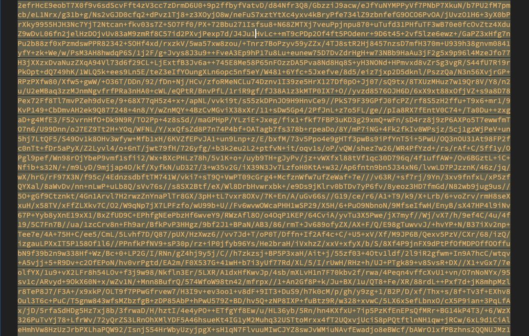
Later changes introduced a long Base64 image string that made the HTML difficult to navigate. I directed ChatGPT to restore readable code. I also requested properly indented JSON-LD for the site’s structured data.
For the Contact page, I provided an approved design from my Art Director site. The brief was precise: Keep the layout, animation, and functionality; change the colors and copy for Webphotographix.
ChatGPT repeatedly rebuilt the page, reversed the form and portrait, changed contact elements, and removed approved details. I redirected the revisions until the page matched the reference.
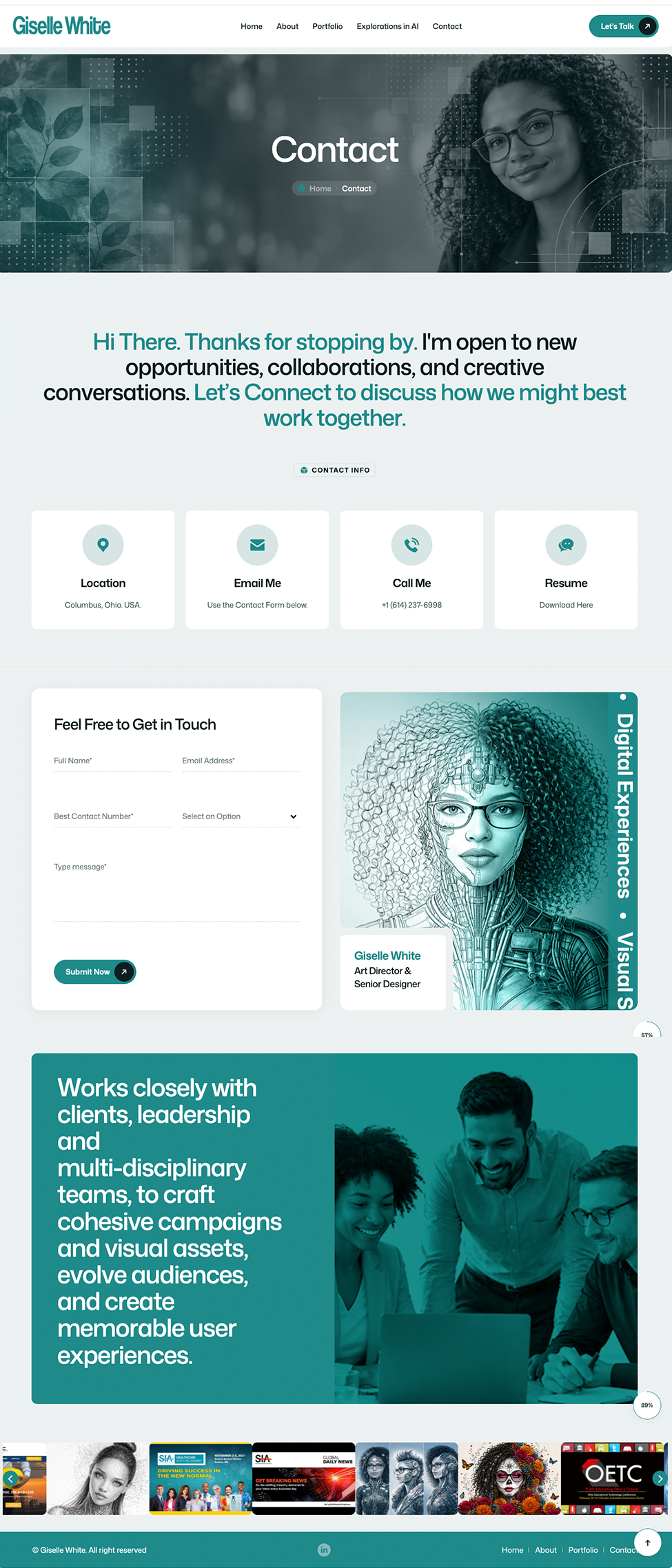
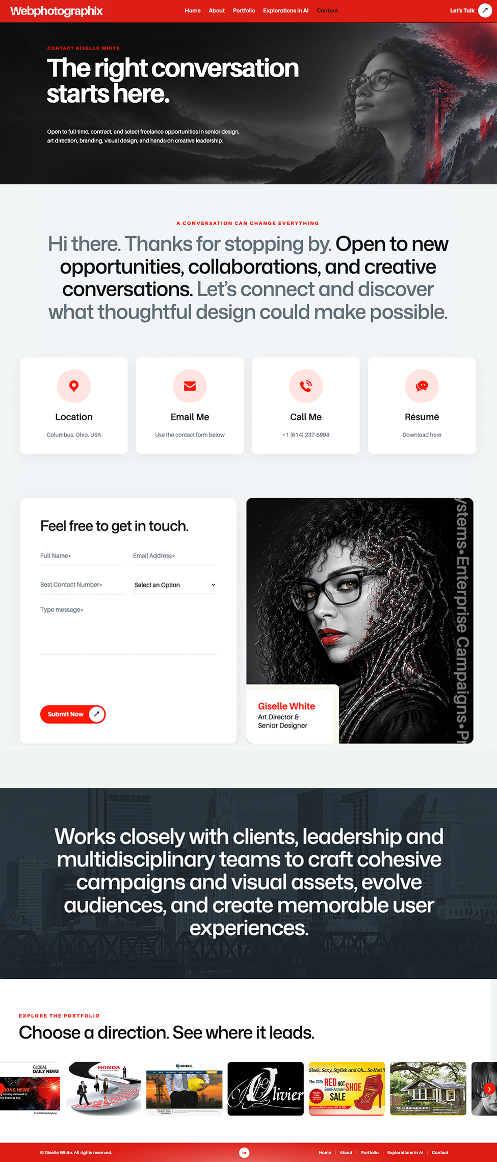
The comparison shows the two finished pages, not the rejected drafts. The lesson: Preserve approved design decisions. Change only what the brief requires.
The result is a responsive, 100-page Webphotographix business website showcasing years of work for clients, recruiters, and employers.
With ChatGPT and Codex, I rebuilt approximately 100 pages in under a month. AI handled substantial HTML/CSS development, galleries, and GSAP animation customization. I directed the results in Dreamweaver without coding every interaction myself.
We developed the showreel through more than 50 iterations, refining the moving red line, transitions, and the portrait’s gradual color changes. AI enabled sophisticated motion work; my reviews caught changes that disrupted previously approved details.
Final showreel: A motion-led introduction to Webphotographix. More than 50 iterations refined its directional red path, image transitions, and gradual color changes, with ongoing Art Direction to preserve approved details as the animation evolved.
The completed site combines custom Art Direction, responsive components, tailored galleries, and motion.
Creative Transformation
Turning an existing template into a distinctive visual experience.
Design at Scale
Organizing a decade of assets and a varied portfolio across approximately 100 pages.
Applied AI
Integrating AI into actual business design and web production.
Creative Control
Maintaining visual standards through direction, review, and refinement.
AI made a 100-page rebuild possible in under a month. ChatGPT and Codex accelerated the development, from responsive HTML and CSS to galleries and animation. But AI also created serious setbacks. It sometimes changed parts of the site I had already approved, ignored precise instructions, or altered shared CSS in ways that broke other pages. Correcting those problems could cost days, especially when repeated attempts failed to preserve what was already working. I directed the design, content, and revisions, deciding what could change and what had to stay untouched.
This project showed me how to use AI effectively on large creative projects: give it meaningful production work, review the results closely, and protect approved designs during every revision. Those lessons apply to websites, campaigns, and large content libraries.
The result is a modern, responsive Webphotographix website with a distinctive visual identity, completed at a scale and pace I could not have achieved alone. Visit Webphotographix Now ↗