
AI Explorations:
5. Ghost In Bloom
Ghost In Bloom:
When Machine Identity Meets Ritual, Memory,
and Celebration
Overview
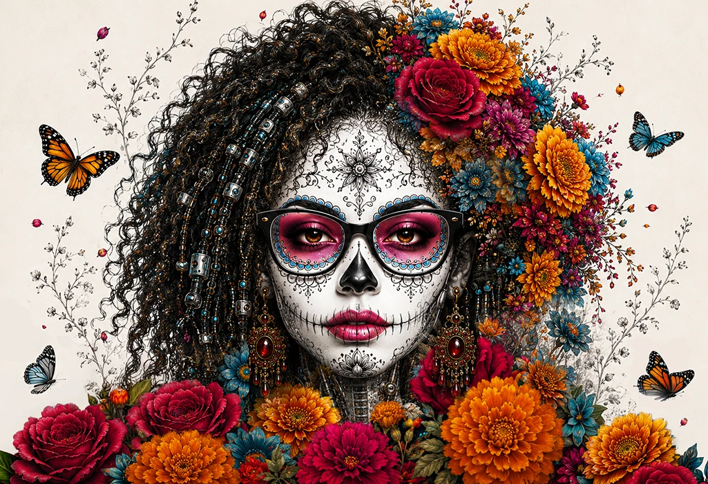
Ghost in Bloom began as an exploration of identity, ritual, memory, and celebration through the lens of AI-assisted image-making, inspired by El Día de los Muertos traditions.
A Mexican celebration honoring loved ones who have passed, El Día de los Muertos (The Day Of The Dead), embraces remembrance not through fear or sorrow, but through storytelling, ritual, beauty, and joy. Even in the presence of skulls and skeletal imagery, the focus remains on preserving identity, celebrating life, and maintaining connection across generations.
Inspired by that spirit, this study examined how likeness, symbolism, and creative intent could be carried across multiple visual interpretations while preserving the essence of the original subject. Botanical illustration, porcelain ornamentation, cybernetic structure, flowers, butterflies, and Day of the Dead-inspired motifs merge into a visual mythology where the organic and mechanical are not in conflict. They coexist.
What began as a search for compelling imagery became something far more revealing: an exploration of the strengths and limitations of current image-generation systems, the persistence required to guide them, and the role of human judgment in protecting what matters most.
Ultimately, Ghost in Bloom became a portrait of what happens when human persistence meets a powerful, imperfect tool.
Botanical illustration + Restored Porcelain. Human + Machine.
The project imagines a future where technology does not erase memory, identity, ritual, or beauty. Instead, those human and cultural markers become part of the machine itself.
My Contribution
Art Direction • Concept Development • Prompt Development • Identity Preservation • Visual Narrative • AI Evaluation • Photoshop Compositing & Refinement. This exploration focused on translating identity into an entirely new symbolic language while preserving the essence of the original subject. I developed the creative direction, guided the AI through iterative prompting across multiple platforms, evaluated hundreds of generated variations, identified where identity and symbolism began to break down, and used Photoshop to refine and protect the strongest ideas.
Rather than treating AI as the designer, I used it as an exploratory partner, making the creative decisions that shaped the final visual narrative.
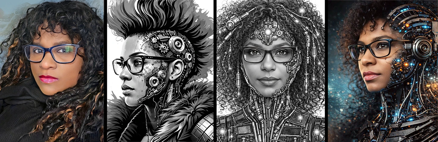
The Source Models
The final direction was not built from a single reference. It developed from several visual anchors that were combined, challenged, and refined across the process: a physical likeness reference, a mohawk cyborg, a detailed graphite cyborg, and a half-human cyborg figure used for later treatments.
Together, these references established the visual vocabulary of the series: identity, mechanical anatomy, profile structure, ornamentation, hair movement, floral symbolism, and contrast.
SOURCE: Various Image Likeness Samples of Giselle
SOURCE: Day Of The Dead Art References
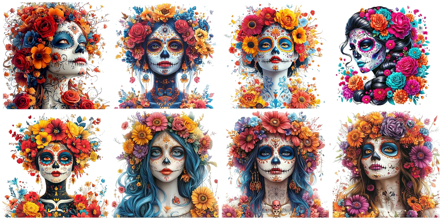
Source Images converted into the Day Of The Dead Art Style by ChatGPT
The Creative Trajectory
The process did not move in a straight line. It began with full-color celebration, moved through identity preservation and visual drift, then found its strongest direction when porcelain, monochrome botanical illustration, and saturated color began working together.
Source
Gathered visual anchors for likeness, machinery, hair, flowers, and profile.
Celebration
Built full-color Day of the Dead-inspired cyborgs with flowers and butterflies.
Drift
Tested how far the image could change before identity and proportions broke down.
Porcelain
Introduced the luminous white face as a symbolic and visual anchor.
Mythology
Resolved the image as a fusion of memory, machine, ritual, and emergence.
Phase One: Celebration Through Color
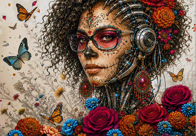
The first major direction leaned into the energy of celebration. Full-color flowers, butterflies, skin, facial markings, and mechanical details created a world that felt festive, alive, and abundant.
These images carried the spirit of Day of the Dead-inspired visual language: darkness, but not horror. Death, but not emptiness. Instead, the work became about color, ritual, adornment, remembrance, and the continuation of presence.
 Click to view larger.
Color as Celebration
Saturated floral cyborg with full-color face, flowers, and butterflies.
 Click to view larger.
Machine Meets Garden
Machinery, flowers, and butterflies begin to share the same world.
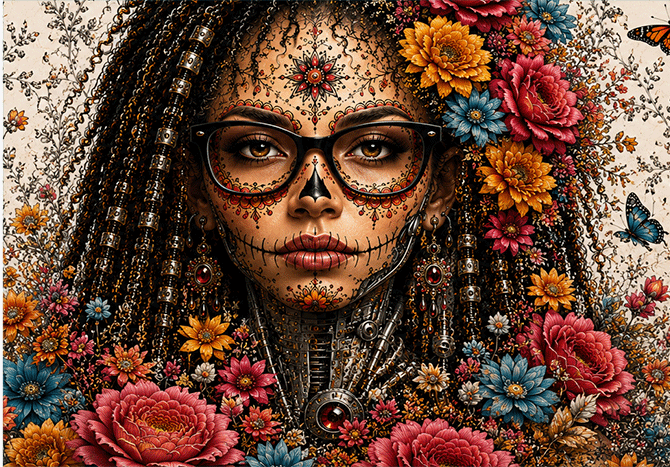
Prompt: Preserve facial identity and recognizable features. Create a biomechanical portrait inspired by Day of the Dead symbolism. Integrate flowers, butterflies, botanical elements, and cybernetic structures into a single cohesive visual language. Use richly saturated reds, oranges, magentas, golds, blues, and teal accents. Flowers should grow through and around mechanical structures rather than appear applied to them. Machinery should feel ornamental and elegant rather than industrial. Balance celebration, ritual, transformation, and beauty. Maintain strong visual detail while preserving clarity and hierarchy. Create an atmosphere that feels vibrant, symbolic, and alive.
The Challenge: When Beauty Replaced Identity
The biggest challenge was not generating a beautiful image. The AI could do that repeatedly. The challenge was preserving identity as the visual language became more elaborate.
As the images moved through color, flowers, porcelain, and mechanical detail, the figure repeatedly drifted toward a generic beauty template. Faces became thinner. Features became more idealized. Facial structure changed. The result was often attractive, but it no longer carried the identity that started the project.
Visual Likeness vs. Visual Drift
This became one of the most important parts of the study. A technically strong image can still fail if the person disappears. The goal was not to create an arbitrary beautiful cyborg. The goal was to preserve the feeling of a specific person transformed through ritual, machine, and memory.
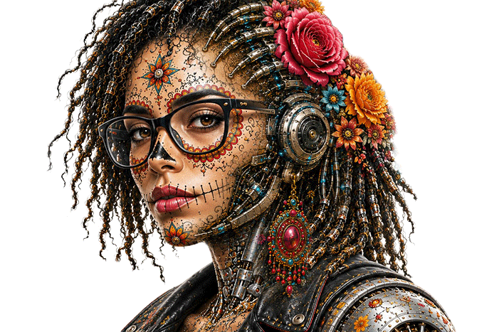
Identity Held
The face, glasses, expression, and proportions still feel close to the intended identity.
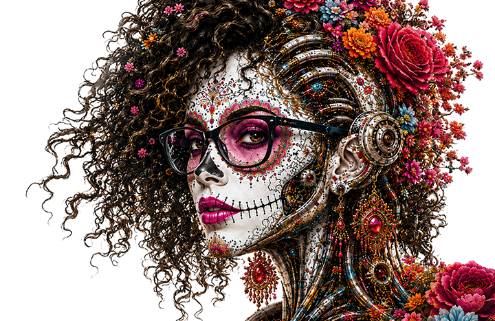
Identity Lost
Generic AI face of a beautiful Caucasian woman. The specific person is gone.
Phase Two: The Porcelain Breakthrough
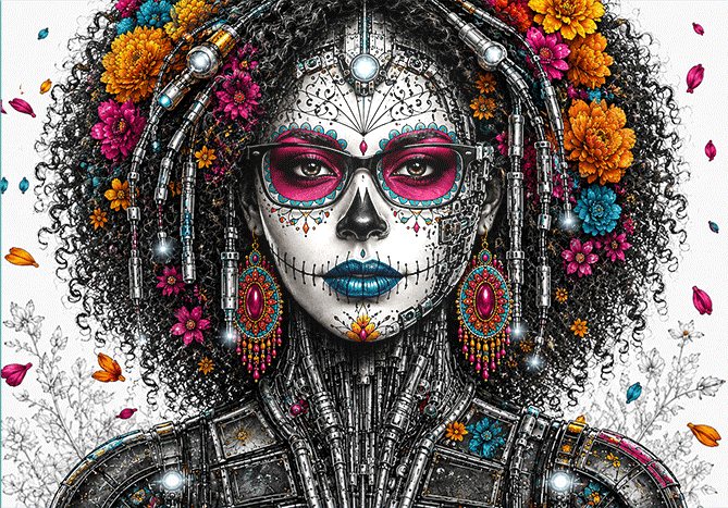
The most meaningful shift happened when the face became porcelain white while the lips, eyes, flowers, and butterflies remained saturated. This did more than change the palette. It changed the emotional structure of the image.
The fully colored versions were rich and celebratory, but every element competed for attention. The porcelain versions introduced hierarchy. The face became the visual anchor. The flowers, butterflies, and machinery could then support the subject instead of fighting with her.
The porcelain treatment also deepened the symbolism. It suggested preservation, memory, fragility, ceremony, and myth. The face no longer felt like painted skin alone. It began to read as something manufactured, preserved, and ritualized. That made the figure feel less like a costume and more like an icon.
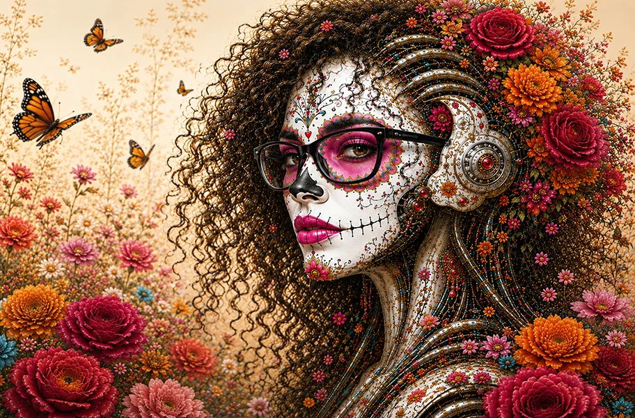
Full Color
Energetic, lush, and celebratory, but with more competition between face, flowers, and machinery.
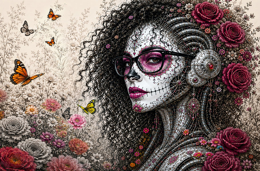
Porcelain Contrast
More resonant because the face becomes a luminous focal point and symbolic object.
Prompt: Preserve exact facial identity, proportions, and recognizable features. Transform the face into luminous porcelain enamel while maintaining likeness. Apply saturated magenta eye makeup and lips. Integrate ornamental porcelain detailing into adjacent cybernetic structures. Allow machinery, flowers, and botanical elements to support rather than compete with the face. Convert portions of the environment into monochrome botanical illustration while preserving selected flowers and butterflies in full color. Use contrast between monochrome and saturated color to create visual hierarchy. Allow the porcelain face to remain the brightest element in the composition. Create a sense of emergence, memory, ritual, and transformation. Balance human presence, mythology, and machine architecture within a single symbolic narrative.
Full-Color Garden vs. Monochrome Botanical Garden
The garden became a second turning point. When everything was rendered in full color, the image felt abundant, but also crowded. When the foliage shifted to monochrome botanical illustration, the image gained air, contrast, and structure.
The monochrome leaves, stems, ferns, and vines echoed the porcelain face without overpowering it. The saturated flowers and butterflies then became moments of life inside a quieter field of memory. This was the visual logic that was being reached for all along: some memories are vivid, some are fading, and some barely remain. The garden behaves like memory itself.

Abundance
Beautiful and lively, but dense. The color competes across the entire image.
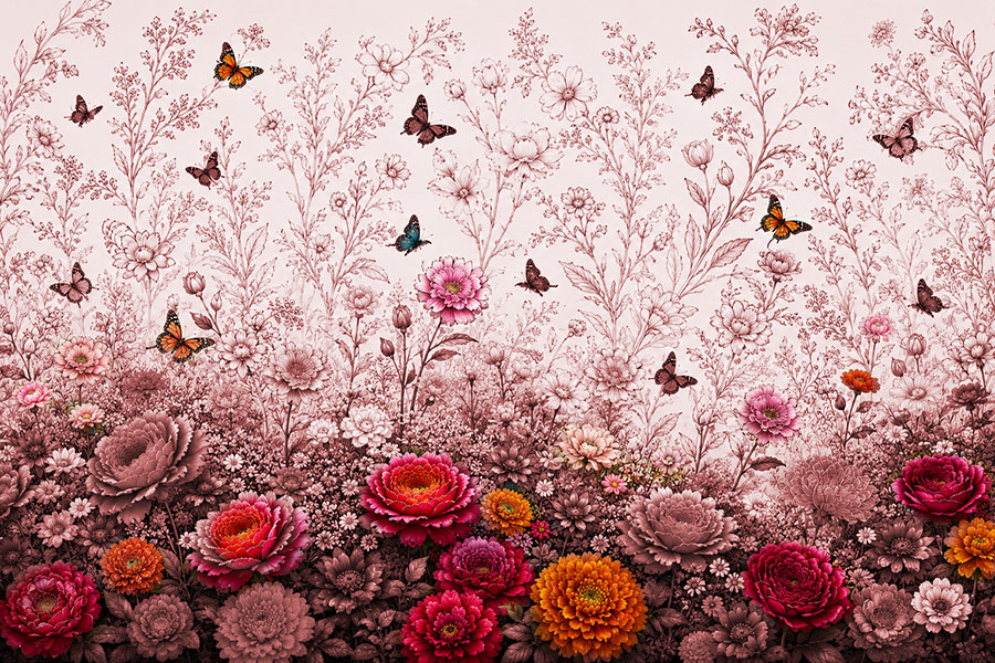
Emergence
More breathable. The monochrome or graphite foliage recede, allowing the face, flowers, and butterflies to come forward.
Prompt: Do not modify the character. Preserve exact face, likeness, facial proportions, glasses, hair length, curl structure, neck, body, machinery, porcelain treatment, flowers attached to the character, butterflies, color palette, and composition. Modify only the environment. Convert approximately 70% of background foliage into monochrome botanical illustration. Background vines, stems, leaves, ferns, branches, and secondary floral growth should appear as delicate graphite-and-ink botanical drawings. Create large pockets of negative space. Preserve selected flowers and all butterflies in full saturated color. Flowers should emerge naturally from the monochrome botanical environment rather than appearing pasted onto it. Avoid dark masses, muddy foliage, heavy texture, clutter, dense bouquets, visual noise, and gritty surfaces.
Symbolism: What the Image Carries
Each visual element became part of the mythology of the piece. The flowers, butterflies, porcelain, machinery, and drawn botanical forms were not simply decorative. They each carried meaning that connected the work to the larger concept behind the series.
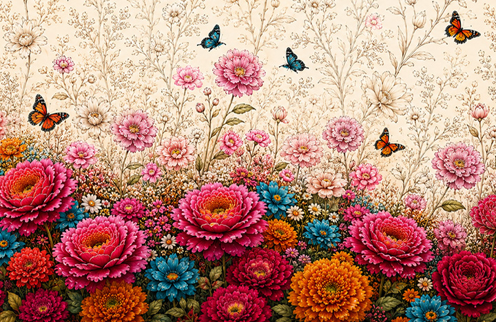
Flowers
Celebration, remembrance, growth, and energy continuing after transformation.
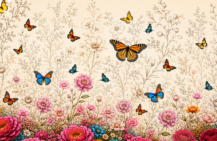
Butterflies
Transition, movement, rebirth, and passage between states of being.
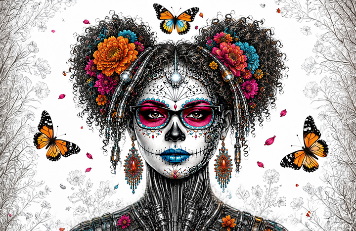
Porcelain
Preservation, fragility, ritual, and the face as an object of memory.
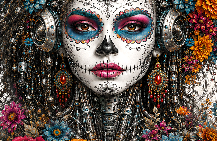
Machine
Structure, permanence, transformation, and the future carrying the past forward.
The Human Role: Direction, Judgment, and Craft
This project reminded me that AI didn't replace the designer's role. If anything, it made that role more visible.
AI was great at generating possibilities. But it couldn't decide which ideas supported the concept, which details distracted from it, or when a beautiful image was actually the wrong image.
AI could generate options. The designer had to decide what belonged, what broke the concept, and what needed to be rebuilt manually.
Prompt: Preserve this exact image. Do not redesign, recompose, re-crop, restyle, or reinterpret the artwork. Do not change the face, likeness, facial proportions, hair silhouette, glasses, flowers, butterflies, cybernetics, or layout. Change only the gritty line work and AI texture noise. Replace dirty, broken, muddy, scratchy marks with thin, elegant, intentional draftsman-style botanical line work. Remove meaningless filler, speckling, and visual static. Keep the same composition and color hierarchy. The goal is restoration, not regeneration.
Art Director's Perspective: Prompting Became Protecting
This exploration began with a very different expectation. Like many people encountering today's AI technology, I believed the message that generative AI could quickly transform an idea into a finished result. And my goal seemed straightforward: Use AI to translate my likeness into a Día de los Muertos inspired cyborg, explore a few visual directions, choose the strongest results, and refine them into three to five strong visuals that I could use for this case study.
I assumed the design portion of the process would take two or three hours. It did not. Instead, it took five days.
The first 2-3 hours were exciting. Using several source images, the AI generated compelling interpretations of the concept and responded well to broad stylistic direction. It felt collaborative, playful, and full of possibility. Then it all changed.
Once an image reached roughly 75 to 85 percent completion, the goal was no longer exploration. The goal was preservation. I wasn't asking for new ideas. I was asking the system to keep everything that was already working and improve one specific detail. That was when the process became unexpectedly difficult.
What I thought would be a final cleanup pass turned into days of iteration. Fixing one problem often introduced several new ones:
• A request to refine gritty line work reorganized the garden.
• Reducing visual noise altered proportions.
• Preserving identity changed facial features... And so on.
If I had known from the beginning that this exploration would consume five days, I would not have started it at all. At the time, building and launching my portfolio website was the priority. But, once I started, and could see the image of what I wanted in my head, I couldn't let it go.
The experience revealed an important distinction:
Creating the garden turned out to be the most difficult part of the design, as the garden is designed to behave like memory itself: The foreground, rendered in full color, represents the abundance of life, where saturated flowers and butterflies become moments of life inside a quieter field of memory. As foreground saturation moves to a monochromatic background palette, and fully formed flowers and leaves transition to linework, this represents the visual logic: Some memories are vivid, some are fading, and some barely remain.
Once I had a solid mockup of the garden, my exploration began with what seemed like a simple request:
"Keep everything exactly the same. Just clean up the line work."
If a designer said that to another designer, everyone would understand what it meant:
• Don't rearrange the layout of objects.
• Don't redesign the composition.
• Don't move the flowers.
• Don't change the face.
• Don't invent new details.
• Don't alter the lighting.
Just improve the line quality as requested.
But, the AI didn't understand it that way.
The Generalization vs. Specificity Trap
When creating a new image, as in: "Create a Day Of The Dead Cyborg and place her in a garden with butterflies, and flowers, in a monochromatic palette", the AI had a great deal of freedom. In simple terms, the process looked something like this:
80% freedom | 20% restrictions.
Freedom is often where AI shines.
But as the image improves, the balance shifts. Until eventually, with my simple request to change the gritty line work in the garden to clean, elegant, draftsman-like, illustrative work... "Only change that one thing." That flipped the balance to:
80% restraint | 20% freedom as the AI has to:
• Keep the face exactly the same.
• Keep the likeness.
• Keep the proportions.
• Keep the flowers.
• Keep the butterflies.
• Keep the composition.
• Keep the lighting.
• Keep the atmosphere.
And that's where the struggle begins.
The model is being asked to do two contradictory things at once:
• Recreate exactly.
• Reinterpret elegantly.
Humans naturally think in layers and hierarchy, so we instinctively understand this distinction.
• The face matters more than the flowers.
• The composition matters more than the texture.
• The requested change matters more than unrelated details.
Consequently, my request to only clean up the gritty garden line work unexpectedly reorganized the garden, altered the flowers, changed proportions, redesigned the cybernetics, added artifacts, tentacles and sea-creature appendages to the cyborg, made the lighting darker, caused likeness drift, and changed the entire composition.
What began as a nine-line prompt eventually grew into six pages of instructions, and the result still wouldn't hold. The system could explain the corrections perfectly in words, then generate the exact opposite visually.
That is why the 9-line prompt became six pages.
• Not because I was bad at prompting.
• Not because I was being overly controlling.
• Not because the AI was stupid.
But because: I crossed the invisible threshold where generation stopped being the right tool for the job.
At 20% complete: AI was brilliant.
At 60% complete: AI was helpful.
At 85% complete: AI became dangerous.
Because, at 85% completion, every decision mattered. And the more you constrain the AI, the more brittle the system becomes.
And that's the irony of the whole experience. The better the image became, the worse the generator became at helping to finish it. Which is exactly why, the final polish came not from better prompting... But from fixing mistakes and refining the image in Photoshop.
Why Photoshop Succeeded
Photoshop actually works the way humans think.
• It has layers.
• It lets you say: Leave everything. Only touch this.
• You can lighten the tentacles.
• You can remove grit.
• You can add/subtract or repair hair/curls.
• You can mask butterflies.
• You can preserve identity.
Photoshop obeys. AI generators don't yet have that granularity.
Lessons Learned
Final Image Set
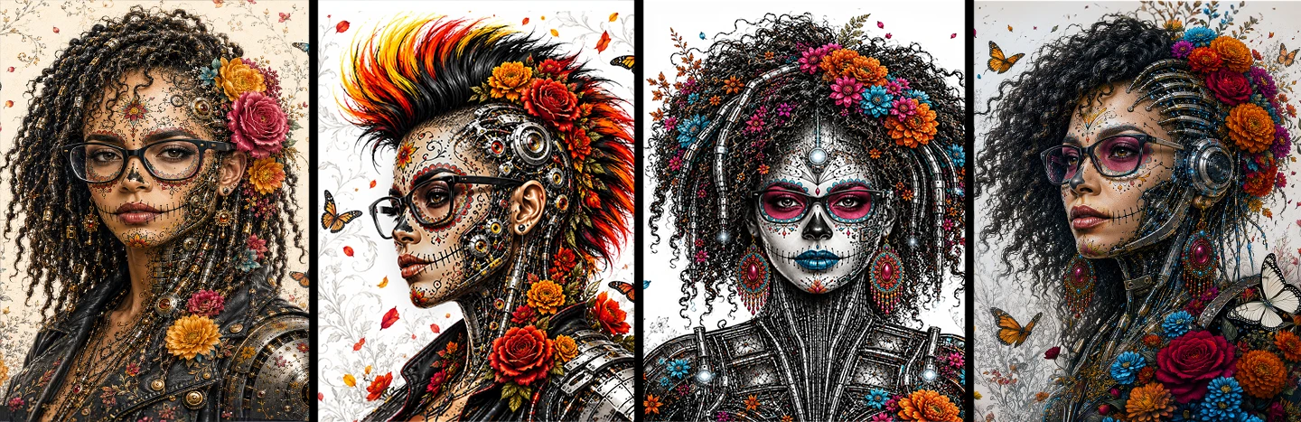
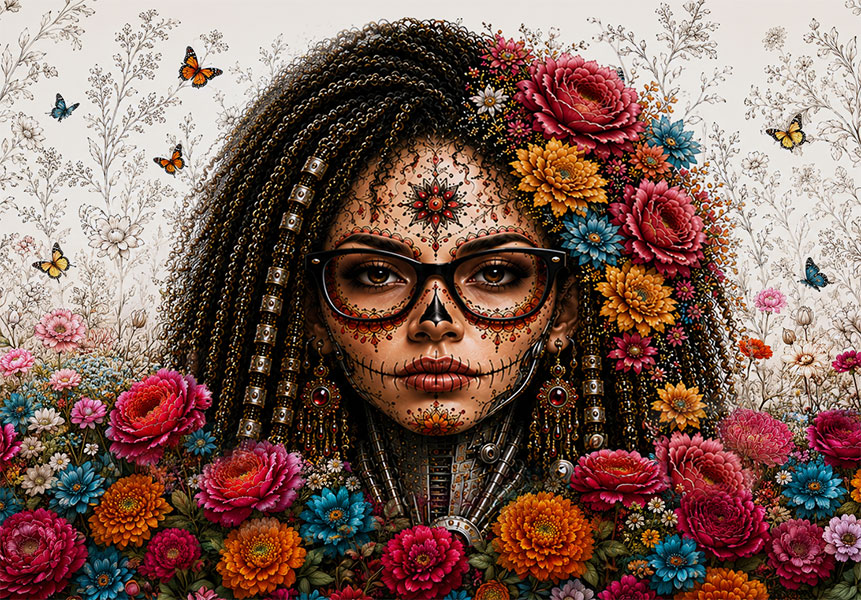
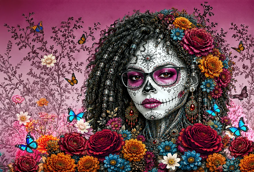
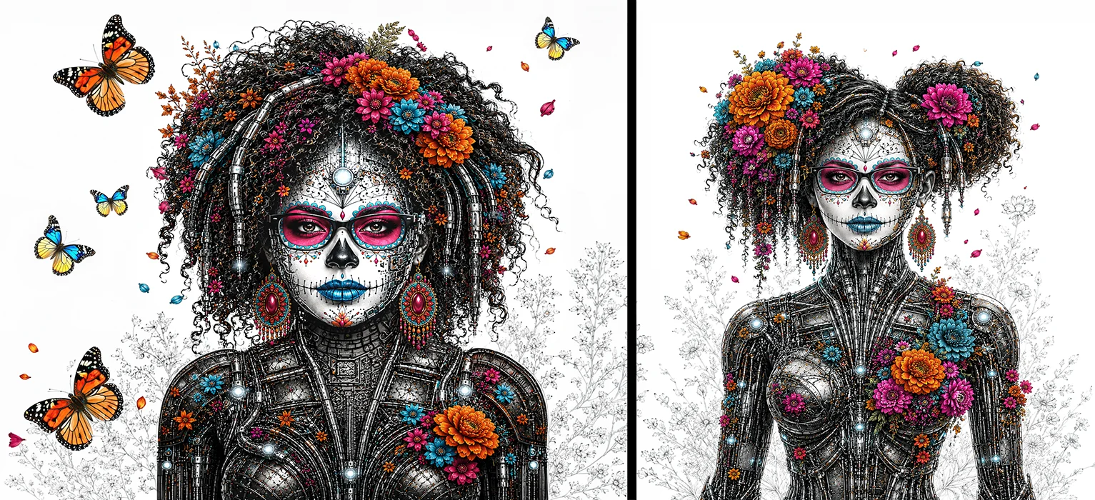
The final image set presents the strongest resolved directions from the exploration: A saturated celebration image, a quieter porcelain-and-botanical treatment, and a tighter integration study where hair, flowers, machinery, butterflies, and graphite illustration begin to work as one visual language.
Rather than showing every iteration, this selection focuses on the arc of the project: from visual abundance to clearer hierarchy, from generated beauty to directed symbolism, and from experimentation to a more deliberate mythology of memory, ritual, identity, and machine.
Celebration
The saturated version that shows ritual, flowers, butterflies, and machine abundance.
Memory
The porcelain version that creates stronger hierarchy and symbolic presence.
Integration
Detail of hair, porcelain, flowers, machinery, and graphite botanical elements working together.
Closing Thought
Technology is often framed around efficiency, speed, and progress. This exploration imagines something different: A machine that still carries memory, symbolism, culture, beauty, and human presence. That reframing connects directly to what Día de los Muertos has always understood. The tradition does not mourn what is lost. It insists on what continues. The essential identity, the personality, the spirit and presence of a person, survives the transformation of form. The celebration is not about death. It is about the refusal to let memory disappear.
That is the same thing this entire series has been about. Every case study, from the first portrait reconstruction, to the porcelain cyborg surrounded by graphite botanicals, has been a study in one question: Can identity survive transformation? Not just visually, but conceptually? Can a specific presence survive a change of style, medium, material, and cultural language?
Watching a face drift into a generic AI ideal, and then pulling it back repeatedly, was not just a technical exercise. It was the same fight that runs through Día de los Muertos itself: the insistence that transformation does not have to mean erasure. That something essential can hold its shape even as everything around it changes.
The visual language developed across this series has a name: Bio-Symbolic Portraiture. It draws from the intersection of vanitas still-life tradition, Art Nouveau's integration of the organic and ornamental, and contemporary dark editorial photography.
For branding, this approach has a direct application: It is a framework for communicating legacy, continuity, and reinvention without erasure. Any brand navigating transformation, whether a relaunch, a heritage narrative, or a cultural campaign, can draw on the same logic. The identity changes form. It does not disappear.
The flowers in these images are not decoration. They are memory. The butterflies are not ornament. They are passage. The porcelain face is not a style choice. It is a statement: Preserved, not frozen. Present, not gone. Transformed, but continuous.
If the machine carries memory forward, who decides what is worth keeping?
OUTCOME: What This Exploration Revealed
This final case study brought the series back to its strongest throughline: contrast, identity, and transformation. But it went further. It asked whether a visual idea could survive being translated into an entirely different cultural and symbolic language, and it proved that the answer depends entirely on how firmly the designer holds the concept.
The hardest part of any AI workflow is not getting to 70%. It is holding the remaining 30% without the system rebuilding what already worked.
Symbolic contrast does more emotional work than full color alone. Porcelain against a saturated environment creates hierarchy, meaning, and memory in a single visual decision.
Identity preservation is not a technical problem. It is a conceptual commitment. The designer has to care more about continuity than the system does, and act on that care at every step.
Translating a visual identity across completely different symbolic languages, from cybernetic portrait to cultural mythology, is where art direction becomes most visible and most valuable.