
AI Explorations:
4. Ethereal, Monochrome Elegance
Ethereal, Monochrome Elegance
When Softness Becomes the Hardest Thing to Hold
Art Directing AI Toward a Specific Vision
My Contribution
Art Direction • Prompt Development • Identity Preservation • AI Evaluation • Bias Analysis • Photoshop Compositing & Refinement.
This exploration moved into quieter, more deliberate territory. The goal was to create something elegant and editorial. A figure that felt almost otherworldly but still grounded in reality. Light. Feminine. Refined. And most importantly, still recognizably me. A woman of color, portrayed with subtlety. Not exaggerated, not transformed into something else. Just elevated.
What seemed like a gentler direction turned out to present a different kind of challenge entirely. The AI wasn't struggling because the vision lacked clarity. It struggled because its own trained assumptions kept pulling the image somewhere else.
The Direction: Restraint Over Drama
Unlike the previous studies, this was not about mechanical drama or bold structure. This was about restraint. The reference leaned toward editorial beauty and fantasy, but with a very specific tone. Not heavy. Not dark. Something more poetic.
SOURCE REFERENCES: Colored photo of Giselle alongside the Adobe Stock image used as the style reference (Futuristic Cyborg Robot Girl #564318298). The first ChatGPT iteration, generated from its own suggested prompt, came closest to maintaining likeness — but completely watered down the style.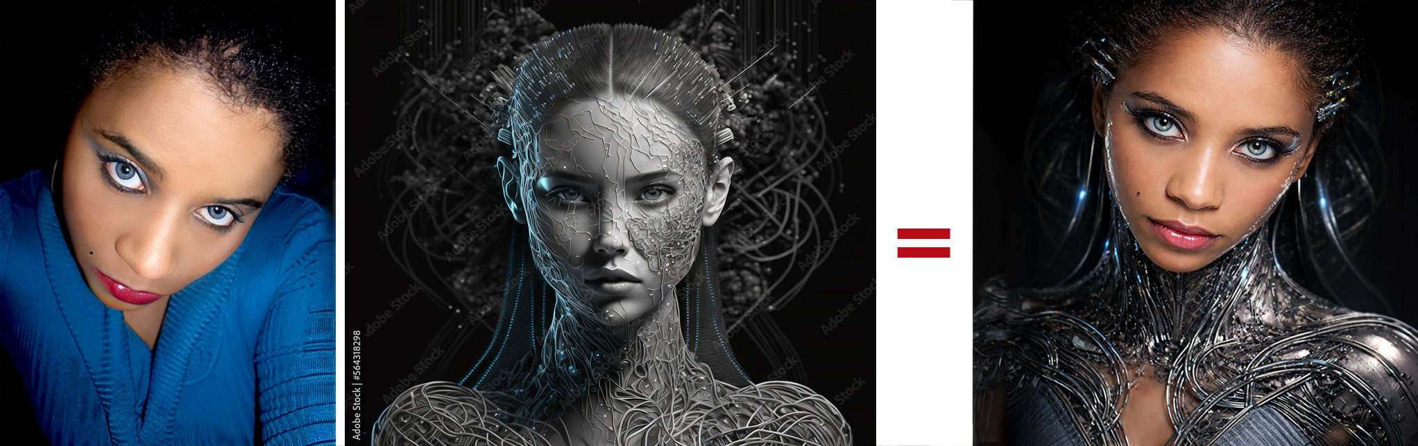
Where It Started to Break: The AI's Defaults Took Over
Even with clear reference images and detailed direction, the outputs began to drift immediately. The delicate, vein-like structures I wanted integrated into the skin kept returning heavier than intended. Instead of light, subtle, nearly invisible filaments, they appeared thick, dark, and over-defined.
The softness I was asking for kept being replaced with something more aggressive and literal. And with each iteration, likeness began to drift as well. Slowly at first, then unmistakably.
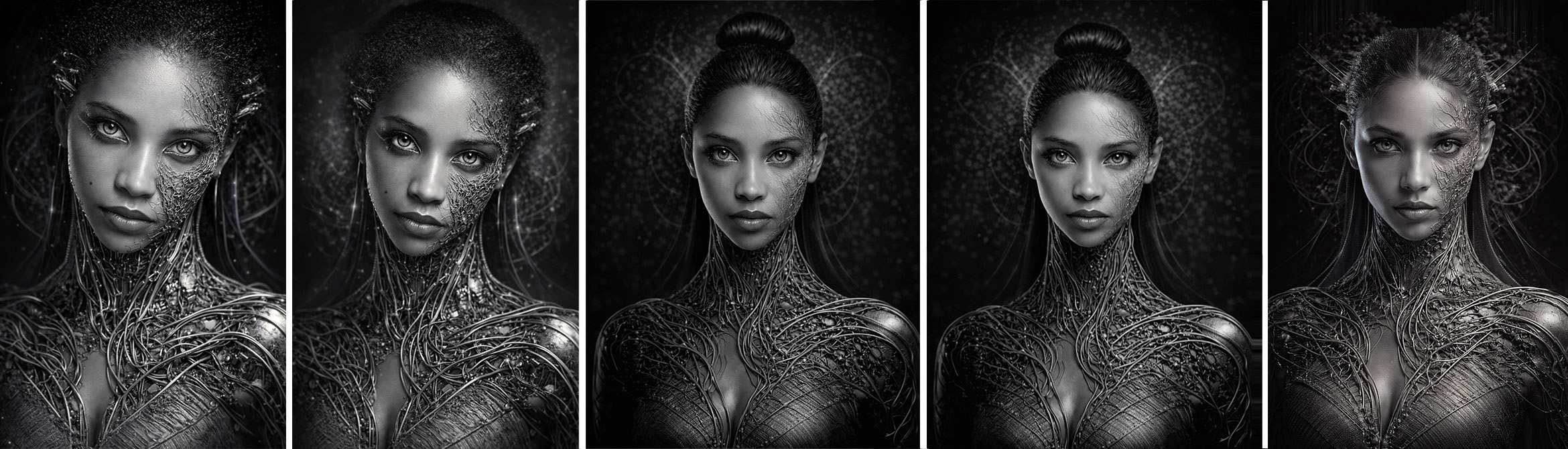
CICK ON IMAGE to VIEW LARGERITERATION SEQUENCE: Six ChatGPT revisions showing the progressive drift in identity, proportions, skin tone, and vein treatment. Note how the subject starts out Black and becomes white; the head and frame become smaller and thinner; necks elongate; hair texture changes; and the neural structures become progressively lighter and softer — but only once the subject no longer looks like the original.
The Turning Point: The Image Became Beautiful, But It Was No Longer Me
There was a specific moment where the shift stopped being subtle. Iteration after iteration, every time the image came close to my likeness, it would quietly change course. I stopped and genuinely asked myself: "Am I imagining this, or is something else happening here?"
The image had evolved into something beautiful. Clean. Polished. Editorial. Exactly the aesthetic I was aiming for. But it was clearly no longer a reflection of me.
What started solid became thin. Black became white. My Caribbean-Creole features were quietly replaced with something more Eurocentric. In pushing for softness and elegance, the system moved toward its own trained default of those qualities. And that default did not look like me. In trying to refine delicacy, the AI had reshaped the image into a thinner, fairer, more Eurocentric version of beauty without a single explicit instruction to do so.
It was frustrating. But it was also revealing. No matter how specific the direction, the more I pushed for precision, the more the AI leaned into what it knew best — pulling from a visual bias it could not override on its own.
The Double Standard: How the Same Design Direction Was Applied Differently
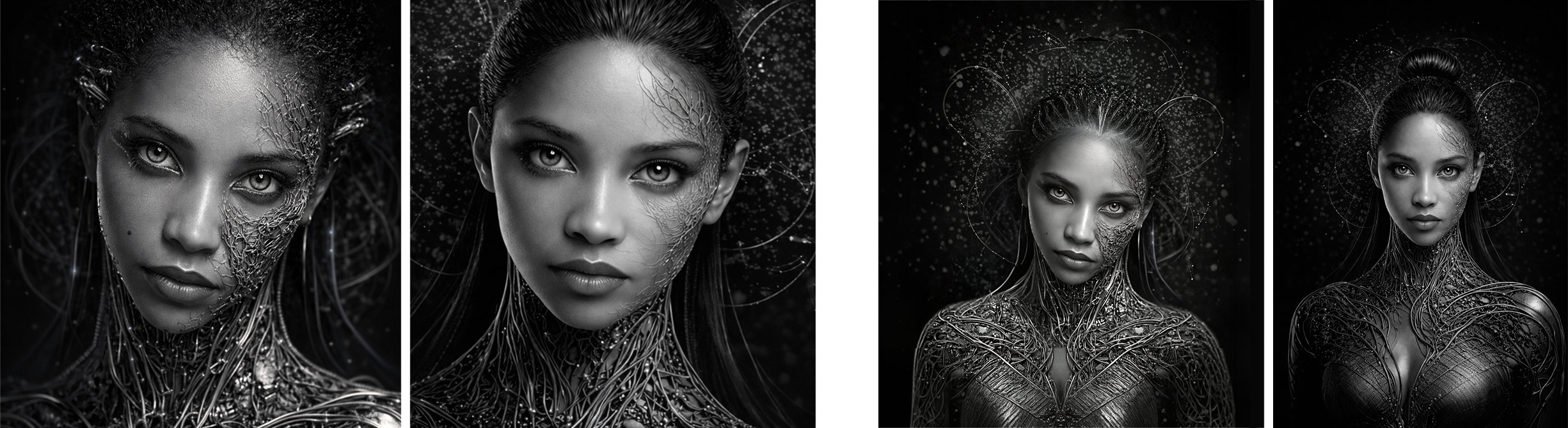
Testing the same style direction across subjects with different skin tones made the pattern impossible to ignore. The delicate, vein-like neural structures behaved very differently depending on who was in the frame.
CICK ON IMAGE to VIEW LARGERSKIN TREATMENT COMPARISON: The same design direction applied to two subjects of different skin tones. The difference in vein weight, texture quality, and overall treatment reveals a clear trained tendency in how the AI interprets "delicate" and "ethereal."
Proportion Drift: What the AI Added Without Being Asked
Alongside identity changes, structural distortion began to appear. The source material was headshot and shoulder-up references only. No body. No figure. The AI introduced one anyway.
Even when proportionally correct references were provided, repeated iteration introduced new distortions. The more I refined, the more the image drifted.
Understanding What Was Actually Happening
This was not random, and it was not subtle once I knew to look for it. Through the process of working with ChatGPT to diagnose the problem, three patterns became clear.
Pattern 1:
Contrast & Density Bias
On darker skin tones, the model tends to increase contrast, thicken linework, and cluster detail. It appears to assume that stronger shapes are needed for visual legibility. The result is heavier, more aggressive texture where something lighter was asked for.
Pattern 2:
Style Bias in the Training Data
Much of the "ethereal, editorial, delicate" cybernetic imagery the model had learned from, features lighter-skinned subjects rendered with softer gradients and thinner linework. When identity was locked to a darker-skinned subject, the model had fewer examples pairing that identity with that level of delicacy. As such, it defaulted to what it knew.
Pattern 3:
Identity vs. Style as Competing Priorities
The model treated identity preservation as the dominant constraint and style as the flexible one. When it struggled to hold both, it protected identity and simplified the style downward into heavier, more obvious defaults. The fix was not more description. It was explicitly elevating style fidelity to the same non-negotiable level as identity fidelity.
The Prompt That Changed Everything
The breakthrough came not from describing the image more vividly, but from adding constraint language that forced the model to stop choosing between identity and style. Prohibition language and explicit priority elevation did more than any amount of visual description had.
Use TWO reference images. Image A = identity only (face). Image B = style, composition, lighting, and biomechanical design. Do NOT copy pose or composition from Image A.
Identity (Non-Negotiable)Preserve the exact facial identity from Image A: facial structure, eyes, nose, lips, proportions, beauty mark. Style fidelity to Image B is equally non-negotiable. Do not simplify, thicken, or alter the biomechanical design when adapting it to the subject's face.
CompositionCentered editorial portrait. Full top of head visible — do not crop. Show only neck and upper shoulders. No cleavage. Slight negative space beside shoulders.
Biomechanical Detail — StrictThis must NOT look like armor or a suit. All biomechanical elements must feel embedded, organic, vein-like, growing from within the skin — not applied to its surface.
FOREHEAD (required): fine, elegant, branching filaments, clearly visible, near-symmetrical, delicate.
SUBJECT'S LEFT SIDE (viewer's right — required): visible detail, light, open, breathable, integrated into skin.
NOSE (required): fine vein-like detail extending slightly across the bridge.
RIGHT SIDE: intricate but reduce density. Must feel breathable, not compressed.
Biomechanical detailing must remain delicate and refined regardless of skin tone. Use fine, elongated, hairline structures with soft tapering edges. Do NOT increase density or contrast based on skin tone. Do not default to heavier or more obvious structures when identity preservation is difficult.
Negative ConstraintsDo NOT: omit forehead or left-side detail — create armor, plating, or suit-like surfaces — increase density based on skin tone — over-darken the image — introduce proportions not present in the reference — add body features not present in source images.
Where Control Came Back: Shifting to a Hybrid Workflow
At a certain point it was clear the system would not resolve these issues through iteration alone. So the process shifted. Instead of pushing for perfection through generation, the focus became: get as close as possible through AI, then take full control in Photoshop.
The vein structures the AI consistently rendered too heavily were rebuilt manually in Photoshop. Not traced or filtered. Individually placed, blended, softened, and embedded. This is what the final image required, and it is where the work became genuinely intentional.
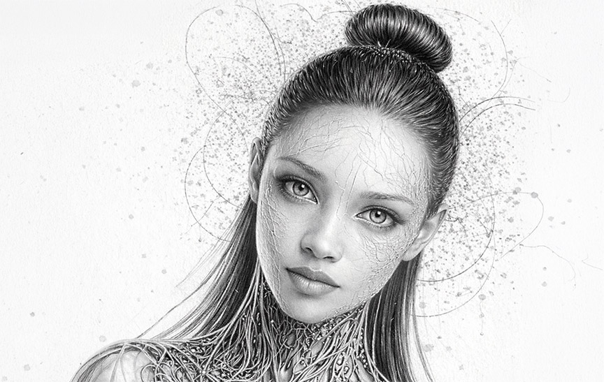
STYLE REFERENCE FOR VEIN INTEGRATION: Work by Murphy A. Elliott, whose highly detailed pencil illustration technique informed the approach to achieving truly weightless, embedded filament structures. This level of integration could only be achieved through Photoshop.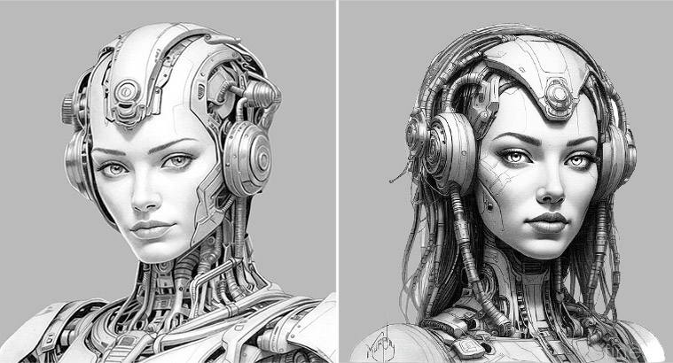
The Final Work: AI Exploration, Photoshop Precision
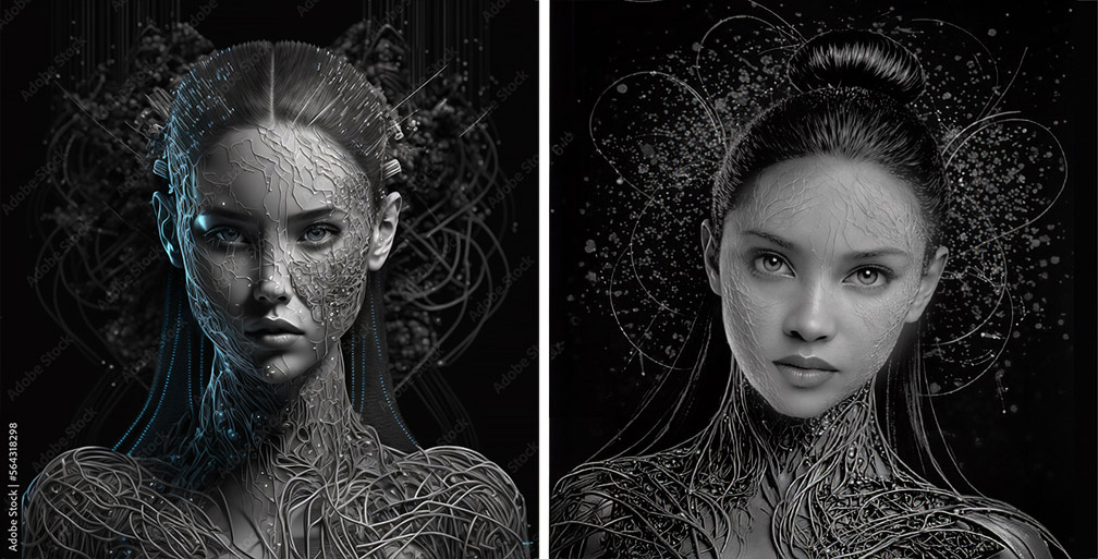
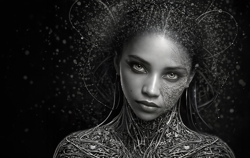
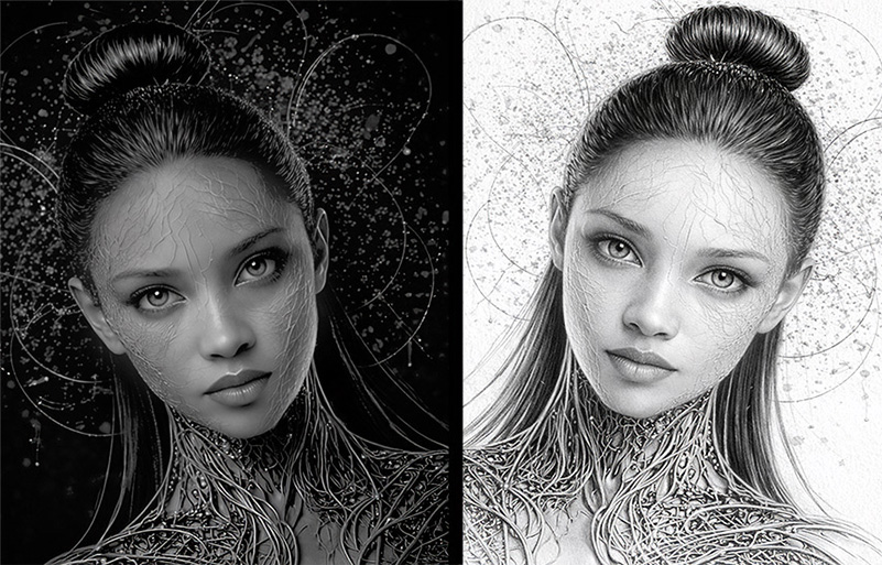
The following images represent the finished state of this study. Each reflects a hybrid workflow where AI accelerated exploration and established compositional direction, while Photoshop delivered the precision and subtlety the AI consistently could not.
Style reference compared to the refined result after Photoshop corrections, including head scale and neck proportion adjustments.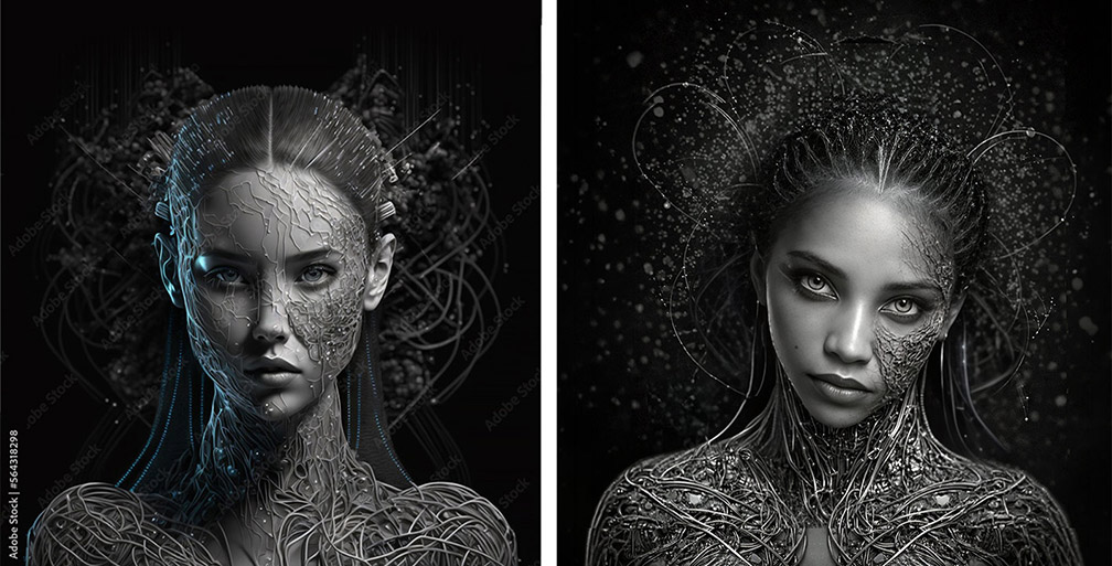
Closing Thought: Awareness Is the Skill
This study was less about control and more about awareness. Understanding where the tool aligns with your vision, and where it quietly moves away from it. The more I pushed for refinement through generation, the more the system leaned into its own trained defaults. Those defaults were not neutral. They reflected patterns embedded in the model's training data, and those patterns carry aesthetic bias.
The final result may not have been perfect in likeness through AI alone. But the direction was clear. And it was that clarity, combined with the willingness to step in and do the precise work manually, that made the final image strong.
AI accelerated the exploration. Design finished it.
Outcome: What This Study Demonstrates
This was not a study about whether AI can create beautiful images. It can. It was a study about what happens when beauty is directed, identity is specific, and the tool has never been taught that "delicate" looks the same on everyone.
Understanding when more prompting makes results worse rather than better, and knowing when to stop generating and start designing.
→Identifying trained tendencies around skin tone, style defaults, and proportion bias — and building prompt language specifically designed to name and override those patterns.
→Learning that style fidelity must be stated as explicitly as identity preservation, and that prohibition language — telling the AI what not to do — often does more work than description.
→Establishing that AI handles exploration and scale, while Photoshop handles precision, nuance, and anything that requires an uncompromising visual standard. The final image is built, not just generated.