Client
CWS Symposium Live
Virtual Event Branding · Digital Campaign · Conference Creative
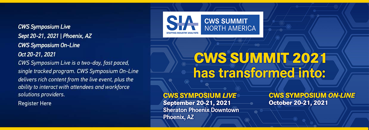
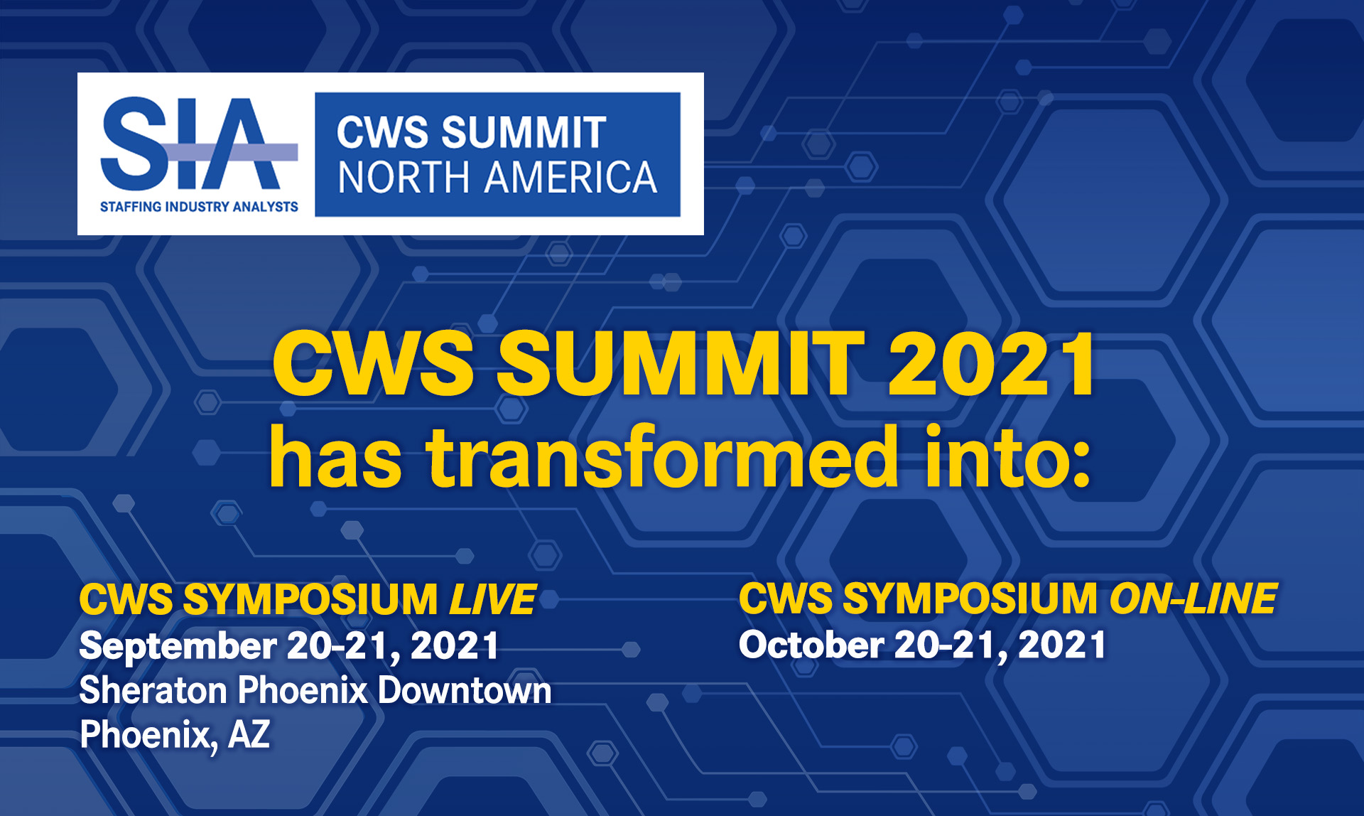
COVID changed the gathering. The conversation still needed to continue. A sharp pivot reshaped CWS Summit North America into CWS Symposium Live and CWS Symposium On-Line, giving the workforce community a way to stay connected while distancing. The creative challenge was immediate: Make the change unmistakable, keep the event compelling, and show audiences when and how they could take part.
Project Overview
CWS Summit North America brings together contingent-workforce professionals, procurement leaders, HR executives, and program managers from major enterprise organizations. Research, peer discussion, and professional connections give the event its value. During COVID, preserving access to that conversation became especially important.
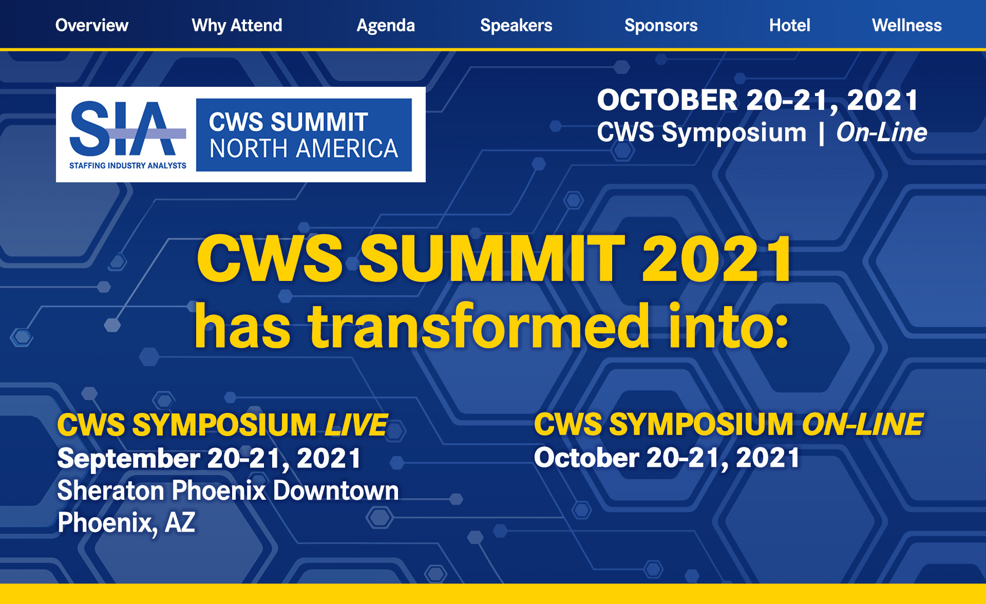
The revised event needed more than a new name. Audiences had to understand that CWS Summit 2021 had transformed into two offerings, with different dates and ways to attend. The campaign placed that announcement at the center of the message, pairing familiar SIA and CWS branding with clear distinctions between the live symposium in Phoenix and the online symposium.
CWS Symposium Live
Graphic Design Manager, art direction, visual design, Virtual Event Branding, Digital Design, Campaign Development, and Production.
Communicate the COVID-driven shift to live and online symposium offerings, clearly distinguishing dates and participation options while preserving conference recognition and appeal.
Virtual Event Identity, Website Graphics, Social Media, Speaker Communications, Digital Advertising, Presentation Assets, Campaign Materials.
The design led with the information people needed first: What had changed, which event they could attend, and when it would happen. Bold yellow headlines against deep blue made the transformation announcement prominent, while the established logo kept the revised offerings connected to the conference audiences already knew.
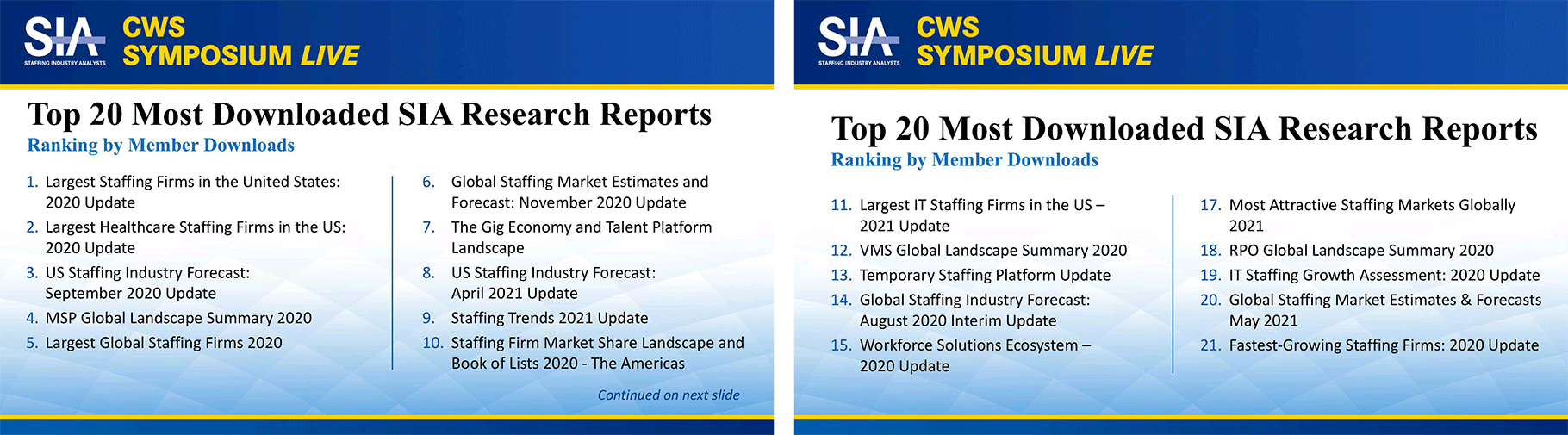
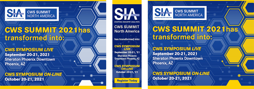
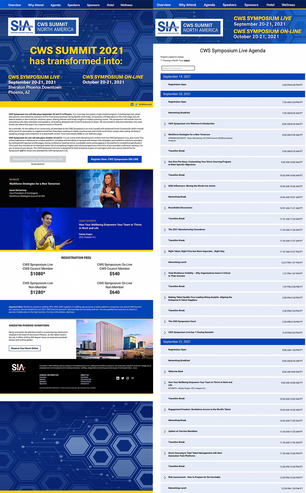
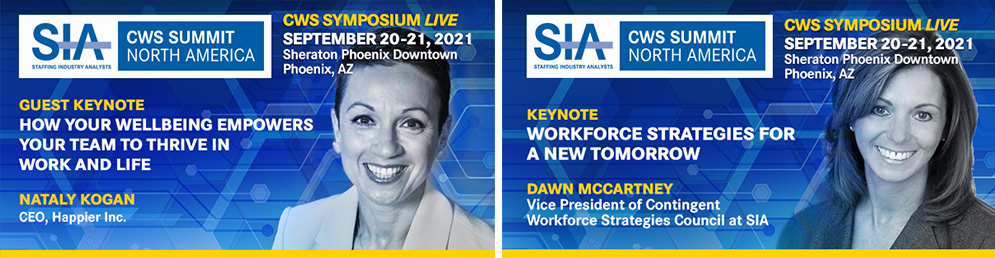
Website headers, homepage promotion, digital ads, speaker badges, and presentation slides each had a different job. Shared colors and geometric backgrounds tied them together, while the hierarchy shifted to give event dates, registration details, speaker introductions, or research content the space they needed.
The urgency shaped the work. Communication had to move quickly and remain clear as the event changed. The resulting campaign presents the pivot with confidence, giving the revised symposium offerings a recognizable identity and a direct invitation to stay involved.
Follow the COVID-driven pivot through transformation announcements, website headers, advertising, presentation slides, and keynote promotion. Each piece helps explain the revised event while keeping the workforce community connected to its purpose.