Client
Peligro Music Band
Music Branding · Merchandise · Promotional Design
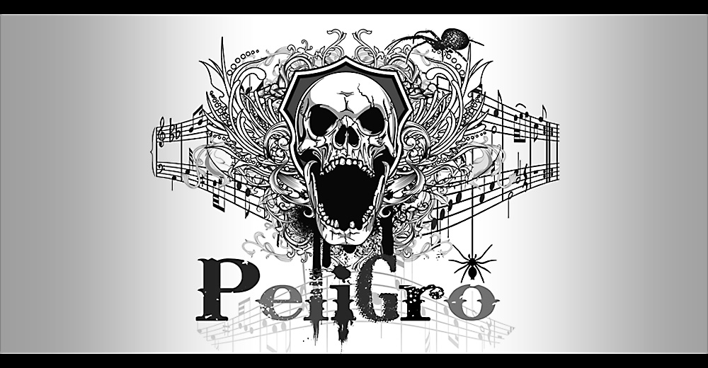
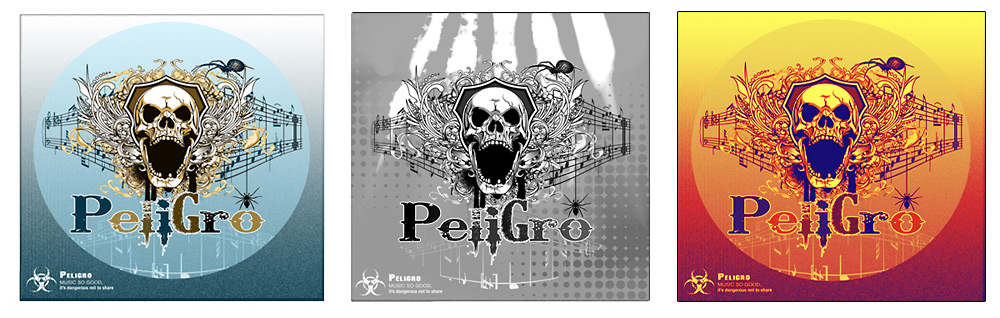
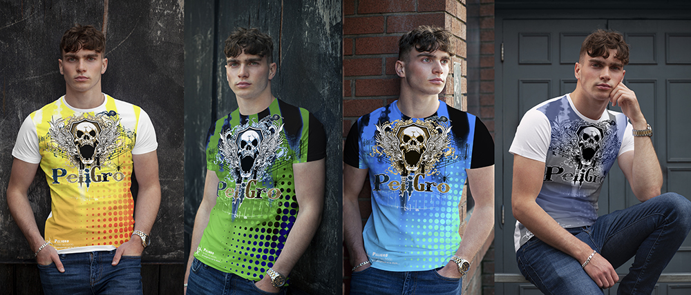
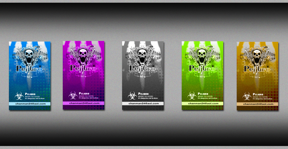
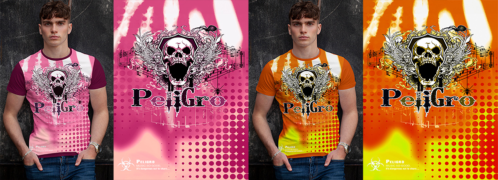
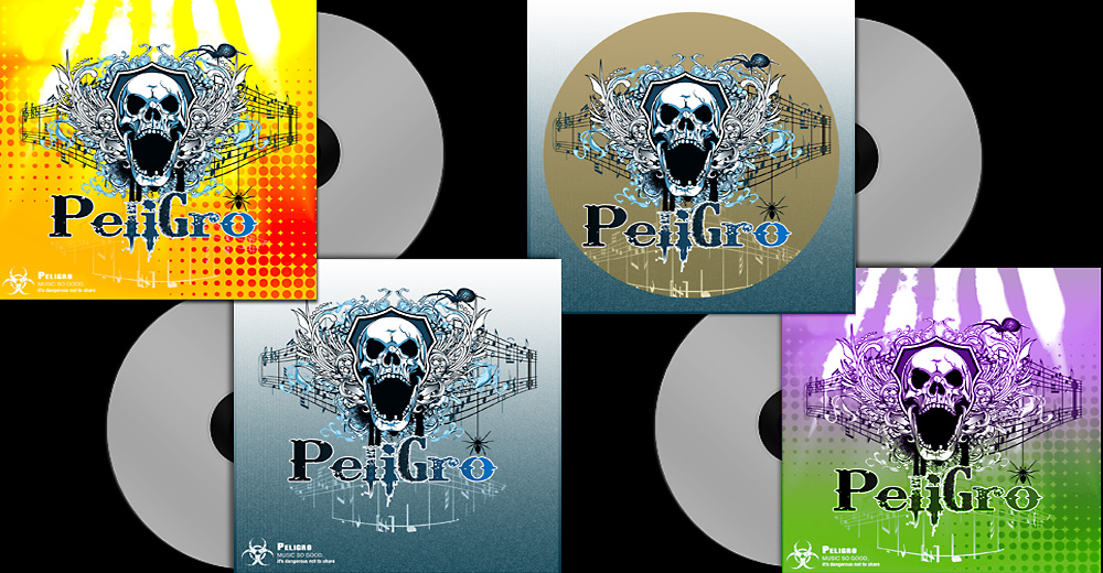
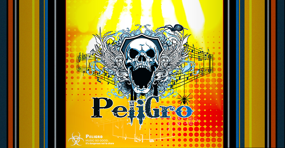
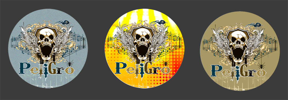
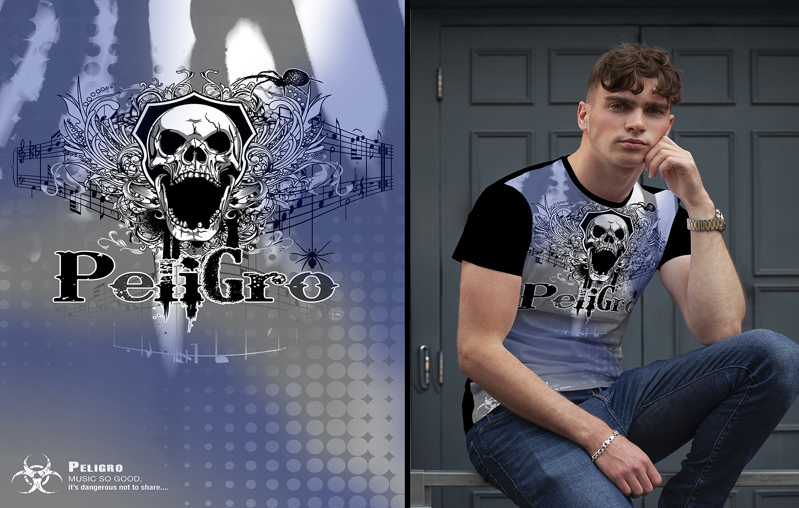
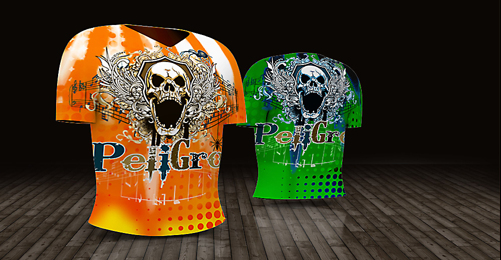
Peligro was a teenage boy band playing Rock Alternative and Grunge Metal, so the identity needed to feel raw, youthful, rebellious, and immediately connected to the music. I developed a hard-edged visual direction with the angst and attitude of the genre, then carried it across logo design, CD and DVD artwork, T-shirts, business cards, stage banners, stickers, labels, and decals. The result gave the band a recognizable look that could move from recordings and merchandise to live promotion.
Project Overview
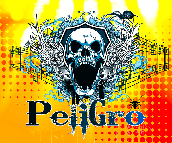
The project was created for a start-up music group whose sound and audience called for something very different from a polished corporate identity. The skull imagery, distressed forms, and darker rock influence were intentional: the brand needed to reflect teenage energy, alternative rock, and grunge-metal attitude without looking disconnected from the musicians behind it.
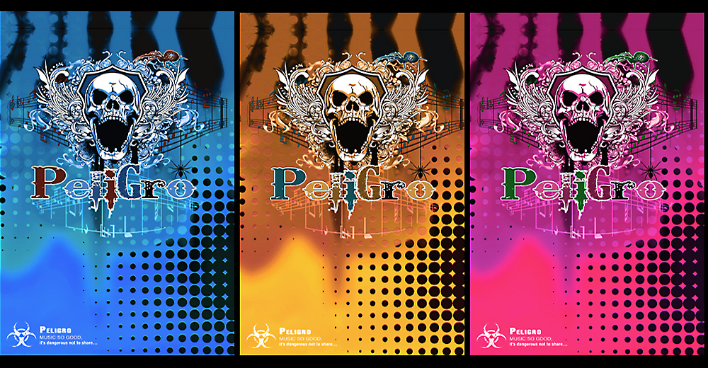
I developed the logo first, then expanded the visual direction into the materials a young band actually needed to promote itself—business cards, stickers, labels, CD and DVD covers, T-shirts, promotional graphics, and a large stage banner. Working hands-on across both merchandise and promotional design made the identity feel coherent whether someone encountered Peligro on a shirt, a recording, a decal, or at a live performance.
Peligro Music Band
art direction, Music Branding, Graphic Design, Merchandise Design, Promotional Design, and Production.
Create a distinctive, youth-driven visual identity that reflects Peligro’s Rock Alternative and Grunge Metal sound and works across music promotion, merchandise, and live performance.
Logo Design, Business Cards, Stickers & Decals, CD/DVD Cover Art, T-Shirt Design, Promotional Graphics, Stage Banner.
The design language came directly from the band’s sound. Rather than smoothing out the visual expression, I leaned into teenage angst, rougher textures, skull imagery, and a more aggressive rock sensibility so the identity felt believable for Alternative and Grunge Metal.
The key was making that attitude repeatable. The logo and graphic elements were adapted across very different formats—from a small sticker or business card to T-shirts, recording covers, and a stage banner—while keeping enough consistency for the band to build recognition.
The selected work shows Peligro across logo design, recording artwork, T-shirts, business cards, stage graphics, stickers, and decals—demonstrating how the identity was built to travel with the band from promotion to performance.