Client
Poseidon Hotel
Hospitality Branding · Logo Design · Visual Identity
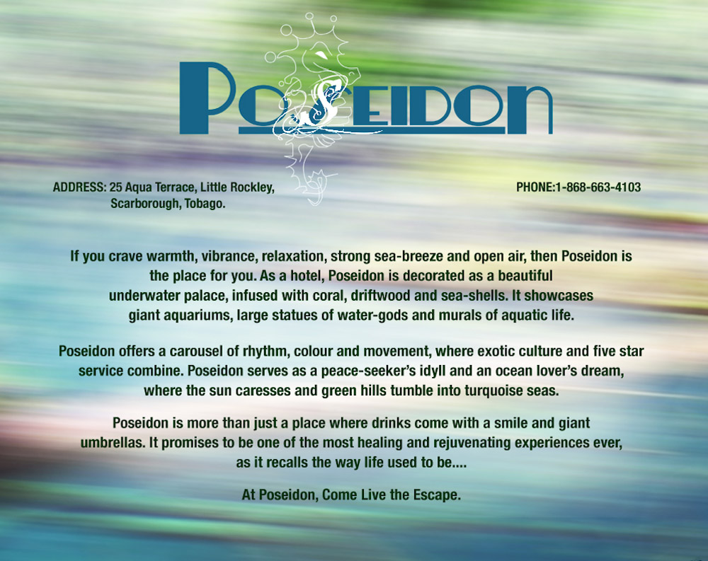
Poseidon Hotel is a hospitality identity shaped around the atmosphere of a coastal escape: warmth, vibrance, relaxation, and the pull of fresh sea air. The seahorse mark, fluid forms, ocean-inspired color, and aquatic imagery create a visual language that feels connected to the water without becoming predictable. Across guest-facing pieces and environmental applications, the identity was designed to make the experience feel established before a guest ever reaches the room.
Project Overview
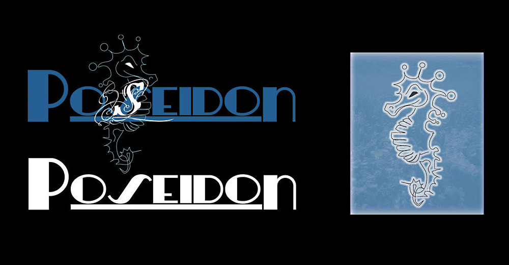
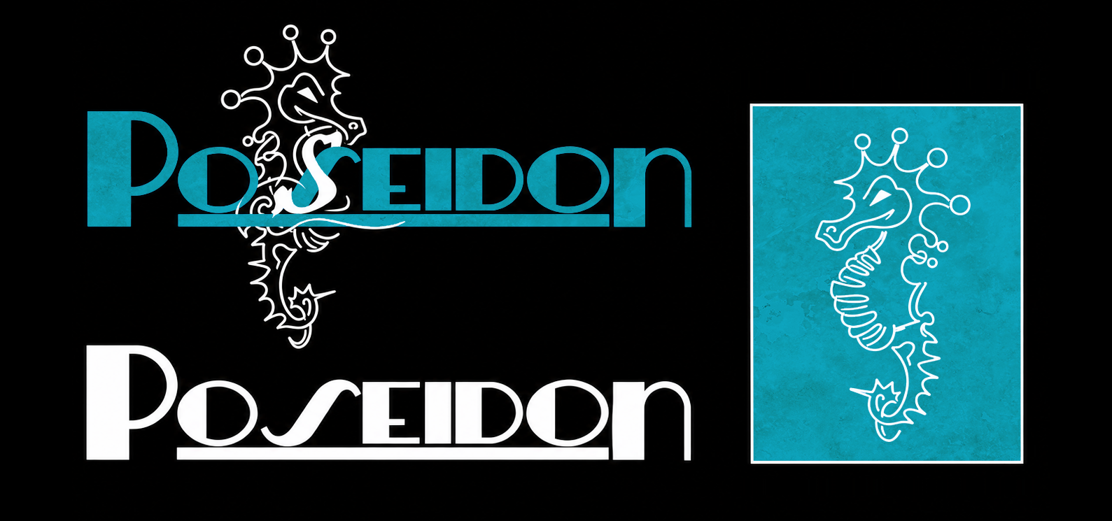
The Poseidon identity began with the relationship between the hotel name, the sea, and the guest experience. Rather than treating the logo as a stand-alone mark, the visual system was developed so its forms and textures could move naturally into the surrounding environment. The seahorse becomes both an identifying symbol and a repeatable design element, while the blue-green palette, bubbles, surf, and watery textures build atmosphere across the work.
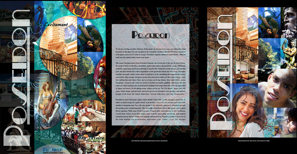
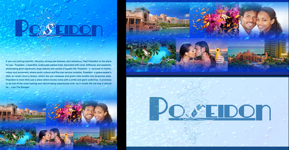
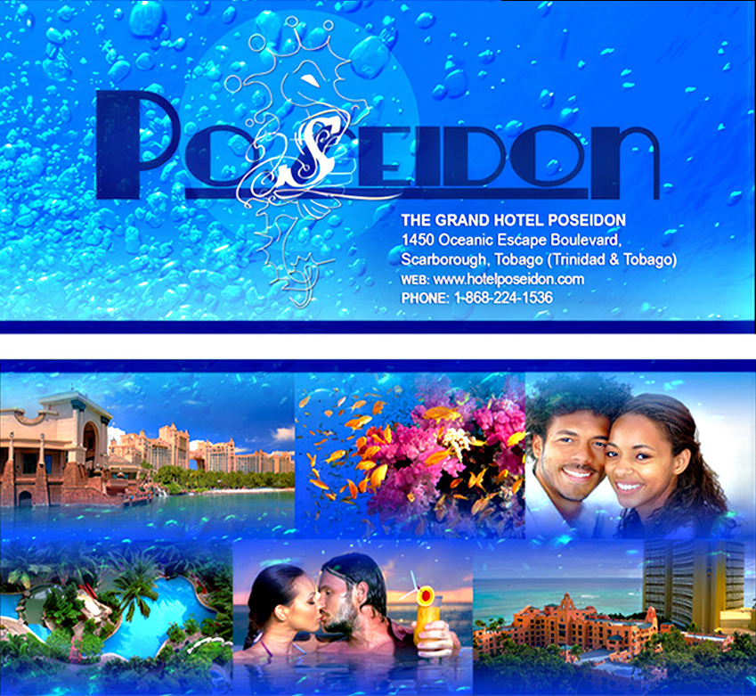
That flexibility allowed the brand to extend from logo variations into environmental details such as a repeating seahorse tile for bathrooms, pool approaches, and other hotel surfaces, as well as flyers, postcards, welcome materials, stationery, and brochure applications. Some treatments intentionally allow the seahorse to recede into bubbles and water imagery, creating the sense that it is moving through the surf rather than sitting rigidly on top of the composition. The result is a compact hospitality identity with enough range to carry the feeling of the hotel across both the physical space and the materials guests encounter.
Poseidon Hotel
Senior graphic design, brand design, visual identity development, art direction, and production.
Create a distinctive hospitality identity that captures the atmosphere of a coastal escape and gives guests an immediate sense of place.
Logo and visual identity design, signage concepts, stationery, guest welcome materials, and promotional collateral.
The visual direction balances polished hospitality branding with a more fluid, atmospheric interpretation of the sea. The seahorse provides the recognizable anchor, while changing scale, transparency, texture, bubbles, and wave-like imagery keep the identity from feeling static. The quieter blue-green tones were chosen to suggest water, glass, tile, and reflected light rather than a loud or overly literal “ocean blue.”
Across the applications, the brand shifts between crisp identification and more immersive moments. In some pieces the mark is clear and formal; in others it partially disappears into surf and bubbles. That variation helps connect the printed materials to the idea of an actual seaside environment while still keeping the Poseidon identity recognizable.
Selected Work
A closer look at the Poseidon identity across logo explorations, signage, guest-facing materials, stationery, and promotional applications.