Client
Kate Ross Music
Music Branding · Identity Design · Promotional Collateral
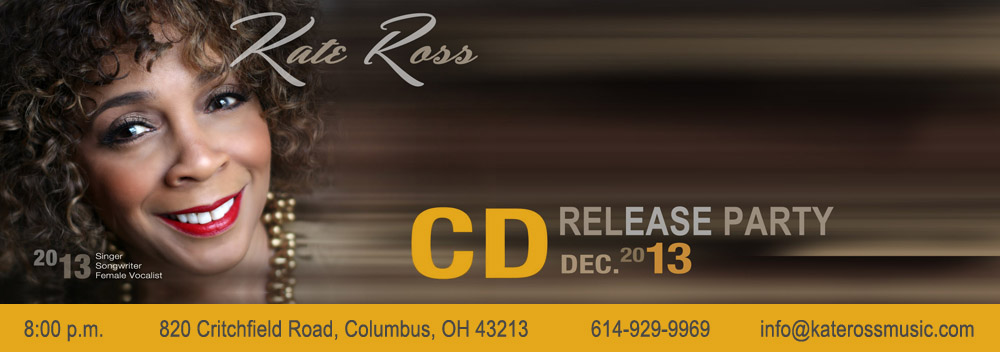
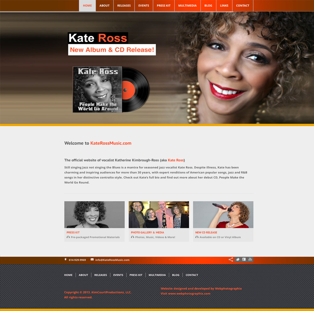
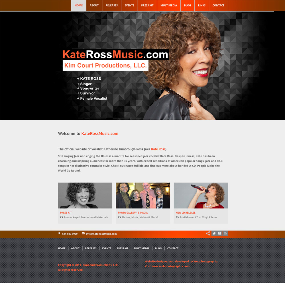
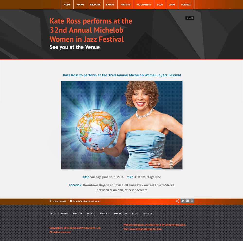
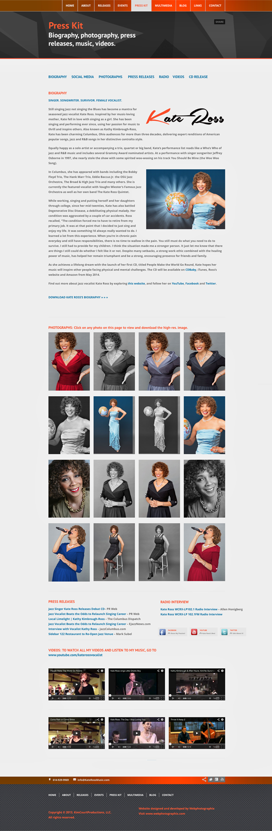
Before the first note is heard, a performer’s visual identity begins setting expectations. Kate Ross Music brings jazz performance, personal brand expression, and promotional communication together across logo design, stationery, performance banners, CD artwork, website concepts, event pages, and a digital press kit, with art direction and visual design shaping one distinctive visual signature.
Project Overview
An artist identity has to create recognition across audiences, venues, media contacts, and collaborators without competing with the performer. For jazz vocalist Kate Ross, the assignment grew into a connected brand presence spanning identity, promotional design, web concepts, music packaging, and press materials.
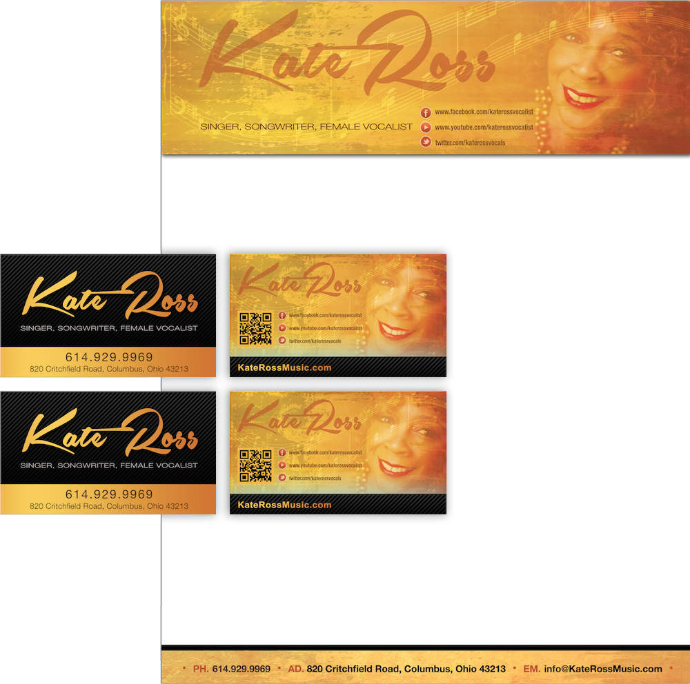
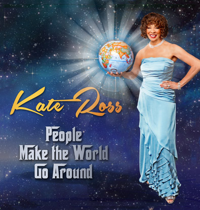
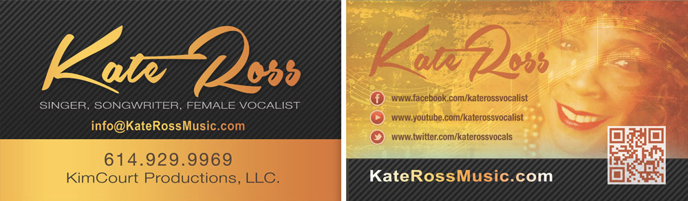
Each piece served a different purpose, but the experience needed to feel unmistakably related. Logo, business cards, stationery, banners, website layouts, CD artwork, event pages, and press materials were developed as one visual family with enough flexibility for photography and performance personality to remain central.
Kate Ross Music
art direction, visual design, Brand Identity, Promotional Design, Web Design, Music Packaging, and Production.
Create a distinctive visual identity that supports audience recognition across performance, promotional, digital, and press communications.
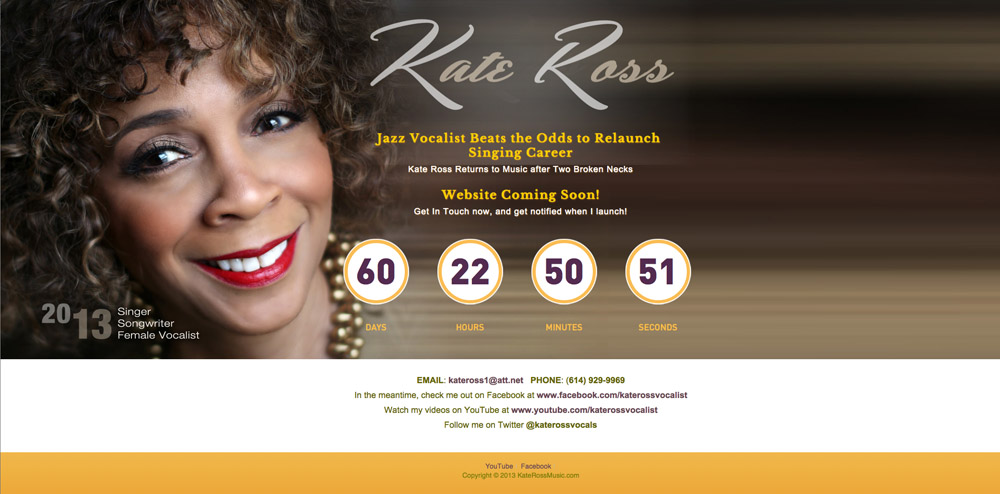
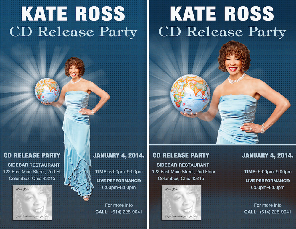
Logo & Identity Design, Stationery, Business Cards, Performance Banners, CD Artwork, Website Concepts, Event Pages, Digital Press Kit.
Elegance, personality, and strong typographic hierarchy shaped the creative direction. Recurring visual cues carried the identity across formats, while scale, imagery, and information density changed according to the communication need.
Digital work made room for biography, performance information, events, and press content. Smaller print pieces demanded tighter hierarchy, while banners and CD artwork needed stronger immediate impact. The brand stays consistent because the underlying visual logic remains intact, not because every composition looks the same.
Move through the identity from logo and stationery into performance promotion, CD artwork, website concepts, event pages, and press materials designed to support both recognition and artist personality.