Client
Honda of America
Campaign Design · Corporate Branding · Event Collateral
One visual idea became a flexible campaign system for Honda of America, moving across inclusion and diversity messaging, bilingual marketing, print and digital advertising, brochures, publications, conference collateral, and environmental applications. The work connects campaign concept development, art direction, visual design, enterprise brand execution, and production across a Fortune 500 audience.
Project Overview
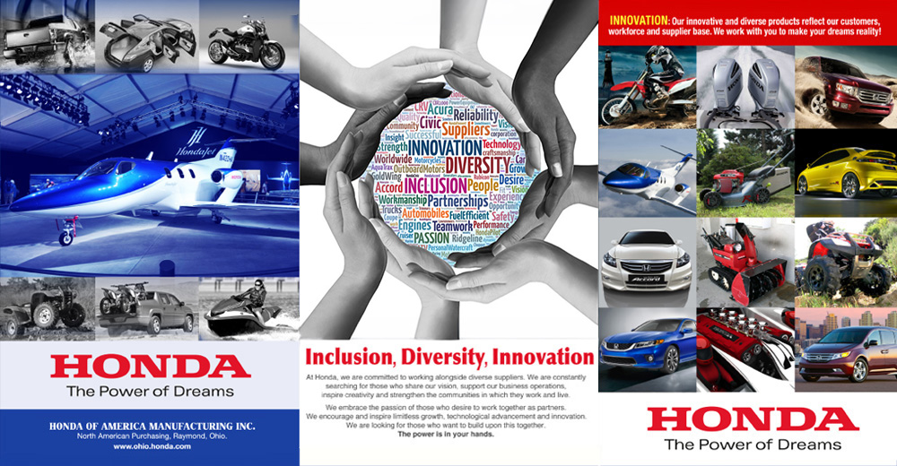
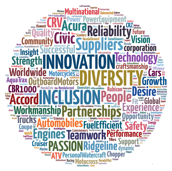
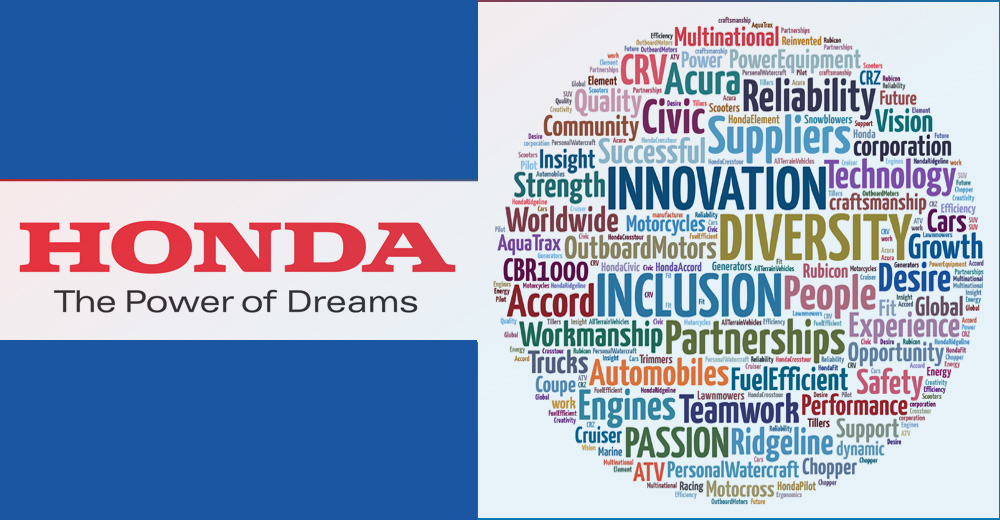
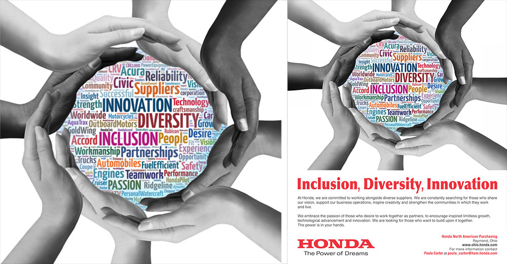
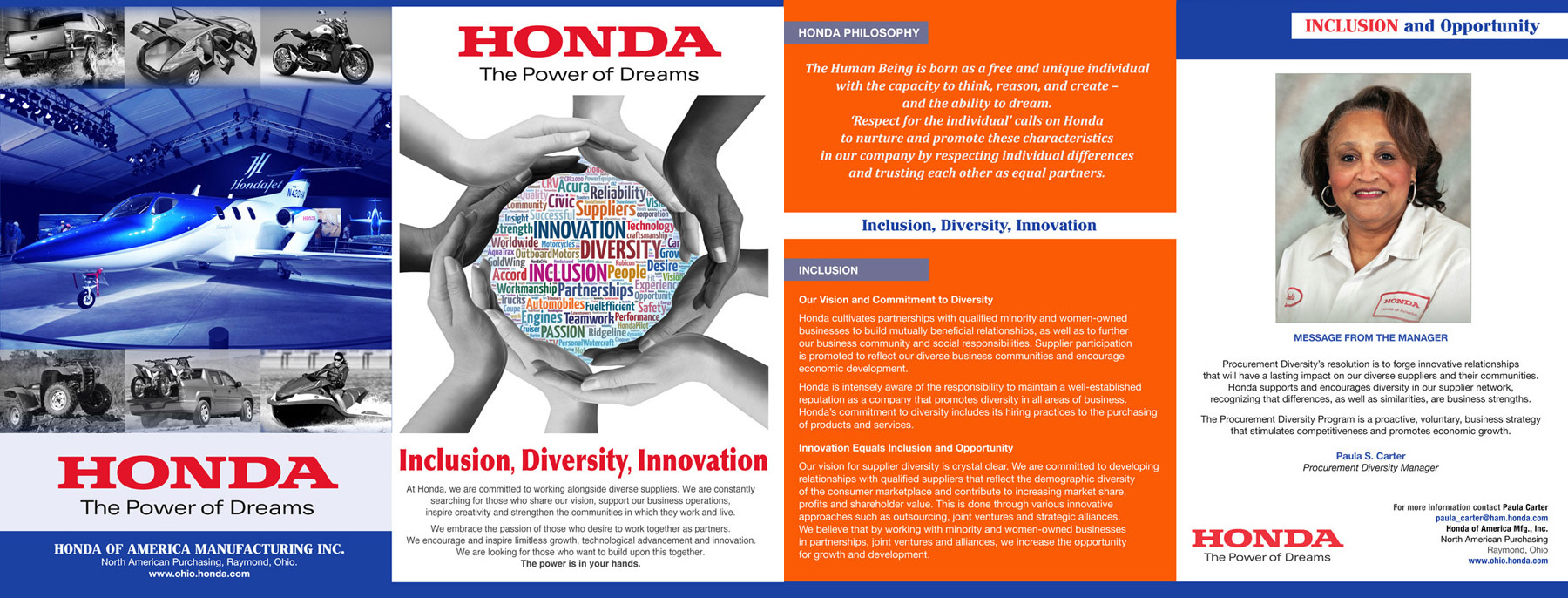
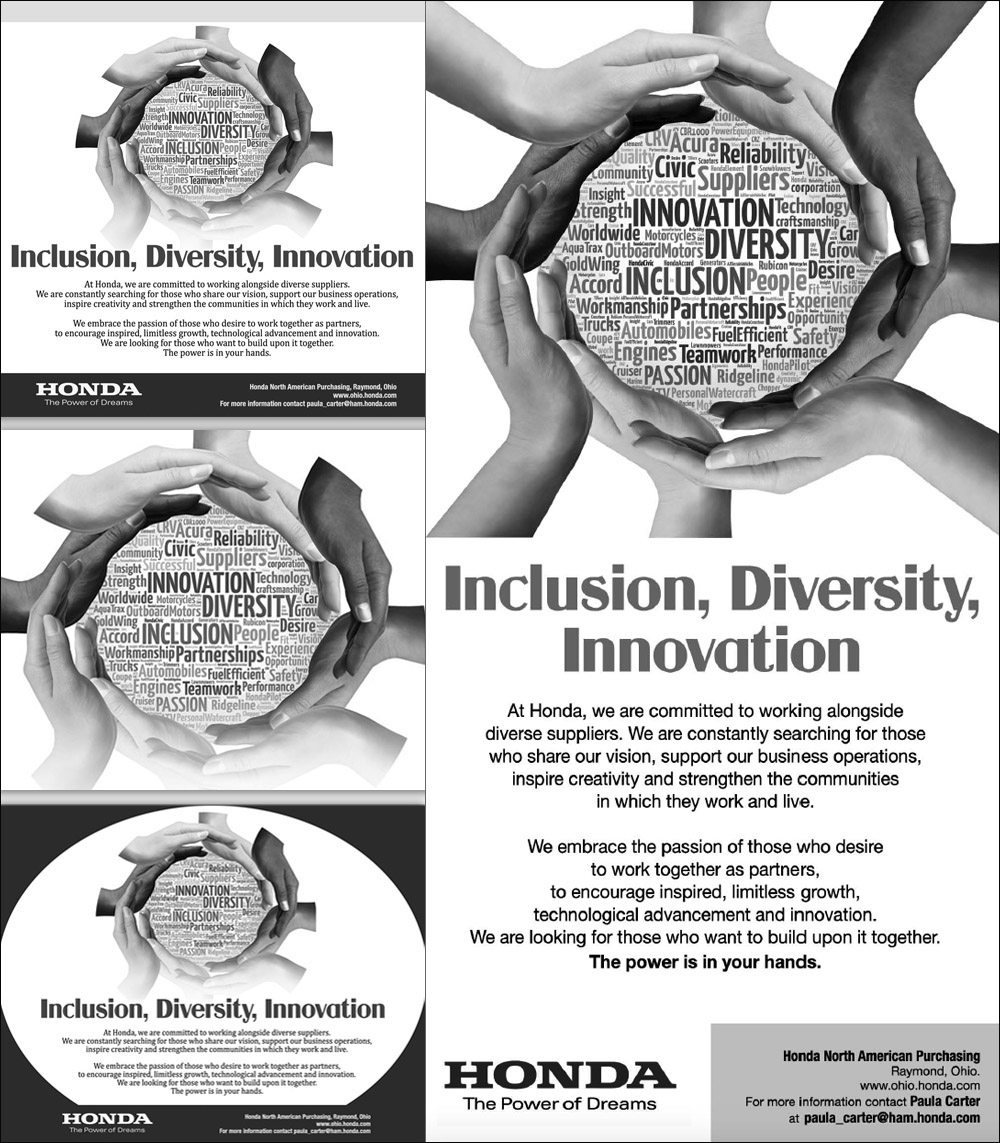
Honda needed a values-driven marketing concept that could communicate inclusion, diversity, and innovation without depending on automobile photography. A custom word cloud brought company values, capabilities, and product language into one visual field, while a circular arrangement of hands introduced the human ideas of community, connection, and shared purpose.
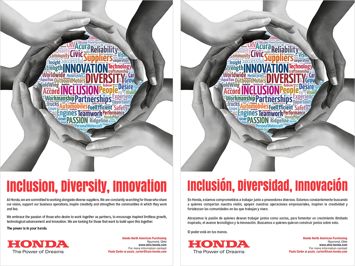
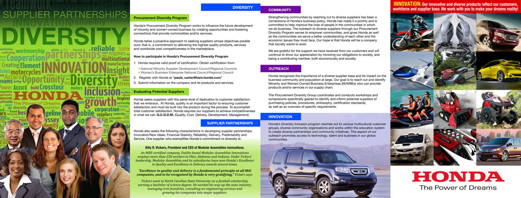
The concept proved flexible enough to move from initial marketing materials into press and publication advertising, brochures, bilingual English and Spanish executions, and later conference collateral. One visual idea became a connected campaign language that could adapt across audiences and formats without losing recognition.
Honda of America
visual design, Campaign Concept Development, art direction, Brand Extension, Bilingual Marketing, and Print & Digital Production.
Create distinctive Inclusion, Diversity & Innovation marketing that communicates Honda values without relying on product photography.
Campaign Concept, Print & Digital Advertising, Brochures, Bilingual Materials, Publication Creative, Conference Collateral, Invitations, Folders, Signage.
The circular composition supported a broader global feel while avoiding dependence on any single product category. Typography, imagery, and hierarchy were structured so the campaign could carry complex corporate messaging while remaining visually immediate.
That flexibility became increasingly important as the work expanded. Advertising, brochures, bilingual communication, conference materials, invitations, folders, and signage each required different production decisions, but the campaign continued to feel connected to the same original idea.
Explore how the campaign expands from concept into print, digital, bilingual, publication, and conference materials while preserving a consistent enterprise visual language.
Conference Extension
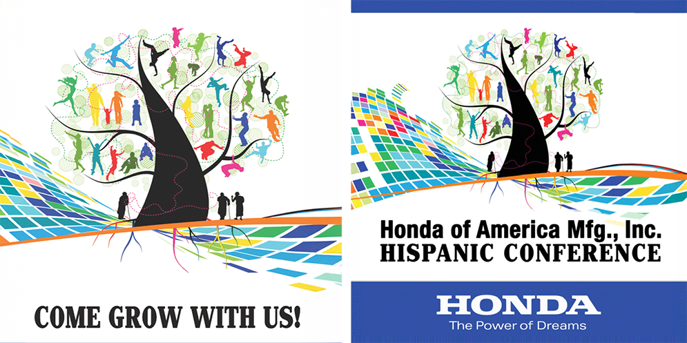
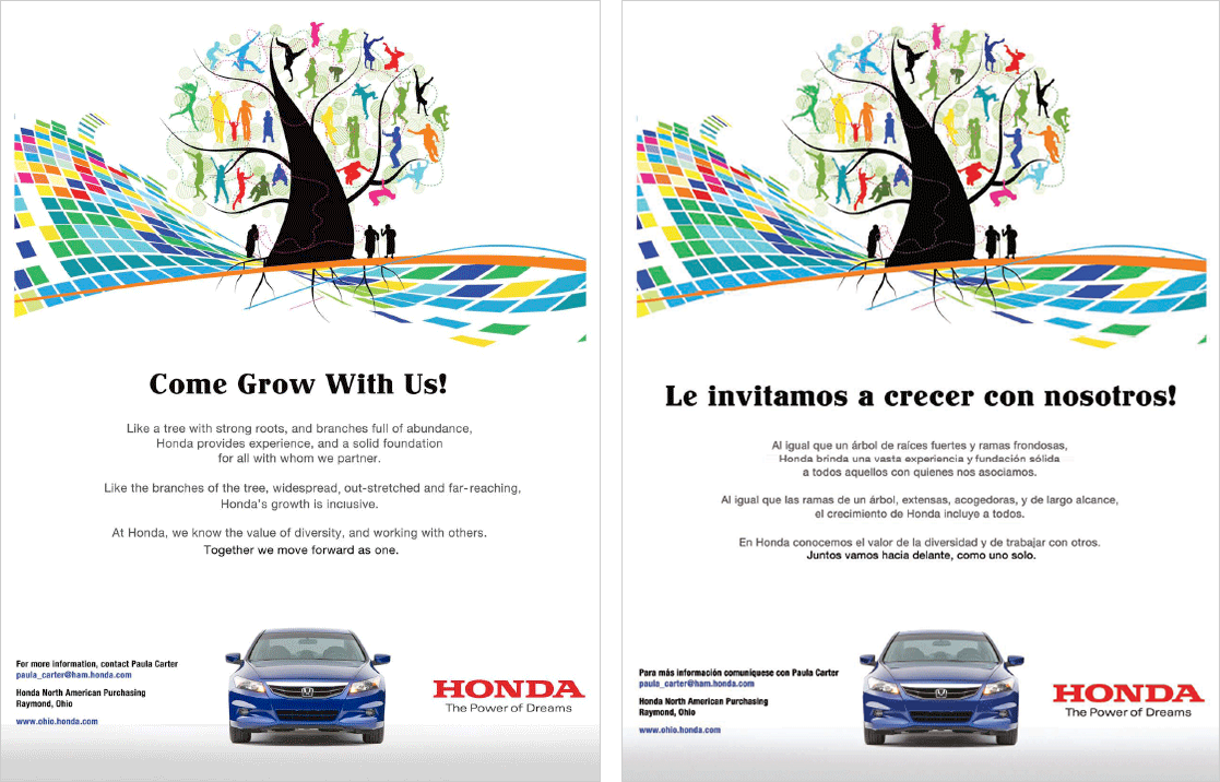
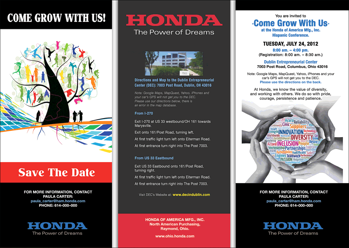
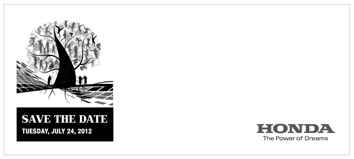
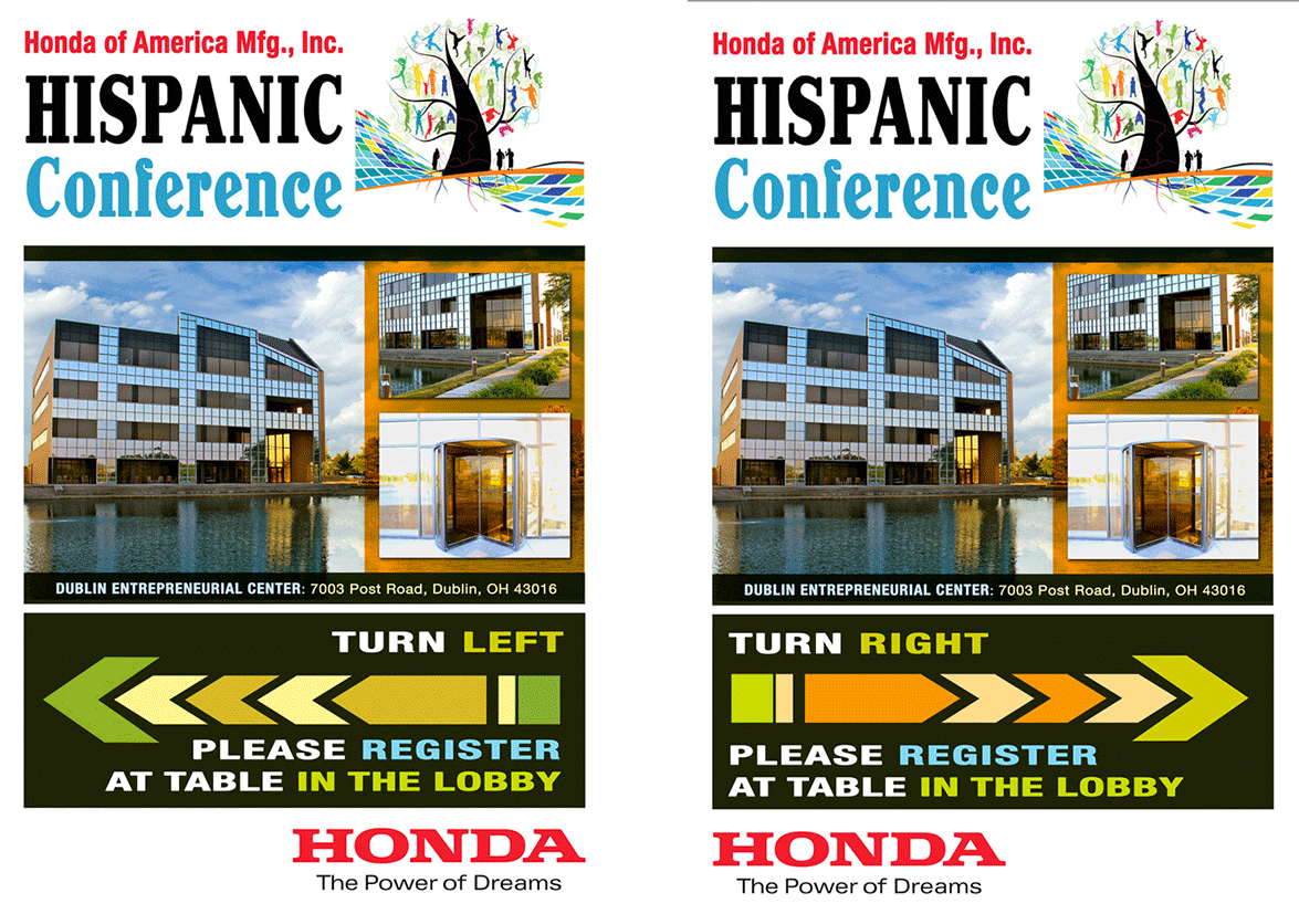
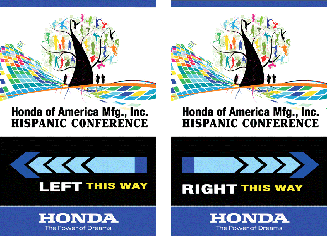
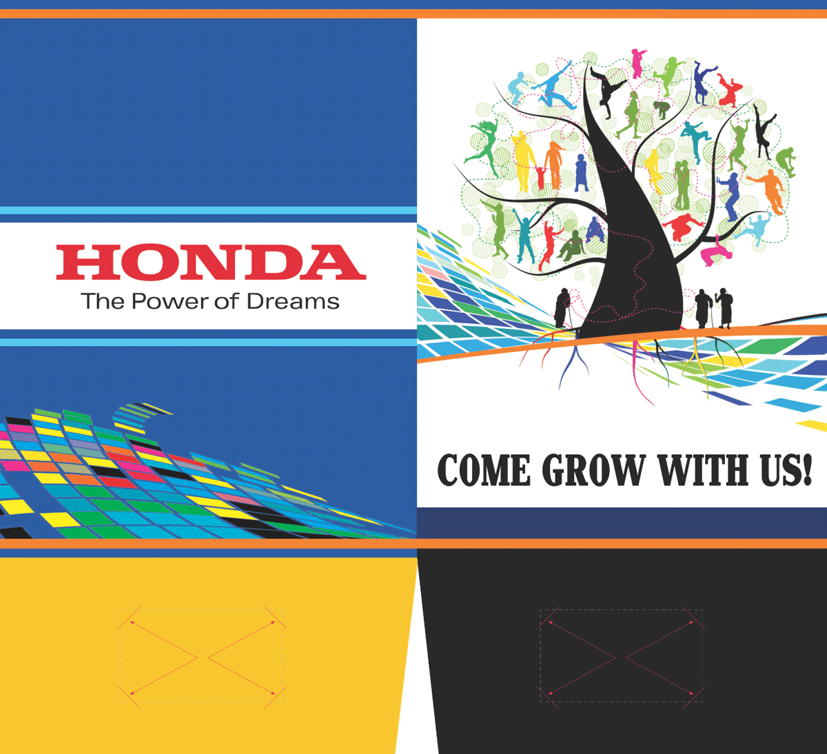
For the Hispanic Manufacturing Conference, the central 3D tree concept had already been created and approved before I joined the project. When the original designer left, I took over with one established visual and a full conference still to build. My role was not simply to place that artwork into finished pieces. I had to determine how the tree would live across bilingual advertising, Save-the-Date materials, stationery, attendee folders, and a complete signage system, designing each application around it so the conference felt cohesive from the first communication through the physical event.
The tree was the starting point, not the finished system. Taking over an established direction can be more demanding than developing a project from the beginning. You inherit a creative decision without the benefit of the thinking that led to it, then have to make every new piece feel intentional and seamless. I developed the layouts, supporting graphic relationships, typography, scale, placement, and conference materials shown here, carrying the approved tree into a complete visual experience while incorporating elements from the earlier Honda word-cloud campaign where they strengthened continuity.