Case Study:
Dayton Water Company
Every Brand Starts with a Name
Building a Premium Water Brand from the Ground Up
Most branding projects begin with a name. This one began before the name existed. The Dayton Water Company had recently discovered artesian wells in Dayton, Ohio and recognized the opportunity to bring a premium, mineral-rich water to market. The ambition was clear: Compete with established premium brands like Fiji Water and Icelandic Glacial. What the client did not yet have was a product name, a visual identity, or a label.
That is an unusual starting point. It is also an opportunity that does not come along often. When a client hands you creative latitude at the naming stage, before any visual direction has been set, the work becomes about more than design. It becomes about defining what the product is, what it means, and how it should feel in someone's hand.
The Client
The Dayton Water Company is an Ohio-based water company with access to natural artesian well water sourced in Dayton, Ohio. Artesian water is naturally filtered as it moves through layers of rock before reaching the surface, a process often associated with exceptional purity and a high mineral content beneficial to health and hydration. That made it an ideal foundation for positioning the product as a premium bottled water brand. The client's goal was to position this water as a premium, organic product, distinct from standard filtered or purified water brands, and competitive with the category leaders in high-quality natural water.

My Role
Art Director, Senior Designer, and Brand Naming Consultant
The scope of this engagement covered product naming, typographic exploration, label concept development, and four fully realized label designs presented as the final creative recommendations. The client had proposed "Aquafore" as a starting name but was not committed to it, and asked for alternatives, most incorporating the word "Aqua" as a directional guideline. Beyond naming, the full visual direction of the product, its imagery, color palette, typography, and overall aesthetic, was developed from the ground up.
The Creative Brief
Premium water is a competitive and visually sophisticated category. Consumers who choose Fiji over a store brand are not making a purely rational decision about hydration. They are making a decision about identity, aspiration, and experience. The label has to earn that decision before the bottle is ever opened.
For this project, earning that decision meant resolving several creative questions simultaneously:
Part One: Naming the Product
The names developed for the Dayton Water Company product line were: Aquafore, Aquafore Pure, AquaDay, AquaDay Pure, Artesian Well, and Artesian Springs.
The "Aqua" prefix does specific work in this category. It signals water immediately and internationally, it reads as clean and contemporary, and it creates a natural platform for product line extensions like "Pure" variants. The artesian-named options took a different direction, anchoring the brand in the specific origin story of the water rather than a constructed brand name. Both approaches were valid. Each served a different vision of what the brand could be.
Part Two: Label Explorations
Before the four final label directions were developed, an extensive exploration phase tested different typographic treatments, visual concepts, and color approaches. The work ranged widely, from evocative figurative imagery to minimal typographic compositions, from deep ocean blues to the blue-green of tropical water.
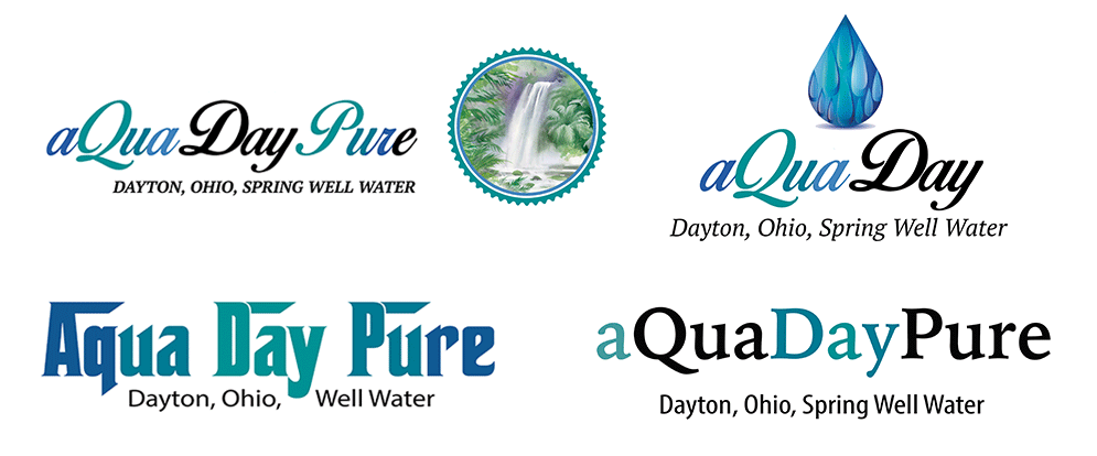
Typography became a central part of the exploration. Consumer product branding, particularly in the premium beverage space, has a different relationship with type than most design work. Typeface selection became a primary design element rather than a supporting one, with each direction testing how typography alone could communicate a distinct brand personality.
Aquafore, Aquafore U and Aquafore Pure Label Explorations
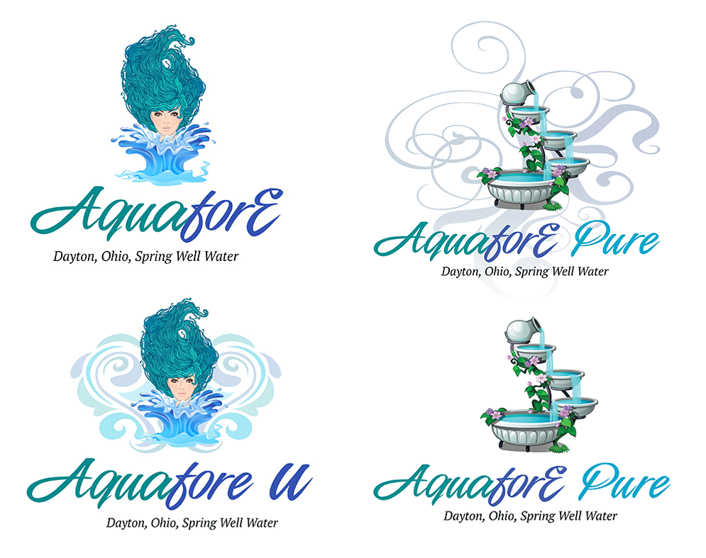
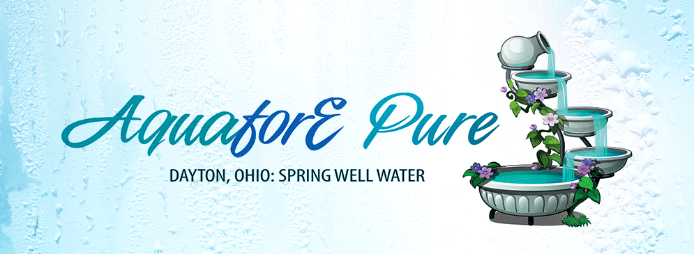
Aquafore Pure Label Explorations
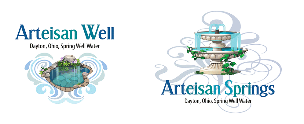
Artesian Well and Artesian Springs: Label Explorations
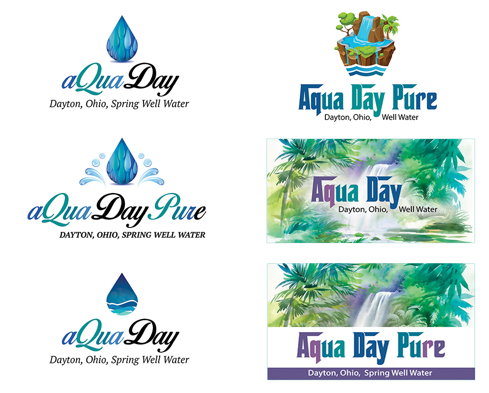
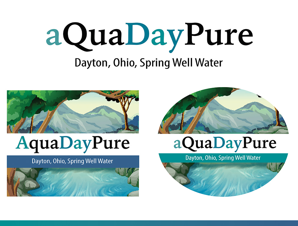
AquaDay and AquaDay Pure Label Explorations
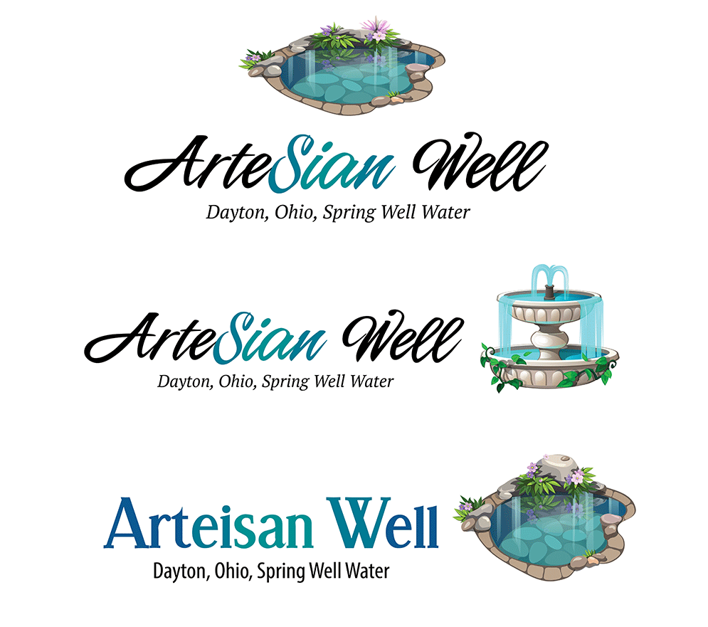
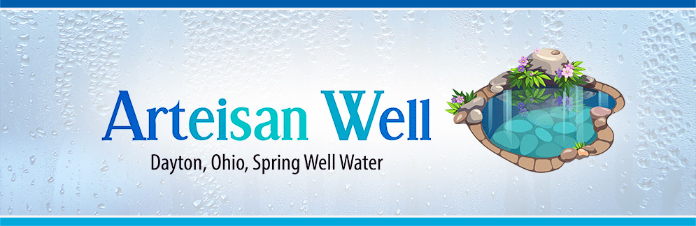
Artesian Well Label Explorations
AquaDay Pure: Additional Explorations
AquaDay and AquaDay Pure Typographic Explorations
Part Three: The Four Final Label Designs
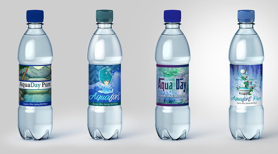
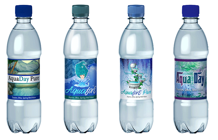
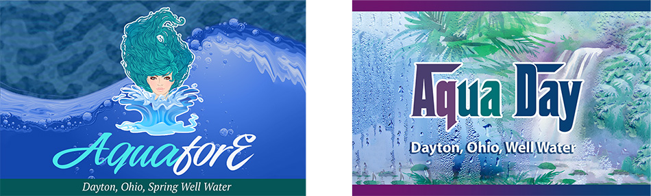
From the full exploration process, four label directions were selected and fully developed for client presentation. Each represented a distinct creative approach to the brand, different in visual personality and typographic voice, but all grounded in the same color territory and the same fundamental proposition: this is a premium natural water that belongs in the same conversation as the category leaders.
Presenting four fully realized directions rather than one gave the client something meaningful to respond to. A single recommendation asks a client to approve or reject. Four directions invite a conversation about what the brand should feel like, and that conversation often reveals priorities and preferences that no initial brief could have surfaced.
Final Label Designs: Flat View
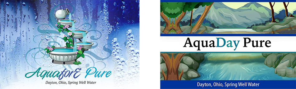
Final Label Designs: Additional Flat View
Final Label Designs: Bottle Mockup