Client
APDS Corporate Rebranding
Corporate Rebranding · Visual Identity · Digital Communication
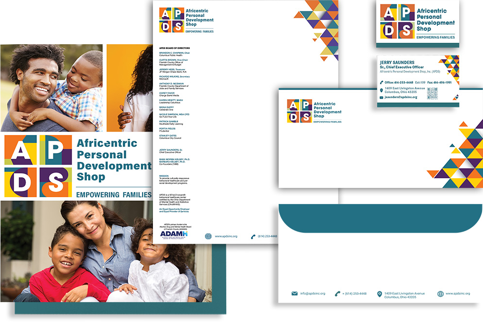
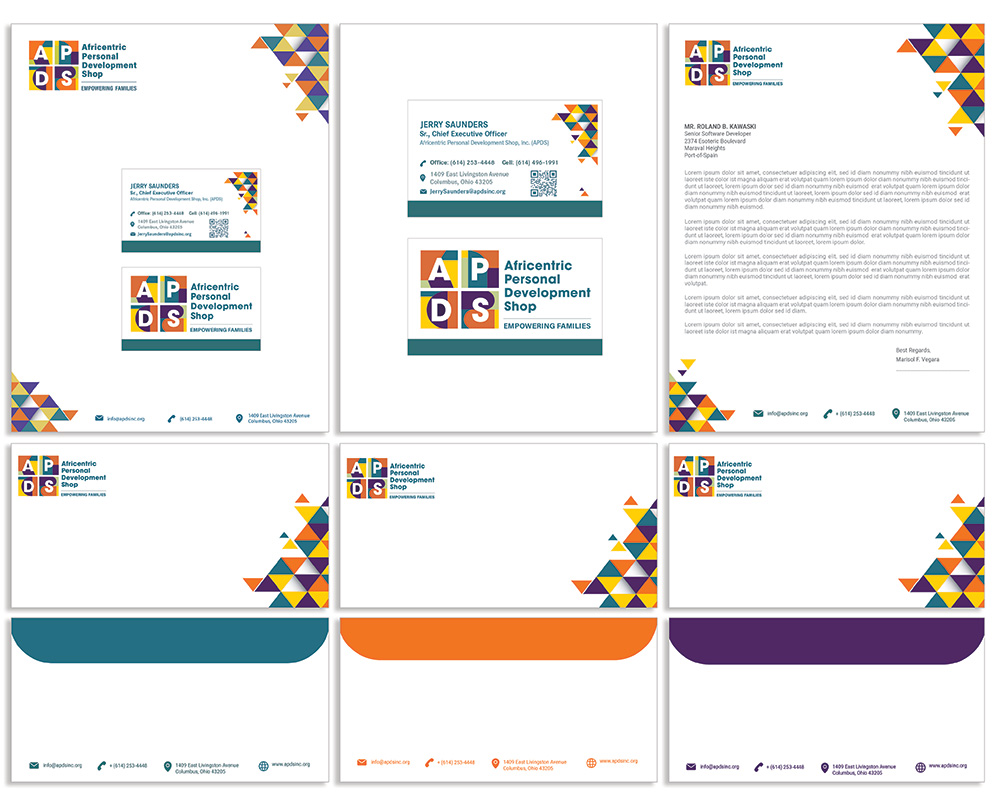
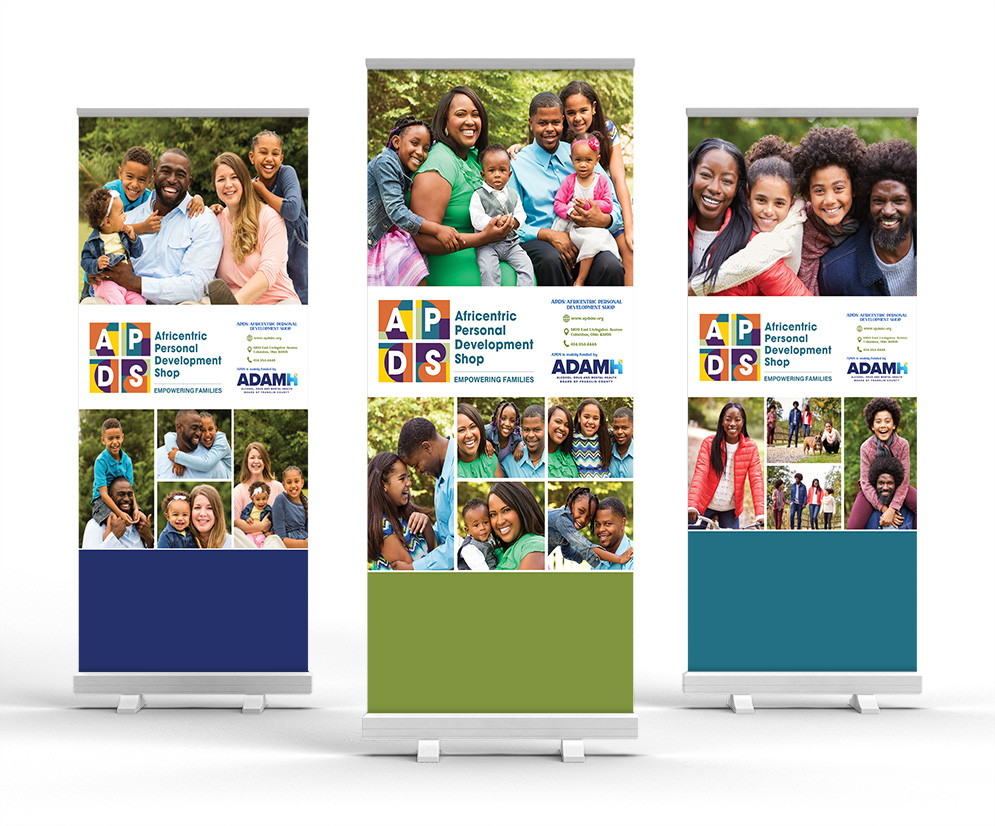
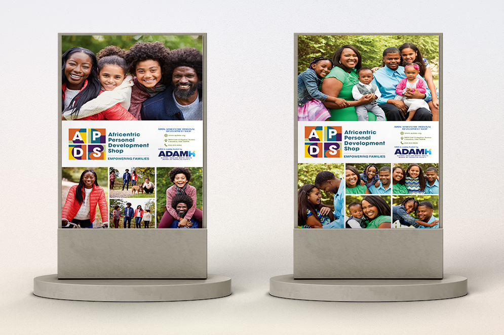
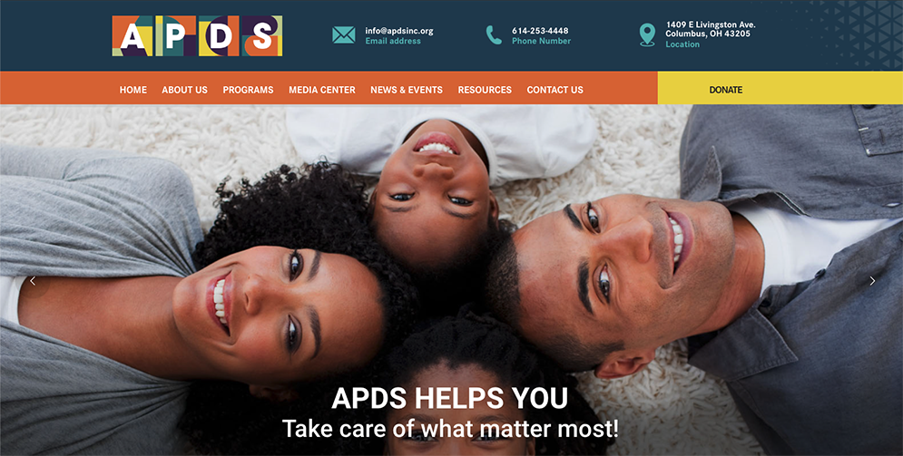
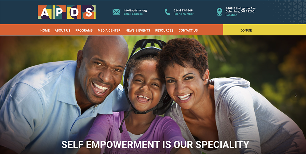
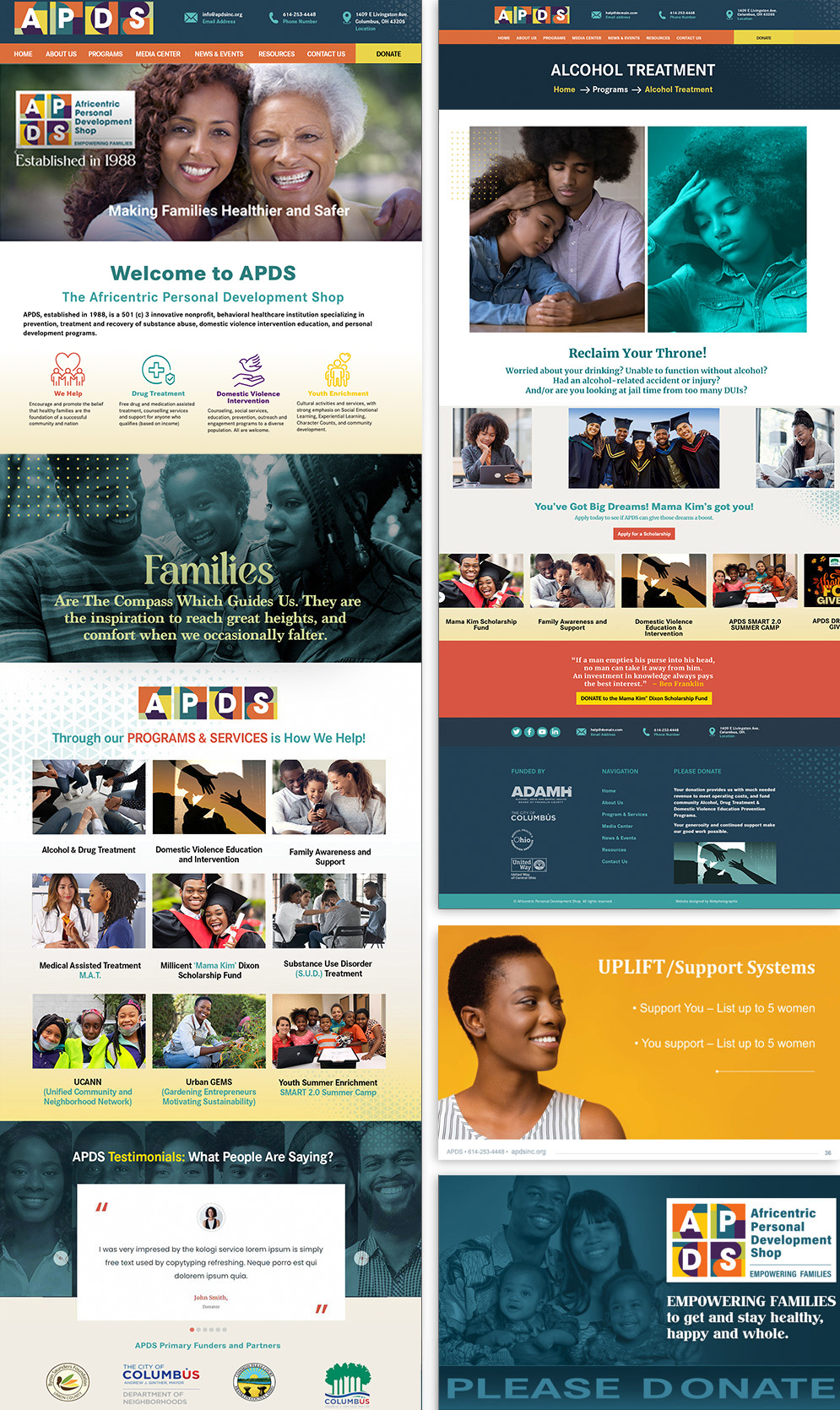
A long-standing community organization entered its next chapter with a more flexible identity, stronger digital communication, and a visual system designed to grow with its mission. The APDS rebrand connects Brand Strategy, art direction, visual design, Digital Communication, outreach, presentations, programs, and event materials around a clearer and more contemporary expression of behavioral healthcare and community impact.
Project Overview
More than a decade of collaboration created the opportunity to evolve APDS without losing the trust, cultural relevance, and human connection already associated with the organization. The rebrand needed to support Cognitive Behavioral Therapy, addiction recovery, domestic violence intervention, youth enrichment, and community programs while giving the organization greater flexibility across print and digital communication.
The work grew beyond a single identity update into long-term brand stewardship. Two major branding initiatives, a signature event identity, and an ongoing stream of outreach, fundraising, program, event, and marketing materials strengthened recognition while allowing the visual language to evolve with the organization.
APDS Corporate Rebranding
art direction, visual design, Brand Strategy, Visual Identity Development, Digital Communication, and Production.
Evolve APDS into a flexible, contemporary brand system that supports growth while preserving community trust and cultural relevance.
Brand Identity, Brochure Design, Posters, Environmental Graphics, Web & Digital Design, Motion Graphics, Advertising, Program & Event Materials.
APDS often brought an objective rather than a finished creative brief. Program launches, community initiatives, grant-funded efforts, awareness campaigns, and digital communication needs first had to be translated into clear messages and useful visual tools.
Brand decisions were shaped around credibility, accessibility, cultural relevance, and clarity. Messaging support, website structure, presentation design, promotional collateral, and community-facing communications were considered as parts of one larger brand experience rather than separate assignments.
That broader creative partnership allowed the visual identity to respond to changing organizational needs while preserving enough consistency to remain recognizable to the communities APDS serves.
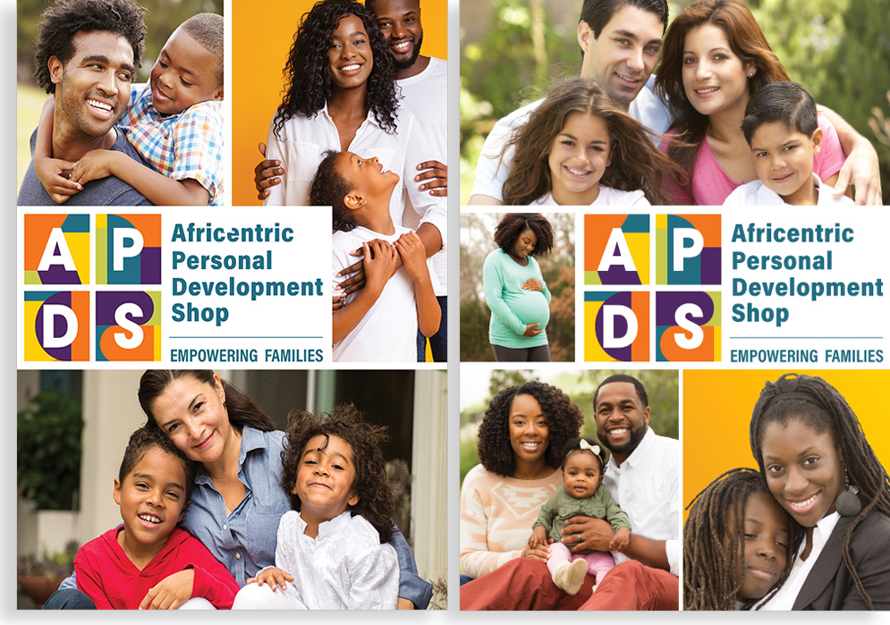
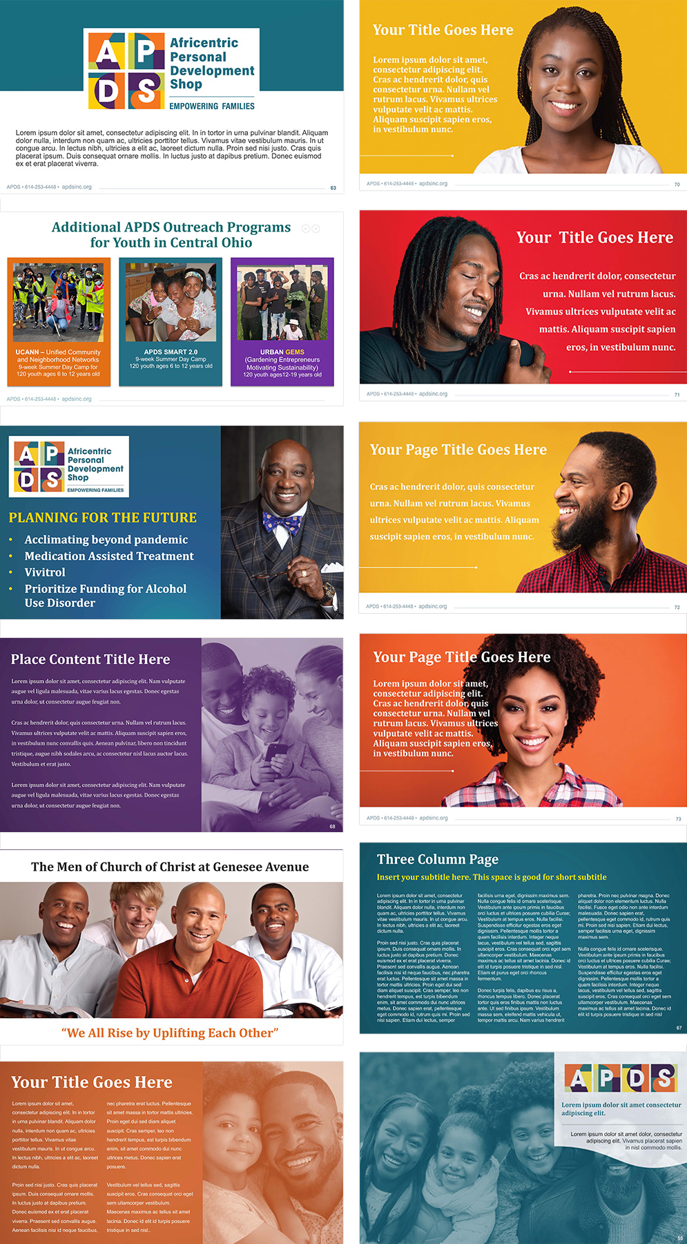
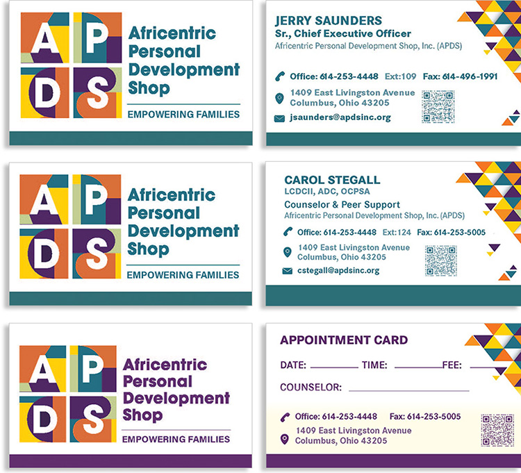
Explore how the rebrand extends across identity, outreach, digital communication, event materials, presentations, and community-facing applications while maintaining a consistent human voice.