Client
APDS Corporate Branding
Corporate Branding · Community Engagement · Visual Communication
Before the later rebrand, APDS needed a complete corporate identity capable of carrying a behavioral healthcare mission across business communications, outreach, presentations, environmental graphics, and the web. The original system established a warm, credible visual language for addiction recovery, family services, youth programs, and community engagement, combining art direction, visual design, Brand Identity, and responsive digital communication.
Project Overview
The initial assignment began with an existing logo and a much larger need: build a complete visual identity around it. The system had to communicate restoration, family, community, and cultural pride while working consistently from business cards and brochures to presentations, signage, and a responsive website.
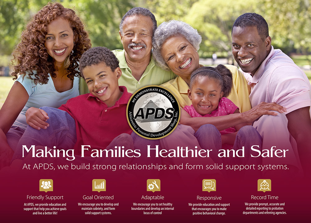
Warm photography, a distinctive wine-colored palette, structured typography, and clear information hierarchy gave APDS a recognizable presence without making the organization feel institutional. The identity established the visual foundation for years of outreach, program communication, and community engagement.
APDS Corporate Branding
art direction, visual design, Brand Identity, Presentation Design, Environmental Graphics, Web Design, and Production.
Build a recognizable corporate identity that communicates credibility, warmth, and community connection across APDS communications.
Corporate Identity, Business & Appointment Cards, Stationery, Brochures, Posters, PowerPoint Presentations, Environmental Signage, Presentation Folder, Responsive Website.
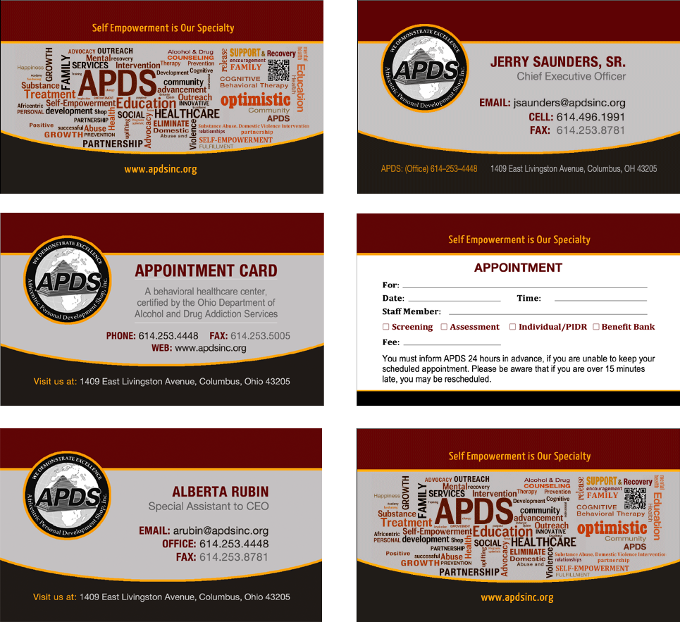
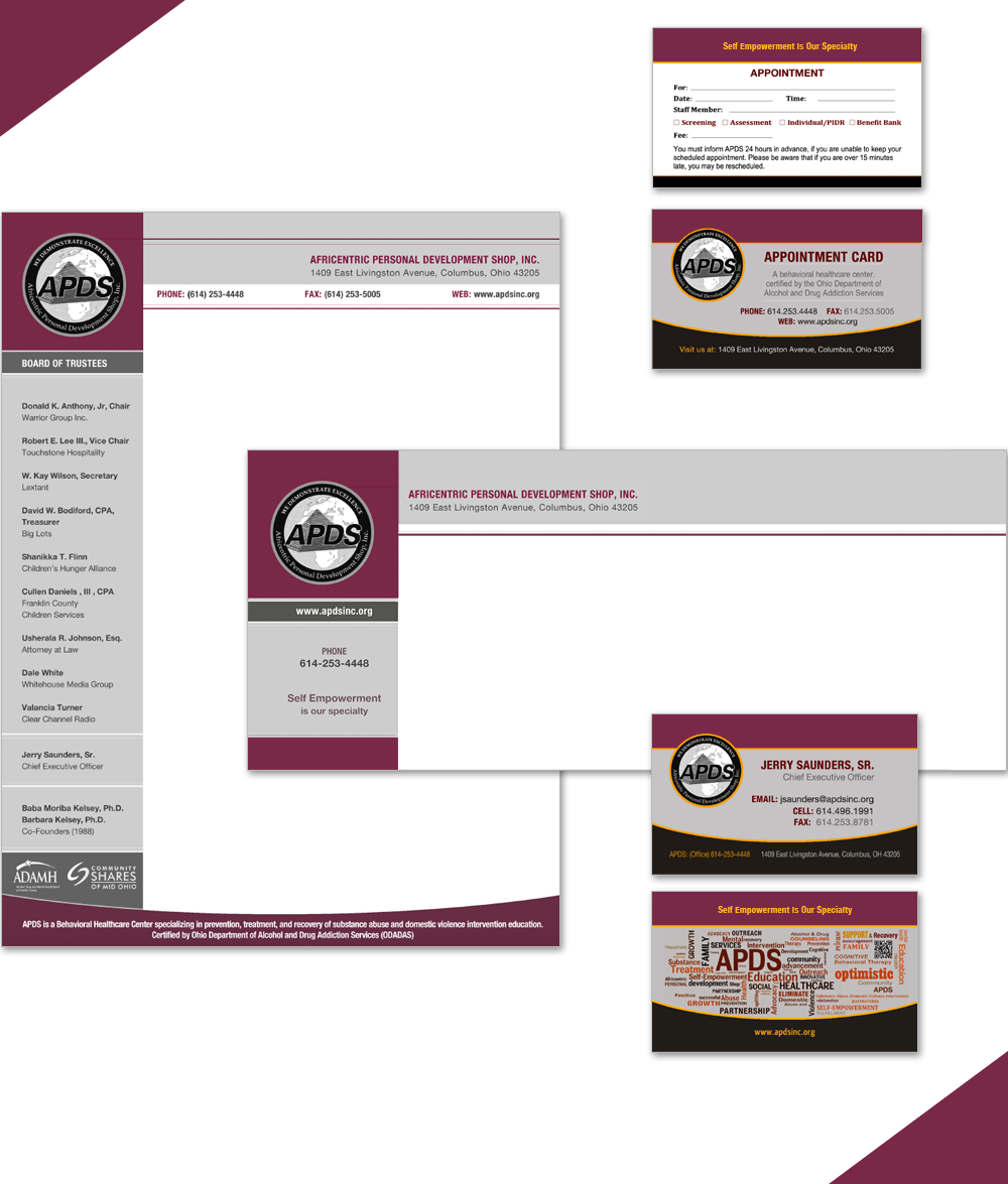
Every application was treated as part of one connected corporate identity. Business and appointment cards, stationery, brochures, support-group posters, PowerPoint presentations, environmental banners, folders, and the responsive website shared the same visual logic while adapting to very different communication needs.
The design balanced professional credibility with approachability. That combination helped APDS present complex behavioral healthcare and community services with clarity while preserving the warmth and dignity central to the organization’s work.
The selected work traces the original APDS identity across print, presentation, environmental, and digital applications, showing how one visual system supported both organizational credibility and community connection.
Business Cards and Appointment Card
Stationery Suite
Z-Fold Brochure One
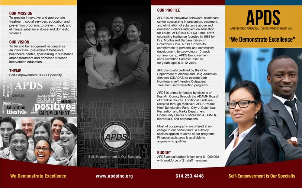

Z-Fold Brochure Two
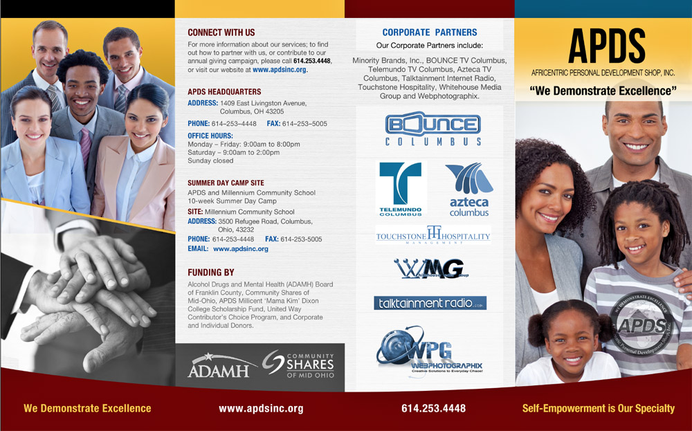
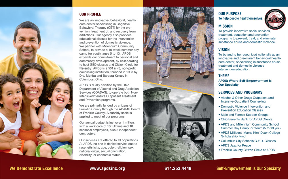
Support Group Posters


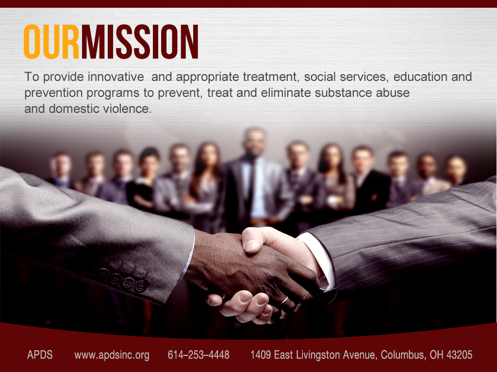
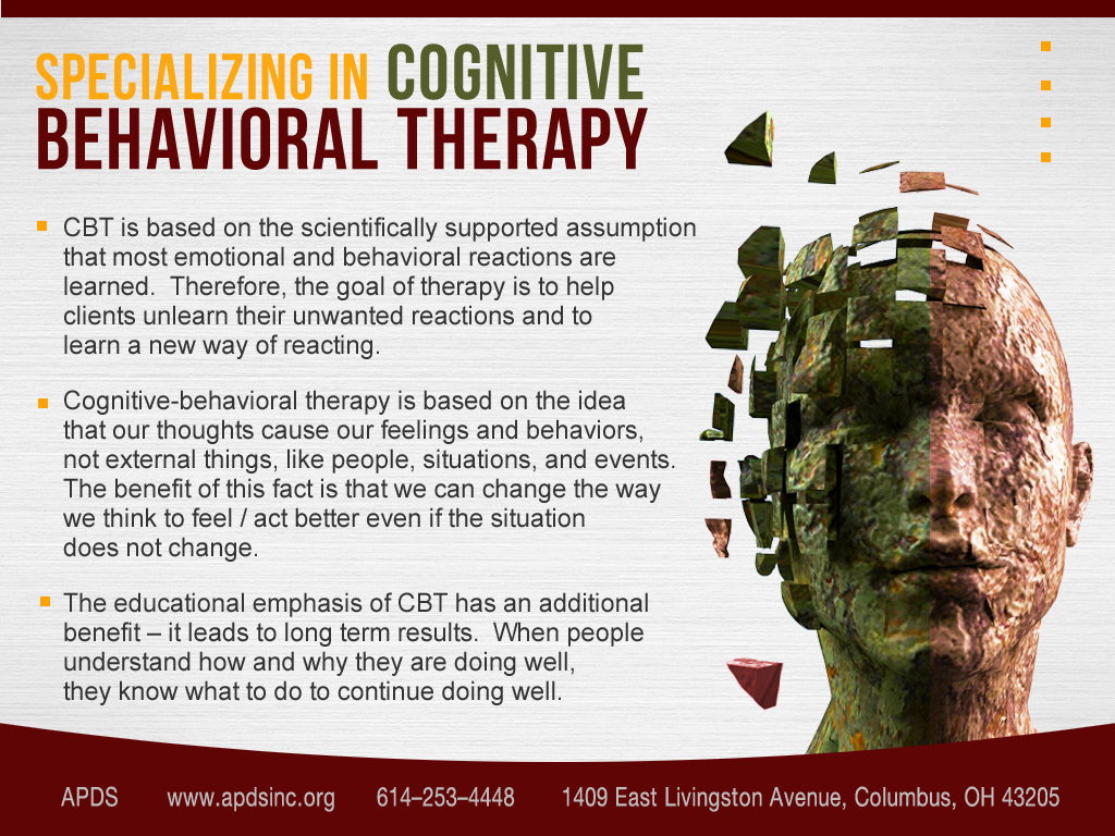
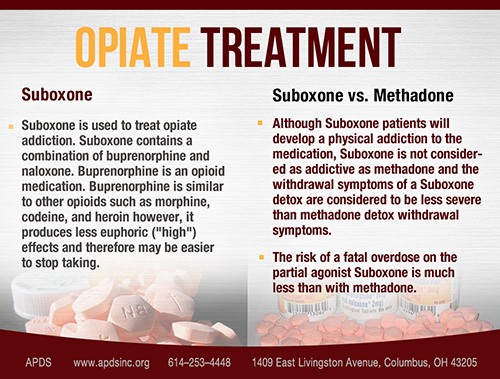
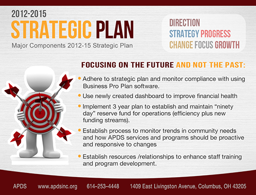
PowerPoint Presentation
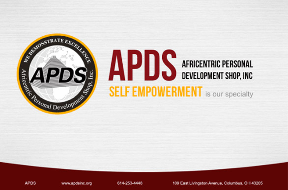
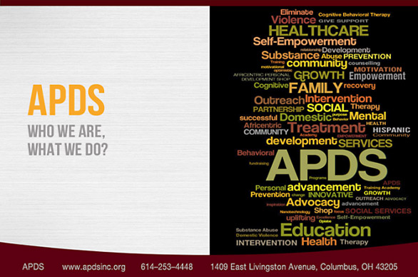
PowerPoint Presentation, Continued
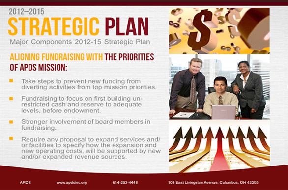
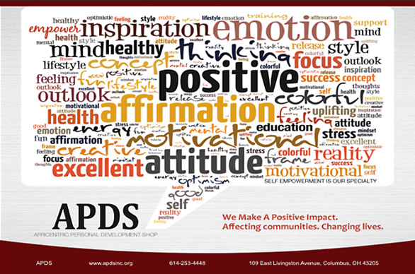
Environmental Banners

Vertical Trade Show Banner
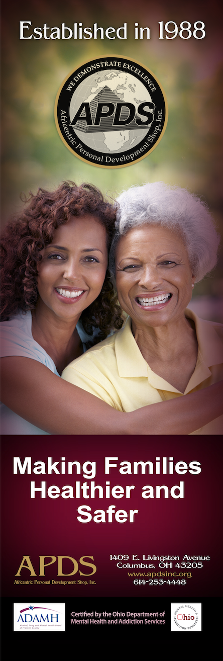
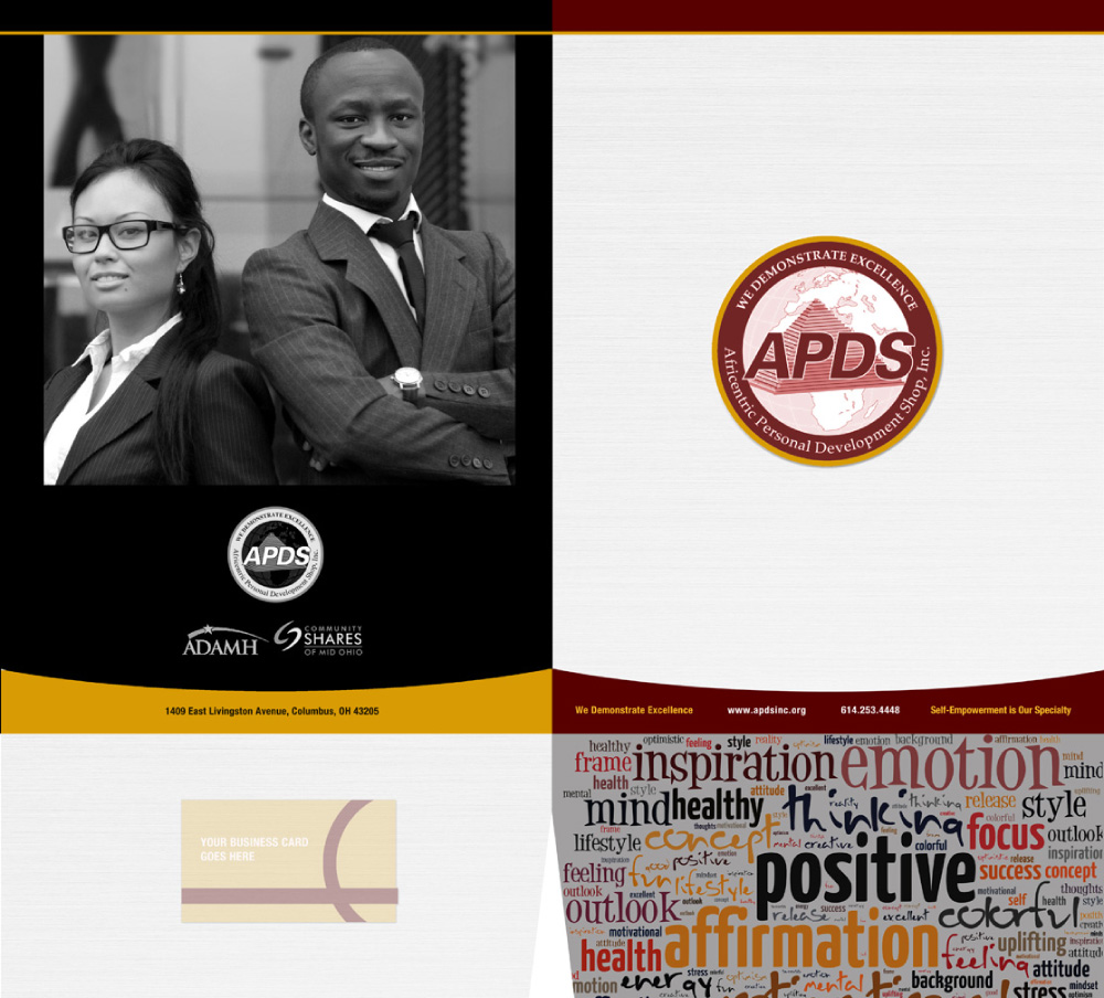
Corporate Presentation Folder
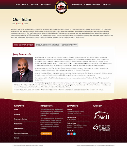
Original APDS Website
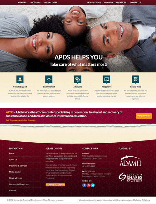
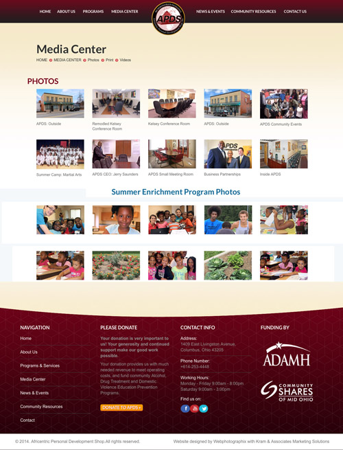
Original APDS Website, Continued
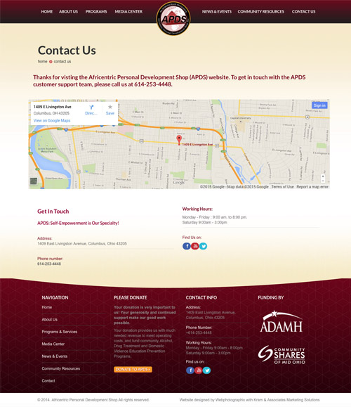
APDS Website Slide